


I’m heading to Alberta for a couple of days this week, so I’ve been looking more carefully at some of what’s going on there, particularly following the MacKinnon Report on government financing. And frankly, I’m a little perplexed at what I am seeing.
Just to be clear, the Albertan government is currently on a kick to balance the budget after several years of deficits. Nothing wrong with that. Higher education is one of the areas they have decided is among those they would like to prune. Nothing wrong with that either. Personally, I’m not of the opinion that no government should ever cut institutional transfers. Governments reflect public opinion, and if public opinion decides it would like to spend less on a particular good, that’s fine. They don’t really owe anyone an explanation.
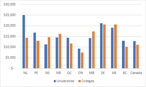
Indeed, arguably, they don’t need an explanation. As I pointed out back here, Alberta spends a lot more on post-secondary than other provinces do and has done for a long time. As shown in Figure 1, it remains in either first or second position on that score, well above the Canadian average. It would be totally OK to say: “you know what? Maybe we don’t need quite that much post-secondary education” or even “maybe we could split the costs with students a bit differently”. Either would be fine.
Figure 1: Expenditures per-FTE Student by Province and Sector, 2016-17
But there a whale of a difference between saying “we’d like to lower levels of spending and accept the consequence of lower levels of service/higher levels of private contributions” and saying “higher education institutions are ripping off the people of Alberta and we’re going to stop them”. Which, as far as I can tell, is what the Government of Alberta, wittingly or not, seems to be doing right now.
Exhibit A for this is Minister Demetrios Nicolaides’ performance last week, in which he spent a Canadian Press interview demanding that post-secondary institutes freeze hiring and stop spending on travel and hosting and followed that up with a short set of tweets showing a bunch of graphs and tables from the MacKinnon report and the background paper produced by KPMG which – whatever the Minister’s intentions – certainly left the impression that the Government of Alberta thinks that its post-secondary education institutions are spendthrift and underperforming.
Problem is, when you look closely at this data from the KPMG reports, you start to see some pretty weird things. Things which make you wonder how the data ever got past quality control. Things which make you wonder what KPMG’s marching orders were.
The Minister started off with this graph, below, which as far as I can tell does not appear in either the MacKinnon report or the KPMG background paper, but which the ministry has been passing around for a couple of months now:
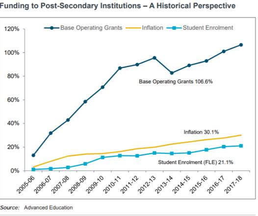
This graph is not wrong, per se, but it portrays the data in a way that I think is somewhat misleading. Basically, this graph mostly shows the huge run-up in spending that occurred under the Stelmach government (which, as I noted back here, was pretty immense). But if you wanted to, you could take exactly the same data and show that since 2012-13 (and maybe even back to 2010-11), inflation-adjusted per-student grants are basically flat or possibly even slightly negative (if you included tuition fees it would be definitely negative because the increased expenditures since 2015 was basically all about replacing tuition, not increasing institutional budgets.) Your eye doesn’t naturally see that because the inflation and student data is presented separately. That’s not an accident. It’s meant to get you to think of institutions as spendthrift.
The Minister followed it up with this comment:
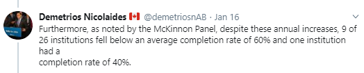
So, what the Minister is referring to is this graph from p. 113 of the KPMG background report.
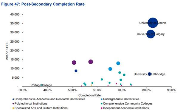
Now, clearly there’s not really a system-wide problem because the research universities – who constitute the lion’s share of enrolment – all have completion rates over 80%. The institutions where you have an issue are Athabasca (which shouldn’t be a surprise to anyone because open, online programs aren’t expected to have super-high completion rates), NAIT, SAIT, and a bunch of smallish, mainly rural community colleges. But look even closer, and even these figures are suspect. The note says that “Completion rate is calculated as an average of post-secondary program types based on the 2011 cohort that was tracked until up to three years after their program ended.” In other words, these aren’t actually institutional completion rates. It’s not clear what is meant by program “types” (grouped by length? field of study? Something else?) but if you average across types, what that means is that small programs count for exactly the same as big ones, which can significantly alter the numbers. Plus – seriously? The 2011 cohort? Made up of students who started in the middle of the biggest oil boom in 30 years, when wages for young unskilled males were through the roof? You’re really surprised that colleges geared towards the oil and gas industry in those years had high dropout rates?
Finally, the Minister tweeted this table, which sure seemed to imply overspending by Alberta institutions on administration.
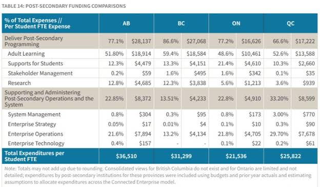
This is from the MacKinnon Report (p.39) based on a slightly different table from the KPMG report (p.125) but oh my God this one is problematic. First of all, the KPMG report claims the source for this is provincial budget estimates for each province. I call bullshit on this because I read provincial budget estimates every year and none of the other three provinces provide data in anything like the detail necessary to come up with these numbers. Which KPMG sort of acknowledges because if you look closely it actually says “consolidated views from British Columbia do not exist [emphasis mine because HOLY SWEET MOTHER OF GOD IF THE DATA DOES NOT EXIST HOW CAN YOU POSSIBLY HAVE COME UP WITH THIS CHART????] and for Ontario are limited and not detailed [AGAIN, JUMPING JESUS, ARE YOU KIDDING ME???].” In other words, the Minister took his own institutions to task for not measuring up on low operations expenditures against two jurisdictions where KPMG had very limited data.
Bra. Vo.
While I was looking all this stuff up, I came across another graph from the KPMG which the Minster did not retweet, but I think gets to the heart of the intellectual honesty of this exercise. It’s this one from page 106 of the report:
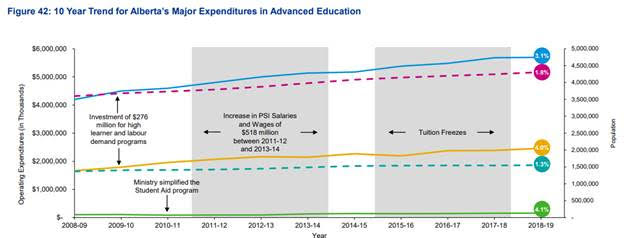
Let’s leave aside the fact that the purpose of the second Y axis is a complete mystery (a prize to anyone who can tell me). But more to the point, this graph makes the amazing claim that student aid costs have been rising by 4.1% annually since 2008-09. This is quite odd because last I checked, in 2010-11, the government hacked off about $45 million in Student Loan Relief Benefit (the program to forgive student loans). And of course, sure enough, in the footnotes, you find that the graph “exclude[s] Student Loan Relief Benefit” and a couple of other major items out of the student aid calculation. Through the simple act of excluding the bits of the budget that were later cut from the baseline, KPMG managed to show that student aid costs were in fact rising.
I am not sure how KPMG analysts sleep at night.
As I say, it’s totally legit for a government in a high-spending jurisdiction to say maybe it’s OK to spend less. You want to spend less? Spend less. But if you go around making up spurious performance and spending issues, people are going to think you have some ulterior motives.
It’s not too late for the Alberta Tories to change tack on this, and I really hope they do. They can and should be better than this.


5 Responses
Thanks for this great analysis. I hope that you keep blogging about what is happening in PS in Alberta as we need more fact-checking. You have a lot of readers in Alberta who appreciate your posts.
I suspect that the second Y-axis is there to allow us to compare population growth to spending growth, though the fact that it’s growth in total population, not university-age population, rather changes things.
What this whole tweet-storm shows more generally is that the language of accountability, efficiency, etc., has largely rhetorical value. Universities aren’t less efficient or accountable than other things governments spend money on. On the contrary, there’s a long tradition of transparency: if you want to know what we do, you can always sit at the back of lectures or read research papers. Making up numbers, however, gives anti-intellectual populists something to rile up their supporters with.
Same thing for K-12 in McKinnon report. Anyone who was involved in K-12 knew from day one the report was a piece of garbage. The report is not worth the paper it is written on. And yet……. the UCP Ministers (and the Canadian Taxpayers) keep bringing it back up.
Sad that we all paid for such garbage.
Thanks for showing how they misuse and mis present data.
Hey, I just discovered your site and it’s been very insightful. Would you be able to clarify the following, just to make sure I understand:
But look even closer, and even these figures are suspect. The note says that “Completion rate is calculated as an average of post-secondary program types based on the 2011 cohort that was tracked until up to three years after their program ended.” In other words, these aren’t actually institutional completion rates.
Thank you!