


The biggest missing piece in the Ontario government’s proposed performance-funding system is any discussion of the algorithm by which data on various indicators gets turned into an actual allocation to institutions. The lack of such a piece is what leads most observers to conclude that the government has no idea what it’s doing at the moment; however I am a glass-half-full kind of guy and take this as an opportunity to start a discussion that might impact the government’s thinking on this.
There are lots of different ways to run performance-based funding systems, but if the model is other North American jurisdictions with 50%+ of funding coming through outcomes, then there is probably only one real model, and it is the type associated with the Tennessee model. Fortunately, Tennessee has published an unholy amount about its model and how it works, so those of you interested in nerding out on this subject may want to just go there now and play around a bit (I had a blast doing so; your mileage may vary). In case that’s not your bag, here’s an explanation.
The calculation starts with each institution presenting data for each indicator. Each indicator is then transformed or “scaled” into a certain number of points (e.g. one point for every two graduates, or every three graduates, or whatever), leaving each institution with a certain number of points for each indicator. These points are then “weighted”; that is, multiplied by a number between zero and one depending on the stated importance of that indicator, with the sum of the weights equal to one (in Ontario, the government has promised to give institutions the ability to partially manipulate their weights to reflect institutional mission; Tennessee does this, too, but there are some pretty strict limits on the degree to which variation is permitted). Multiply each indicator by the weighted value, then sum the products and what you get is a composite score for each institution. Divide your institution’s composite score by the composite score of all institutions combined, and you get your institution’s share of whatever amount of money is on the table from government (which if you apply to current budgets and what Ontario says it wants to do with performance-based funding would seem to be about $2 billion for universities and $1 billion for colleges).
So far, so good. In some ways, we do this now with the weighted student enrolment formula. Indicators are different baskets of programs with similar program costs (Arts students are type 1, science/engineering type 2, etc.). The number of students in each indicator is weighted by whatever the government thinks the cost of each program is worth. The indicator values are multiplied by the weights, and your institutions’ “share” is whatever your share of the total aggregate weighted values are (ok, it’s actually a bit more complicated than this, but in principle this is how it works). Research intensive institutions – the ones with lots of science, engineering and medical students – get larger shares of the pie not just because they have more students, but because their students are worth more on average because of the weighting scheme.
For the system to deliver \ different results from what we currently have, it would need to produce results in which institutional “shares” are radically different from what they are now under the weighted student unit system we currently use. And we cannot tell if this will be the case simply from the chosen indicators (which I looked at back here); we need to know what kinds of values are going to be produced and what kinds of scales and weights are going to be used to arrive at an aggregate points total. And this is where there are a few things to watch.
Under the current system, the input units are “students”. Big schools have lots of them, smaller schools have fewer of them. That is to say, they are already scaled to institutional size to some degree. It’s not clear what the input units are going to be in this new indicator system. If you use “graduates” then big schools will get more and small schools will get less, which is more or less as it should be. But if you use graduation rates, those are not scaled to size. Ditto salaries and whatever “skills” score we end up using. Big research institutions might get better values (grads earn $50K instead of $45K, for instance), but it’s not clear how those values get translated into dollars without some other mathematical jiggery-pokery accounting for size.
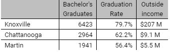
Thisis where scaling comes in. I guarantee people will focus on the weights allotted to each indicator, but actually the impact of weighting is probably secondary to the scaling. Let me show you, using some truncated data from Tennessee as an example. To simplify the story and not completely overwhelm you with numbers and charts, I am going to use three real institutions from Tennessee (UT Chattanooga, UT Knoxville and UT Martin) and three real indicators (bachelor’s graduates, the six-year graduation rate, and income for “research, service and sponsored programs”). To show you how this works. First, the raw indicator results for 2016-17:
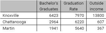
Now let’s scale these, as they do in Tennessee: one point for every graduate, 100 points for every percentage point on the graduate rate, and one point for every $15,000 in outside income. That leaves us with the following points totals for each school.
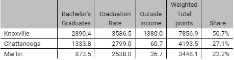
Now let’s assume the three indicators are weighted 45% to graduates, 45% to graduation rate and 10% to research income. (this isn’t quite how they are weighted in Tennessee because they are six other indicators, but these three do account for about 75-80% of the total and 45-45-10 is close to their proportions). Multiply each of the cells above by the appropriate weight, add them up, and you get a weighted point total. Since each institution gets its share of total weighed points, it’s then easy to work out how much money each institution gets. In this case, if the total budget was $100 million, then Knoxville would get $50.7 million, Chattanooga $27.1 million, and Martin $22.2 million.
My guess is most of you can work out in your head what would happen if we played around with the weights: for instance, Knoxville would do better if we put more weight on income. But even if you leave the weights unchanged, you can completely alter the results by changing the scales. So, for instance, what happens if we leave the scale for graduation rates unchanged, but change the scale for graduates from one for each graduate to one for two graduates and offer one point for every $5,000 in income instead of $15,000? I’ll skip a step to save space, but here are the final point outcomes:
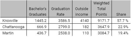
See? No change in weights but a change in scales, and suddenly Knoxville grabs seven million from the two smaller institutions.
This is tricky stuff. And not easily visible to the casual observer.
Now, in Tennessee it seems that a major function of the scales – at least at the start – was explicitly to calibrate the new system with the old one and make sure that there was as little disruption as possible in funding levels between the old system and the new one (and if there was a slight drop in the share of money going to each institution, they were usually made whole by the fact that the budget was rising every year – which is not going to be the case in Ontario). Tennessee was happy to let funding go wherever the formula told it to do *after* it was introduced, but they seem to have made quite a big effort, mainly through the scales, to ensure that at the start it was as seamless as possible.
The question is whether Ontario intends to do the same.