So yesterday we noted how universities’ per-student income had increased 40%. But we also noted that it’s a universally acknowledged truth that pretty much everyone in higher ed will swear up and down that things are worse than ever, always doing more with less, etc. Is there a way to reconcile these competing notions without simply coming to the conclusion that profs and administrators are delusional/greedy?
Well, sort of. Let’s start with Figure 1.
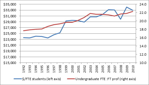
Figure 1 – Income per FTE Student and Student-Teacher Ratio
The blue line (left axis) just highlights you what I showed you yesterday – that per-student expenditures jumped from $23,000 to $33,000 over the period in question. The red line (right axis) shows something different: the ratio of FTE students to FT professors. This, weirdly enough, also increased over our period. In fact, the ratio went up by 24%, from just below 18:1 to a shade over 22:1.
This is, pretty much, bananas; indeed, it’s a pretty stunning indictment of higher education as a whole. Per FTE student income rose by 40%, and not only was that money not used to reduce student-teacher ratios, but the ratio actually deteriorated by 25%. How is this possible?
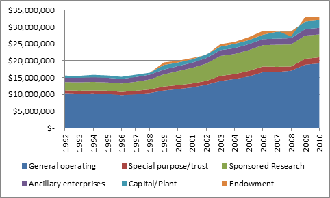
Well, one reason is that the operating budget grew more slowly than other types of income. Operating funds were up 82% over our period; research money, on the other hand, increased 178%.
Figure 2 – University Income by Fund, 1992-2010
But that’s not really a full answer – even if you pull out all those other income sources, operating budgets per student still rose by 20%. So why are student-teacher ratios going up?
There are basically two reasons. The first is that professors cost more than they used to. Just looking at the period 2001-2009 – the period for which I happen to have data handy – average faculty salaries jumped by about 24% in real terms. Now, that’s after a decade in which salaries stayed roughly even, or dropped a little, so the increase for 2001-09 period should be pretty close to the increase for 1992-2010. In other words, the cost of a professor rose more or less proportionately with income per student.
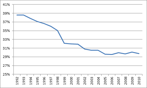
Everything else being equal, that means that student:faculty ratios should have stayed roughly the same, rather than having risen. But here’s the second reason: everything else wasn’t equal. Operating budgets increased twice as fast as academic salary mass, and, as a result, the percentage of operating budgets going to academic salaries fell from about 39% to 30%, mostly in the 1990s.
Figure 3 – Academic Salaries as a Percentage of Operating Budgets
So it was the combination of rising salaries and changing spending priorities that caused the rise in student ratios. But this just begs the question: what were these new priorities? Where did the money go? Stay tuned.


 Tweet this post

I hope that in a future blog you will talk about research expenditures. The rough rule of thumb (is it accurate?) is that about 70% of every research dollar, especially from tri-council grants, go directly to student support in the form of RAs, stipends, tuition support and the balance to operating costs.
Where did you get these data, Alex? CAUBO? If so, which tables?
It’s all from the Financial Information for Universities and Colleges survey from CAUBO.
I thought so. Thanks. Do you have the table numbers handy? I’ve looked at these data and they can be a bit overwhelming.
No pre-set #s. This is us playing with the data in 20/20.
My guess is student services.
Good guess, but not quite. As I say, tune in tomorrow.