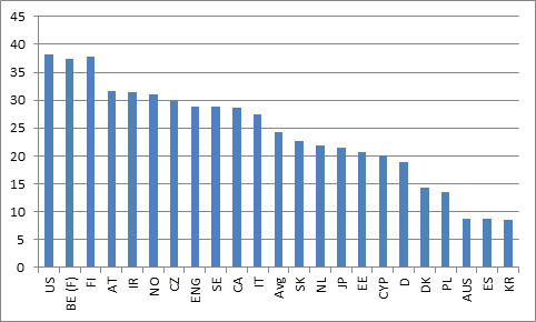
A few weeks ago, when commenting on the PIAAC release, I noted that one could use the results to come up with a very rough-and-ready measure of “value added” in higher education. PIAAC contains two relevant pieces of data for this: national mean literacy scores for students aged 16-19 completing upper-secondary education, and national mean literacy scores for students aged 16-29 who have completed Tertiary A. Simply by subtracting the former from the latter, one arrives at a measure of “value added”, which I reproduce below in Figure 1 (the y-axis is difference in PIAAC scores; PIAAC is scored on a 500-point scale, where 7 points are considered to be equal to roughly 1 year of schooling).
Figure 1: Tertiary A value-added: Mean Tertiary A PIAAC Score Minus Mean Upper Secondary PIAAC Score
This is a bit crude, though; to be genuinely comparable, one needs to control for the proportion of upper-secondary graduates that actually go on to higher education. Imagine two countries, both of which had the same mean score among upper secondary students, but country X enrols 20% of their upper secondary graduates in Tertiary A, and country Y enrols 40%. One would expect a larger gap between mean high school and mean Tertiary A scores in country X than in country Y because, comparatively, it’s cherry-picking “better” students. So we need some way to correct for that.
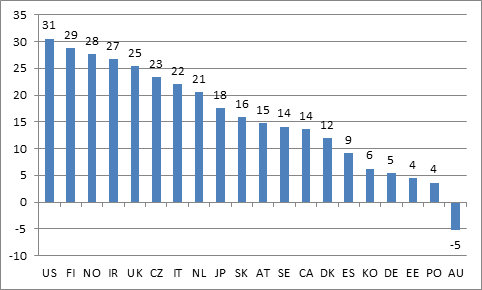
Fortunately, the OECD’s Education at a Glance provides data both on upper secondary graduation rates, and on tertiary attainment rates by age 30 (indicators A1.2a and A3.1b, if you’re following at home). From those two figures one can calculate the proportion of upper secondary graduates who go to university. Since PIAAC publishes not just means, but also scores for the 25th and 75th percentiles, one can now estimate the relevant threshold PIAAC score for getting into a Tertiary program (i.e. if 37.5% of your students get a degree, then the threshold secondary score will be halfway between the mean score and the 75th percentile score). To get a value-added figure for Tertiary A, one can take the mean score for Tertiary A and subtract this threshold secondary score, rather than the mean secondary score. The results look like this:
Figure 2: Tertiary A Value-Added: Mean Tertiary A PIAAC Score (16-29 yr.olds) Minus Threshold Upper Secondary PIAAC Score (16-19 yr-olds)
This change in methodology only slightly changes the results: absolute scores are smaller, reflecting the fact that the baseline is now higher, but the rank order of countries is similar. The US looks pretty good, indicating that its higher education system may compensate for a weak K-12 system; Australia’s result, somehow, is negative, meaning that average PIAAC scores for Tertiary A graduates are lower than the threshold score for secondary graduates heading to university. Which is a bit mind-boggling, to be honest.
I’m looking for feedback here, folks. What do you think? Does this work as a model for calculating tertiary value-added? How could it be improved? I’m all ears.


6 Responses
I wonder if the Australia scores are due to a high rate of admission to university of international students with English as an additional language (EAL), who did not complete their high school in Australia, but subsequently remained in Australia after graduating from university. If the proportion of EAL students graduating from high school is lower, and the proportion graduating from university is higher, then the average literacy scores could could appear to decline. One would need to know more about the sampling methods to assess if this is a possibility.
Hi Jon,
It’s possible, I suppose – but similar things happen in Canada too and we don’t see similar effects. Do you think the OZ numbers are so much larger than cdn ones that you;d see that kind of difference?
Thanks again for your thought-provoking posts, Alex. I think there is something interesting in these numbers, but I’m not sure what it is. I would want to know a lot more about how the tests were framed when they were administered. There is some interesting data on how the framing for the Collegiate Learning Assessment in the U.S. – basically, why you should care about doing well on this – that suggest it matters a lot if students are really motivated to put effort in the test (or are just going through the motions). Maybe the tertiary grads in Oz just blew off the test because they had figured out that it was meaningless for them? Or were suffering from assessment-fatigue after the Course Experience Questionnaire or other measures not applied elsewhere?
A minor quibble: Alex, you say that you are using the “proportion of upper secondary graduates who go to university”, whereas I think you are actually using “proportion…who complete some form of tertiary program”? If a country has a high dropout rate in tertiary education, maybe those dropouts still got some value out of that experience in terms of PIACC scores so the samples are not as linked? Or maybe a tertiary system that graduates a higher proportion of students is adding more value by accomplishing this for a tougher audience, which is masked by the calculation using threshold values as if raising literacy levels took the same effort or had the same value at all points on the scale?
This is very clever reasoning, and I do think the value added estimate is meaningful. The method is also validated by comparing the absolute values on the two graphs. That difference (eg. for Canada it goes down from 28 to 14) is a rough measure of the self selection bias in tertiary education. Some economists have estimated that roughly half the productivity gains derived from tertiary education are the result of selection and signalling.
One quibble: the Threshold is an estimate of the minimum for the group going on to tertiary, which you are then subtracting from the average for those completing tertiary. Thus the value added is a consistently biased over-estimate. (think about how the threshold would look if 75% completed tertiary — wouldn’t your method kick out the 25% percentile?). The ranking of countries is not affected, but the extent of the value added is – probably more than just Australia goes negative.
Hi Walter. Thanks for reading and for your contribution.
Re: thresholds: No argument with your quibble – with available data I don’t see a way around that. All I can say is that it is unlikely to affect the comparison much (that is, it probably overstates values, but does so in a similar manner across countries).
Hi Alex,
This is an important and promising approach and I’m glad to see you’re taking up the challenge. I agree with you that the negative result for Australia, as calculated, is “mind-boggling” and I suspect that it may be an issue with the method or, possibly, the data itself. Ideally we would just use longitudinal data to sort this out but, as is often the case, we’re forced to compare cohorts and this always creates issues. So given the funny result using the cohort comparison approach, what might be going on?
Your analysis assumes (reasonably) that higher ed institutions try/do pick the best and brightest of the 16 to 19 age group—but maybe they don’t. Some possibilities to ponder:
1. Enrolment in Australian institutions could include groups that would fall outside of the 16 to 19 control group, such as international students (who may have lower PIAAC scores coming in or have had such difficulty in their studies that they bombed the PIAAC test) or mature students returning (many of whom might also have lower PIAAC scores).
2. Perhaps Australia, for one reason or another, selects a high proportion of students who don’t start out in the top of the 16 to 19 cohort—perhaps spots allocated by location or demography?
3. Another possibility (remote but worth considering) is that high school performance in the last 3 or 4 years has really taken off while PSE performance has stayed the same (which means that the younger cohort has a higher baseline than the graduate cohort would have had before they started PSE. That is, there may have been value added, but the cohort comparison approach misses this.)
In any case, my current understanding of the Australian system is limited, so I don’t know whether one or any of these is the case. Setting aside these possibilities, it could just be a data issue. I plan to take a closer look in the coming months and would be happy to share my thoughts. (One thing you/I might ask is what happens if we do the analysis using % scoring at certain levels rather than mean scores). Still, this is a promising approach, I’m glad you’re pursuing it, and hope we can go down the road further. In some respects, the peculiar result for Australia might have the benefit of keeping us on our toes about what we can and can’t do with the data.