I was updating some old charts on sources of university income for a presentation last week and they are kind of interesting so I thought y’all might want to have a look.
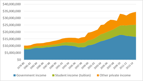
The first is the total income of Canadian universities over the past 35 years, in constant dollars. What it shows is that total income has increased in a relatively steady fashion ever since the late 1990s (the slight spikiness of the last decade has more to do with uneven endowment income than anything else). Total income for 2014-15 was around $35 billion, or more than double the figure of twenty years earlier, even after accounting for inflation.
Figure 1: Total Income of Canadian Universities, 1979-80 to 2014-15, in $2013
But of course, student numbers have increased substantially over the past two decades. In the late 1990s, we had about 650,000 university FTEs; in 2014-15 those numbers had increased to nearly 1.1 million. So if we calculate income on a per-student basis the gains are less impressive.
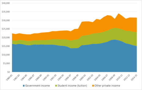
Figure 2: Per-student income of Canadian Universities, 1979-80 to 2014-15, in $2013
Income per student stayed roughly stable through the 80s and 90 at around $23,000 per student per year in constant dollars. Income then began to rise sharply. For most of the last decade the figure has hovered around $31,000, or about one-third higher than it was in the 1990s.
Now, this flies in the face of conventional wisdom. Cutbacks are everywhere, right? So how can there be so much money in the system? Well, a few reasons. The main one is that there actually hasn’t been much an increase in dollars available for operating funding. On a per-student basis, government funds are now lower than they have been at any point this century, and if research funds are removed from the equation, then they are more or less lower than they have been at any point since these records began. What has offset this is a rise in income generated from tuition (more on that in a second) and income from other sources (which is not the same as net income, so not all of this is available to the academic enterprise).
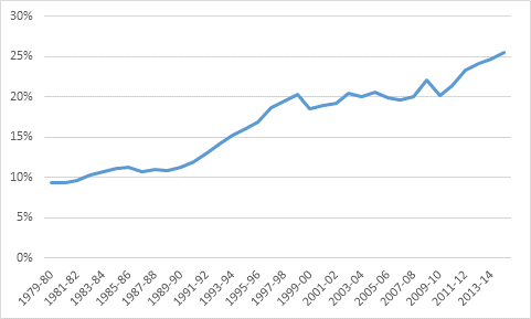
Now, a quick peek back at figure 1 shows that the big trend of the last few years has been a decrease in government funding (the blue area) being offset by an increase in student contributions (the green area). That’s a real trend: after a decade of student contributions sitting at around the 20% mark, they have increased in the last few years to 25%.
Figure 3: Tuition Fees as a Percentage of Total Income, Canadian Universities, 1979-80 to 2014-15
But before anyone goes around yelling about the evils of tuition fees, it’s worth remembering that tuition fee increases for domestic students over the past few years have been roughly inflation plus one percent. The increases in tuition income per student, however, have been rising at about inflation plus three per cent. How is this possible? Simple. International students and – to a lesser extent – increased enrolment in higher tuition programs.
This is the very simple lesson of the past half-decade. Governments can allow public funding to erode quietly, keep domestic tuition relatively stable and institutions can make up for it all by enrolling more and more international students. So far, it’s worked as a strategy, even if no one owns up to it actually being a conscious strategy. But there are limits to this policy and eventually, something has to give.
It would be helpful if we started having out-loud grown-up discussions about what those limits are, and what we do when we hit them, rather than playing it all out in silence with nods and winks. But that implies maturity among our politicians. Based on their recent performances, I have my doubts.


 Tweet this post

I know you hinted at this a bit, but might be interesting if you can to figure out what the trend in institutional provision of student aid, scholarships etc has been, as I’d guess a good bit of the other private income has gone that way.