


If you are just joining us, we’re in the middle of a three-day session on the finances of the world’s top-200 universities, or, more specifically, the 147 of them in the US, UK, Australia, Germany, Sweden, Switzerland, the Netherlands, Japan and Canada. Yesterday, I showed that the top-200 institutions in all these countries were increasing their total expenditures in real terms, albeit at different rates, and that their research funding was also increasing substantially (in fact, faster than general revenues in every country except Sweden).
But income is only part of the story. That money has to be spread over a certain number of students or a certain number of staff. If income grows more slowly than student or faculty numbers, can an institution really be said to be better off?
Let’s look at the raw numbers, starting with students. Now remember, the way students are counted is not the same everywhere, so what you are looking at is changes in student numbers as each country counts them. But still, there are some interesting stories here.
Figure 1: Change in Enrolment at Top-200 Universities, by Country, 2006 to 2017
Some stories here are easy to spot: demographic decline is keeping student number growth low in Japan, and international students have been swelling numbers in Australia. But others are harder to pick out. Sweden had low growth because universities after 2011 or so deliberately started shrinking their intake so as to improve “quality” (for professors, presumably); in the Netherlands, where the university system was long kept deliberately small and elite (most students were funnelled into the polytechnic system), there has been a “flight to the universities”. In most countries, what we see is a pretty steady growth of about 1% per year.
Now over to academic staff. This is a tough one because though Canada is very clear about only counting full-time ranked academic staff, in most countries, what is counted is something closer to “knowledge workers” (e.g. in Germany Wissenschaftliches Personal) which seems to include a lot of non-teaching research personnel. Also, there are widely different approaches to counting medical/clinical staff. Be that as it may, what is shown in figure 2 is the change in academic staff using whatever method each country uses.
Figure 2: Change in Academic Staff Count at Top-200 Universities, by Country, 2006 to 2017
Again, wide differences between countries, though here the story is not so clear-cut. Japan sees almost no changes because, well, it’s Japan and basically nothing changes there. The US, Canada and Australia are all at the low end, while the UK and continental Europe occupy the high spots.
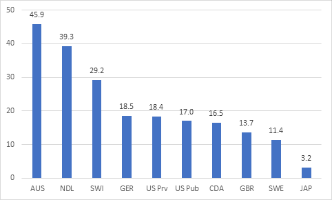
Now, for fun, let’s take a look at what that does to student-staff ratios.
Figure 3: Change in Student-to-Academic Staff Ratio at Top-200 Universities, by Country, 2006 to 2017
In Canada, at top-200 institutions (which, if you’re wondering, includes U of T, McGill, UBC, Alberta, Ottawa, McMaster and Université de Montréal), the increase in student numbers was exactly matched by the increase in academic staff. In Australia, and to a lesser extent the Netherlands, we see significant increases in student-staff ratios. The really interesting stories, though, are in Europe – specifically, Switzerland, Germany, Sweden and the UK– where there are significant decreases in the ratio of staff to students. Does that mean teaching quality has increased? Or that research output is up? We’ll see.
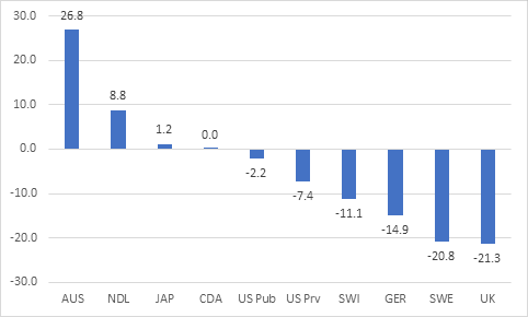
But now let’s start looking at how all of this intersects with money. There are changes in expenditures per student, which we show in figure 3. Not much new here if you’ve been paying attention: everyone up except the Dutch, who have combined low expenditure increases with large increases in enrolment and as a result are substantially worse off than they used to be by this metric.
Figure 4: Change in Expenditure per Student at Top-200 Universities, by Country, 2006 to 2017
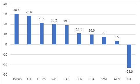
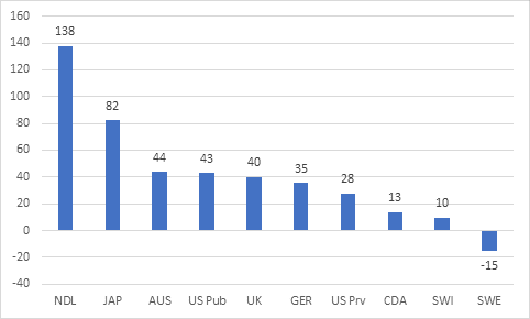
Of course, it looks totally different if we look at things through the lens of change in research dollars per faculty member. If you use this metric, the Dutch go from last to first and it’s the Swedes – who greatly increased academic staff with very little extra research funding – who look the worst.
Figure 5: Change in Research Income per academic staff at Top-200 Universities, by Country, 2006 to 2017
What you should take from this (and yesterday’s post) is that “world-class universities” are being subject to vastly different kinds of experiences. They are nearly all accumulating more resources, but not all of them are using these resources to acquire more academic staff. Some are acquiring new resources by chasing new students, which does not necessarily leave them much better off over time. The Dutch are apparently both teaching far more students and attracting a *lot* more research dollars. Canadian top-200 universities tend to find themselves on the lower end of the distribution in terms of extra resources, no matter how you slice the data.
Tomorrow: how it all pans out in terms of research output.