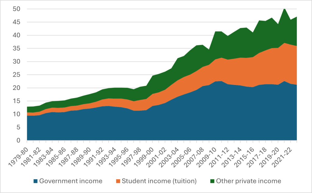
Most of the time when I talk about the history of university financing, I show a chart that looks like this, showing that since 1980 government funding to the sector is up by a factor of about 2.3 after inflation over the last 40-odd years, while total funding is up by a factor of 3.6.
Figure 1: Canadian University Income by source, 1979-80 to 2022-23, in billions of constant $2022
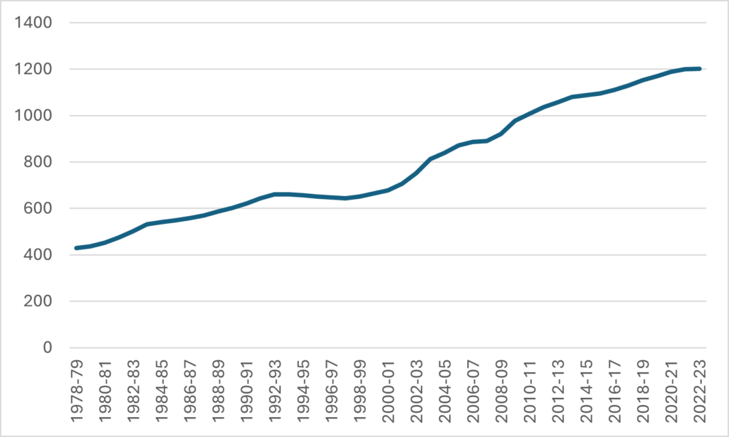
That’s just a straight up expression of how universities get their money. But what it doesn’t take account of are changes in enrolment, which as Figure 2 shows, were a pretty big deal. Universities have admitted a *lot* more students over time. The university system has nearly doubled since the end of the 1990s and nearly tripled since the start of the 1990s.
Figure 2: Full-time Equivalent Enrolment, Canada, Universities, 1978-79 to 2022-23
So, the question is, really, how have funding pattern changes interacted with changes in enrolment? Well, folks, wonder no more, because I have toiled through some unbelievably badly-organized excel data to bring you funding data on this that goes back to the 1980s (I did a version of this back here, but I only captured national-level data—the toil here involved getting data granular enough to look at individual provinces). Buckle up for a better understanding of how we got to our present state!
Figure 3 is what I would call the headline graph: University income per student by source, from 1980-81 to the present, in constant $2022. Naturally, it looks a bit like Figure 1, but more muted because it takes enrolment growth into account.
Figure 3: University income per student by source, from 1980-81 to the present, in constant $2022
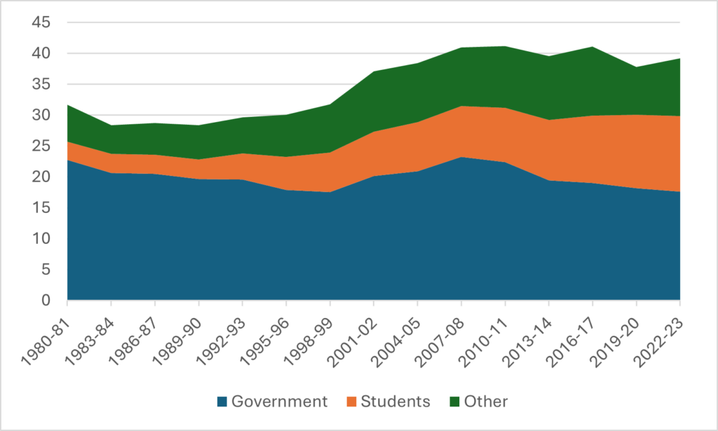
There’s nothing revolutionary here, but it shows a couple of things quite clearly. First, government funding per-student has been falling for most of the past 40 years.; the brief period from about 1999 to 2009 stands out as the exception rather than the norm. Second, despite that, total funding per student is still quite high compared with the 1990s. Institutions have found ways to replace government income with income from other sources. That doesn’t mean the quality of the money is the same. As I have said before, hustling for money incurs costs that don’t occur if governments are just writing cheques.
As usual, though, looking at the national picture often disguises variation at the provincial level. Let’s drill one level down and see what happened to government spending at the sub-national level. A quick note here: “government spending” means *all* government spending, not just provincial government spending. So, Ontario and Quebec probably look better than they otherwise would because they receive an outsized chunk of federal government research spending, while the Atlantic provinces probably look worse. I doubt the numbers are affected much because overall revenues from federal sources are pretty small compared to provincial ones, but it’s worth keeping in mind as you read the following.
Figure 4 looks at government spending per student in the “big three” provinces which make up over 75% of the Canadian post-secondary system. Nationally, per-student spending fell from $22,800 per year to $17,600 per year. But there are differences here: Ontario spent the entire 42-year period below that average, while BC and Quebec spent nearly all that period above it. Quebec has notably seen very little in terms of per-student fluctuations, while BC has been more volatile. Ontario saw a recovery in spending during the McGuinty years, but then has experienced a drop of about 35%. Of note, perhaps is that most of this decline happened before the arrival of the current Ford government.
Figure 4: Per-Student Income from Government Sources, in thousands of constant $2022, Canada and the “Big Three” provinces, 1980-81 to 2022-23
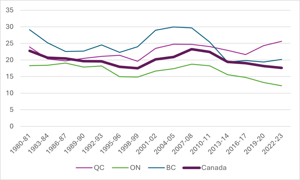
Figure 5 shows that spending volatility was much higher in the three oil provinces of Alberta, Saskatchewan, and Newfoundland & Labrador. All three provinces spent virtually the entirety of our period with above-average spending levels but the gap between these provinces and the national average was quite large both in the early 1980s and from about 2005 onwards: i.e. when oil prices were at their highest. Alberta of course has seen per-student funding drop by about 50% in the last fifteen years, but at the same time, it is close to where it was 25 years ago. So, was it the dramatic fall or the precipitous rise that was the outlier?
Figure 5: Per-Student Income from Government Sources, in thousands of constant $2022, Canada and the “Oil provinces”, 1980-81 to 2022-23
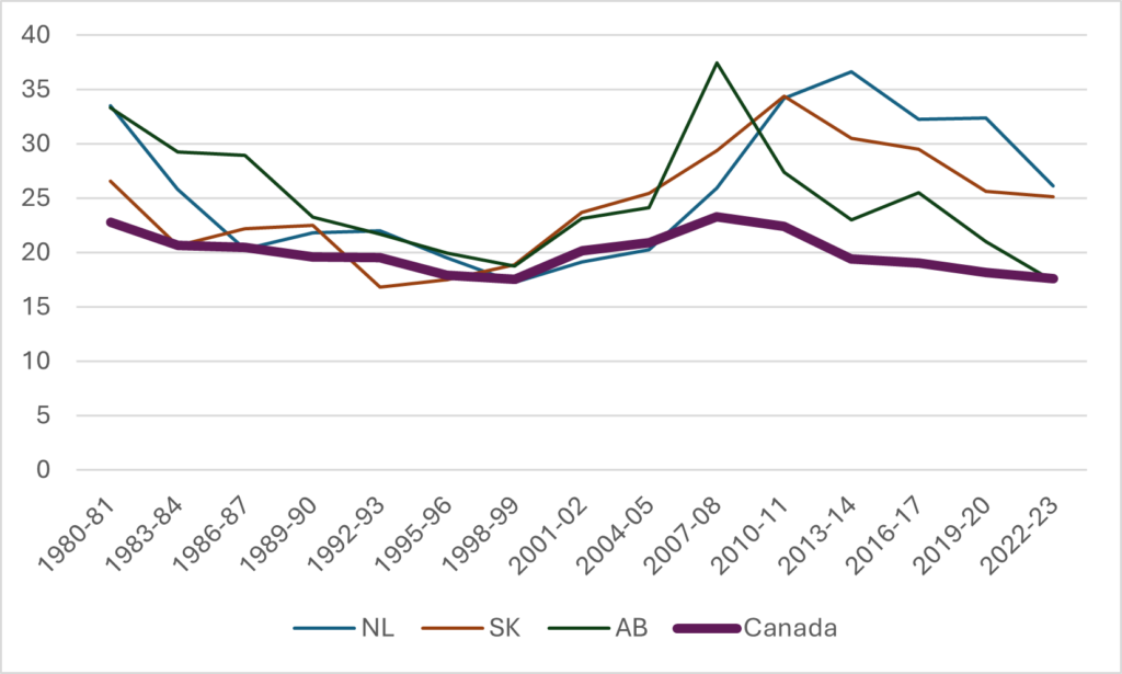
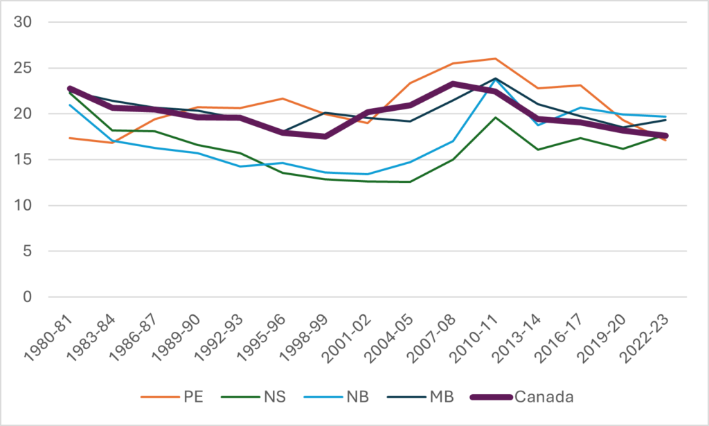
Figure 6 shows the other four provinces for the sake of completeness. New Brunswick and Nova Scotia were the lowest spenders in the country for most of the period we’re looking at, only catching up to the national average in the mid-aughts. Interestingly, the two provinces took two different paths to raise per-student spending: Nova Scotia did it almost entirely by raising spending, while in New Brunswick this feat was to a considerable extent “achieved” by a significant fall in student numbers (this is a ratio, folks, both the numerator and the denominator matter!).
Figure 6: Per-Student Income from Government Sources, in thousands of constant $2022, Canada and selected provinces, 1980-81 to 2022-23
An interesting question, of course, is what it would have cost to have kept public spending at 1980 per-student levels. And it’s an interesting question, because remember, total spending did in fact rise quite substantially (see Figure 1): it just didn’t rise as fast as student numbers. So, in Figure 7, I show what it would have cost to keep per-student expenditures stable at 1980-81 levels both if student numbers had stayed constant, and what it would have meant in practice given actual student numbers.
Figure 7: Funds required to return to 1980-81 levels of per-student government investment in universities, Canada, in millions of constant $2022
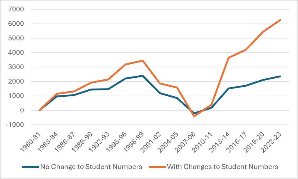
Weird-looking graph, right? But here’s how to interpret it. Per-student public funding did fall in the 80s and early 90s. But it rose again in the early aughts, to the point where per-student funding went back to where it was in 1980, even though the number of students in the system had doubled in the meanwhile. From about 2008 onwards, though, public investment started falling off again in per-student terms, going back to mid/late-90s levels even as overall student numbers continued to rise. We are now at the point where getting back to the levels of 1980-81, or even just 2007-08, would require a rise of between $6 and $6.5 billion dollars.
Anyways, that’s enough sunshine for one morning. Have a great day.


