


Morning all. Yesterday I promised you more faculty data analysis, and I am going to start by looking at variation in pay by institution. I’m going to be deliberately provocative by showing people the distribution of salaries at the level where they vary the most: full professorships. Ready?
Figure 1: Average Salaries of Full Professors by Institution (and yes, the X-axis is unreadable, do you know how many institutions there are in this country?), Canada, 2018-19
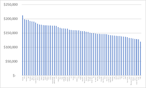
The point I want to underline is that the top institution (University of Toronto), average pay at the top rank is $212,100, while at the bottom institution (University of Northern British Columbia) the average rate is only $119,875. When I pointed this out on Twitter a few days ago, the main reaction was “well, yeah, but the price of housing!”, which seemed to imply either a) that people thought that pay rates were caused by housing prices, somehow or b) Toronto profs need to look oppressed even through they are clearly, clearly, clearly in the 1%. Or both.
I mean, yes, York (2nd overall, average full prof salary $198,250) and Ryerson (7th overall, $190,000) have high rates, but it’s not really because of the high cost of living here at The Centre of All Things. If that were true, why would OCAD U’s top rate be a mere $129,000? Why would the average at Simon Fraser, located in a more expensive place than Toronto, be at $156,000? Far from being a symbol of variance in cost of living, what this chart really shows is the difference in raw financial power across different institutions, and how they choose to use it. And U of T has *a lot* of spending power.
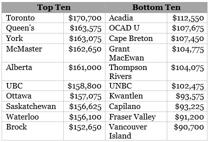
Ok, you probably just want to me to name the big spenders and little spenders, right? So how about this: a table showing top and bottom ten institutions for average salaries, all ranks. To a limited extent, this shows the age of faculty (universities with older faculty have higher average salaries because of seniority), but it’s also not a bad measure of financial power. Unsurprisingly, eight of the top ten are U-15 schools (York and Brock sneak in there too, presumably because they feel it necessary to compete in a tough southern Ontario market). The bottom group is dominated by new universities: of the ten only Acadia was operating as a full university (i.e. without college-level programming) under its current name prior to 1992.
Table 1: Top and Bottom Ten Institutions for Average Professorial Salary, 2018-19
Let’s turn to the issue of gender parity in wages. Nationally, men who are tenured and tenure-track professors earn, on average, $15,450 per year more than women, a gap of 11.8%. Part of that gap has to do with fields of study; certain male-dominated fields, in particular Engineering, Math and Computer Sciences, have both large pay gaps and are very male-dominated. The other part has to do with some mix of seniority (men are more numerous at top ranks) and everyday systemic sexism (even at the assistant professor level, where there really should be no pay difference among individuals, in most fields of study pay gaps of $1,000 or more persist).
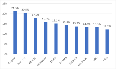
In terms of pay gaps, Figure 2 shows the ten institutions with the largest proportionate gaps in average pay (that is, the amount by which the average man’s salary exceeds the average woman’s salary). As you can see from the figure seven of the ten are U-15 schools and as such have big departments of Engineering, Math and Computer Science (and Medicine, as well), which means a surfeit of men in highly-paid professorial positions. Brandon, of course, is a big outlier here – I am told by their comms team that this is the result of a recent hiring binge which added a large number of women to staff, but since new hires tend to be junior, they have below institutional average salaries, so the woman’s average is lower than it would normally be.
Figure 2: Ten Canadian Institutions with the largest average gender salary gaps, 2018-19
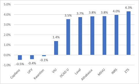
But pay gaps emerging from field of study can’t be the whole story: as we see in Figure 3, Université Laval, a U-15 member in very good standing, has among the country’s smallest pay gaps, and École de technologie supérieure is 100% Engineering (francophone institutions from Québec seem to do much better than the rest of the country on this measure). Intriguingly, there are three universities where women make more on average than do men – all of them in BC, all of them new universities from the 2008 expansion and none of whom use academic ranks in the conventional sense (they both do and don’t, it’s complicated). Of note, perhaps, is that at five of these ten institutions, women make up fifty percent or more of the academic staff.
Figure 3: Ten Canadian Institutions with the smallest average gender salary gaps, 2018-19
This is a complex issue, so more on gender tomorrow.


2 Responses
You’re probably sick of me beating this drum, but what about colleges?
We’ve done a fair bit of hiring in the last few years at that level and, on average, short-listed men have had about 2 years more post-phd experience than women (actual offers have run about roughly 50-50). Under our collective agreement that means the men start a salary step or two ahead on the pay grid, since we recognise previous experience fairly generously. If this combination of hiring dynamic and experience recognition is common, you’ve got an explanation for the junior gap on something other than sexism. And, perhaps, 2 different stories about the market to be sorted out: equity hiring is working and moving women forward or its not and women are not getting the contract work/post-docs necessary to build competitive CVs for TT jobs. Would be really curious if there’s any data to pull either of those stories apart..