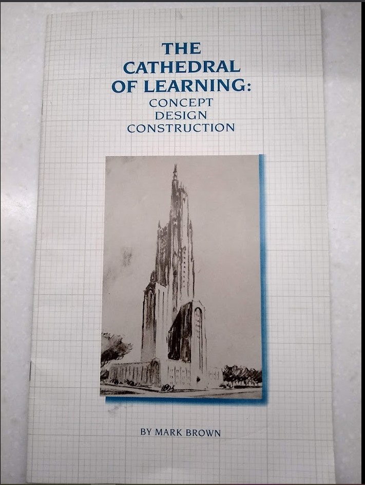
Some of the more interesting piece on our shelves are not actually books at all, but pamphlets, short guides, conference proceedings, and other paraphernalia. One day, I will show y’all the programme from that 2006 conference on student aid sponsored by the Thai government, where we got to see the Thai civil servants in their quasi-military uniforms (this is a thing, believe it or not), and where the Deputy Minister of Finance mounted the stage beneath two crossed shooting jets of dry ice to a very loud instrumental version of Springsteen’s Born To Run. The whole idea was to put some kind of international seal of approval on an Income Contingent Loan program in which the loans were quite clearly designed to run at a loss rate of 70 or 80%, but that was OK, because it was really all about finding a way that Thaksin Shinawatra could use cheap loans to buy urban student votes the way he had sewn up the farmers with cheap agricultural land (it was all for naught because he was ousted by a military coup a few months later).
One day. Can’t find it right now. But what I did find recently on a foray into the COVID-deserted HESA Towers was this lovely little pamphlet about the construction of maybe my favourite building on any US campus: that is, the Cathedral of Leaning at Pitt. So that’s what I’m going to talk about.
Now, a brief diversion here about Pitt, which used to be a private institution and is now – along with Penn State University and Temple University – treated as a “state-related university”, which means it accepts public money but maintains greater freedom than Pennsylvania’s actual public universities (which include such confusingly-monikered places as California University of Pennsylvania and the Indiana University of Pennsylvania – really, it’s better not to think too hard about this). Set contiguous to Carnegie Mellon University, a couple of miles from the confluence of the Allegheny and Monongahela Rivers, the two have a kind of duo act for the local economy, with Pitt’s Medical Center (a $20 billion enterprise) acting as a health sciences twin to Carnegie Mellon’s more tech-based impact.
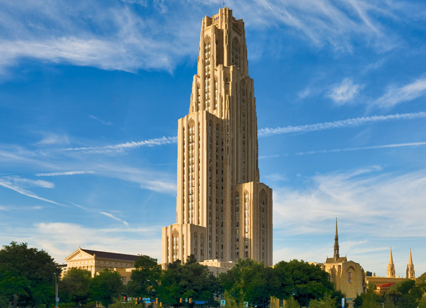
But long before Pitt became famous for hospitals, it was famous for a deeply eccentric architectural decision made in the mid-1920s; specifically, that it would build a quite massive, 42-story building in the middle of campus. And not a modern-looking Empire-State-ish art-deco-y building that would have been normal for that period, but rather a weirdly gothic 42-story building inspired loosely by Chicago’s Tribune Building. When I happened to be in town a few years ago (a surprisingly fun mid-summer Detroit – Cleveland – Pittsburgh – Buffalo circuit), naturally I picked up this quite fascinating little history of the place.


Now, when they call it the Cathedral of Learning, it’s not just because of the gothic exterior: it’s also got an interior which looks pretty Hogwarts-y, too, at least on the main floor. Vaulted ceilings, study tables: it has quite the vibe.
But the weirdness of the Cathedral does not stop in the main floor’s Great Hall; instead, it is extended quite a ways by the 31 “Nationality Rooms” which line the exterior walls of the first and third floors. Ever been at some kind of multicultural fest where all the different tables or tents or whatever represent a different nationality? Ok, imagine that but in architecture. Basically, the local Korean/Welsh/whatever community gets together and donates a bunch of money to the university, and in return they get to deck out one room in a kitsch ethnic-style of its choosing. So, the Japanese room is done up in nice dark woods and rice paper, the Austrian room looks like something Metternich would have used, the Polish room has a Copernicus vibe, etc. You can see all of them here.

The whole thing a weird, Soviet vibe to it. Partly because of the way it evokes the Tribune Building (also an inspiration for Moscow’s seven sisters, one of which is the main building at Lomonosov State University, which I guess makes them kissing cousins) and needless vaults which are kinda Moscow subway-ish, but also for the almost cartoonish approach to ethnicity that the Nationality Rooms embody. It is so self-consciously and ahistorically retro that it almost seems like an ironic commentary on itself and its past (a bit like the dioramas at the Natural History Museum in New York). It’s all quite batty and also quite fun.
Though universities portray themselves as modernist institution, there is something deep in the sector’s DNA which prefers early nineteenth-century height rules. As a sector, we’re really addicted to big clusters of low buildings with huge footprints and (preferably) lots of greenspace. I think we’re getting better at mid-rise buildings (I’m quite partial to the Leslie Dan building at U of T, for instance), but we both dislike and are terrible at designing tall buildings (I love you Carleton, but Dunton Tower is a monstrosity). The Cathedral was an attempt to change that mentality, but even then, it was only a half-hearted one, keeping as it did the gothic elements of much older east coast colleges even as it tried to project modernity by reaching into the sky.
A failure then, but still a pretty glorious one. If you’re ever in Pittsburgh (a deeply under-rated city, by the way), take the time to go.


