if you pay attention to discussions of higher education funding, one of the memes that inevitably pops up revolves around the notion that higher education has been under some brutal, neo-liberal assault since… well, I’m not sure, but probably since 1995 at least, and everything is being defunded, laid on the backs of students, it’s the end of civilization, dark ages ahead, etc., etc.
Problem is, this yarn is utterly at odds with the data, which tells a very different story. Starting today, I’d like to tell you that story.
Are you sitting comfortably? Then I’ll begin. Let’s jump right to Figure 1.
Figure 1 – Total University Income By Source, in Billions, 1992-2010
Now, the first time I saw Figure 1, I assumed it was in nominal dollars. But it isn’t. Those are real, constant dollars, folks. And in real terms, university income more than doubled between 1998 and 2010.
Sure, the 1990s sucked – government expenditures fell in real terms, and the system only kept itself afloat through greater reliance on private income (mostly tuition). But the 2000s were years of simply eye-popping growth. Basically, every year, it was 6-7% growth after inflation. If anyone in academia is puzzled as to why higher education is seen as spoiled by much of the rest of the public sector (and indeed the public-at-large), this graph is the answer.
One interesting thing about the 2000s is how the different revenue streams all went up at about the same pace. That is, tuition income and income from private sources continued to rise after 1998, but they didn’t become a larger portion of the pie, because revenue from government was rising so quickly. At the start and end of that period, the revenue split remained 54% government, 21% tuition, and 25% other revenue. So much for “governments downloading costs to students”. Student fees certainly went up, but government spending went up proportionately, too.
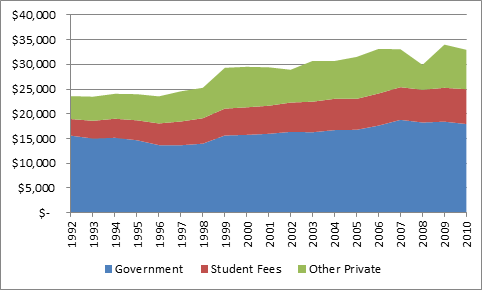
Ah, say the skeptics, but you’re only accounting for inflation. What about that huge influx of students? Surely, if we showed this data on a per-student basis, it would show the ever-deprived nature of our universities. Well, no, as a matter of fact. FTE numbers in universities did indeed rise, but only by about 50%. So on a per-student basis the graph looks like this:
Figure 2 – Per-FTE University Income by Source, 1992-2000
Between 1997 and 2006, per-student funding rose by roughly 40%, from about $23,000 to $33,000 (again, this is in constant dollars). For the rest of the decade, per student dollars remained reasonably consistent, give or take a huge hit on endowment revenue in ’08. If I could extend that graph out to 2013 (which I can’t), you’d probably see a small drop in government funding offset by an increase in (mostly international) tuition dollars.
So why does everyone think universities are getting poorer when in fact they’re getting richer? Tune in tomorrow.


 Tweet this post

I suppose I should wait for the rest of the story so as not to ruin the suspense, but then maybe you have something else in mind. The thought that popped into my mind in reading this was what’s the breakdown in government support between operating grants and research funding?
Patience, grasshopper. All will be revealed.