OK, so I was going to share with you some interesting research from Europe and elsewhere on Individual Learning Accounts, which everyone in Ottawa seems to think are going to be A Big Deal in the upcoming budget. However, that will have to wait because yesterday the Innovation Minister, Navdeep Bains, speaking yesterday to what was no doubt a packed room at the CD Howe Institute in the middle of a full-on Toronto white-out, released a fantastic new piece of post-conceptual art called “Building A Nation of Innovators”.
I will spare you a detailed examination of this document because for the most part there is literally nothing new here. I mean, yes, it’s amusing that the government has redefined the noun “impacts” to mean exactly the same thing as the verb “to spend”, and I suppose it’s handy to have three years’ worth of budget announcements and ISED press releases regurgitated WORD FOR FLIPPING WORD in one spot, but there is really nothing else. I have already told you what I think of the Minister’s vacuous thoughts on superclusters, coding, the obsession with digital and cleantech, superclusters, his total inability to differentiate between growth policy and innovation policy, etc. This is a “greatest hits”, not a new album, so there’s really nothing to review or even get excited or upset about. Mostly I read it and feel exhausted and a bit sad that the government continues in this vein, instead of dealing with real issues around innovation.
But… the graphics! Holy hell, the graphics. They may not reach the heights of Peak Deloitte, but they are nevertheless something to behold. Suffused with a heavy Dadaist orientation, the satirization of government policy within government documents has perhaps never been so open, so blatant.
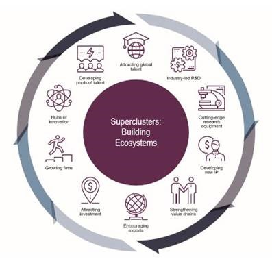
The use of infographics is really quite startling. Infographics, of course, are supposed to turn complex quantitative information into something visual and intuitive. But, Nation of Innovators is about – well – innovation! So in this document, infographics are used mostly to… replace bullet points. Want to know how superclusters build “eco-systems”? There’s a graphic for that!

Or the benefits of 5G wireless? Also a circular graphic for that.

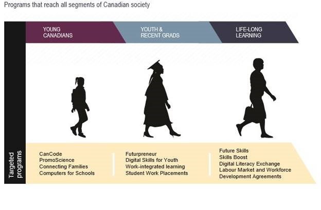
This next point would be sooooo much less compelling without the visual, don’t you think?

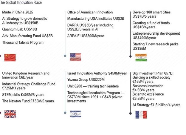
The following graphic is from the inevitable “other-people-are-doing-things-therefore-we-must-do-things” section of the report. Since this is a paper about innovation, the designers have chosen to illustrate this using a technique never before used in the entire history of graphic design: flags! But not just any flags… textured flags.

Now, I quite enjoy this next graphic, entitled “The Innovation Continuum”. It is of course nothing of the sort, being just a vaguely-related set of six different concepts, which immediately made me think of Rene Magritte, because of course ceci n’est pas un continuum.

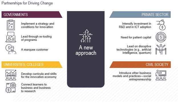
Maybe my favourite work of art in here, though, is called Partnerships for Driving Change which is simply filled with classical allusions.Change itself is depicted as a gray box, filled with arrows for no apparent reason (an allusion to Diana, perhaps? Goddess of the Hunt and Nature? And therefore a nod to the Green/Cleantech agenda? Be sure to stretch well before this read) and labelled “A New Approach”. The four elements allegedly driving change appear to be randomly placed around the New Approach.

Now to the uninitiated, this just looks like random garbage, with five elements placed in proximity to one another with no obvious logical connection between them. But look more closely and Renaissance themes quickly emerge. The “New Approach” is quite clearly Botticelli’s Venus or Raphael’s Madonna, and the four sectors are arranged around it in adoration.


Ok, I’ll stop now. I just wish the Minister would, too.


One Response
I love this post! These kinds of documents are not confined to federal government – they are endemic, and they demonstrate why so many “leaders” in so many fields are ineffective. I recently reviewed the international plans of a large number of Canadian universities. They are almost all the same: everyone is keen to educate “global citizens”, and they mostly have photos of white Canadians helping brown people in tropical locations, and happy multi-ethnic tutorial groups all getting along nicely on sunny, leafy Canadian campuses (why can’t we attract international students with photos of slushy snow?). Virtually none of these plans have any real targets, and virtually none of them provide links to data that would allow one to assess whether the plan has been successful.
We have created a class of people in leadership roles whose modus operandi is to write strategic plans. They move into a position and undertake extensive consultation, making sure to be hyper-inclusive. They then write plans intended to please everyone. Once they have produced their plans, they hire more staff to oversee them. Then they apply for a job at another institution, on the strength of their consultative and inclusive behaviour, and the bland, unachievable plans they have written. And the cycle continues.