At some point in the next week or so, Statistics Canada will be releasing its annual statistics on tuition fees. Hopefully it will be less of a fiasco than last year, when they released data a few days after the Quebec election, but didn’t bother to note that the planned tuition fee hike was being reversed.
What I want to do today is to put the inevitable “rising fees” stories that always accompany the Statscan release into some sort of context. Students pay two types of fees – tuition and “ancillary fees”. Statscan data on the latter is only marginally better than hopeless, so these fluctuating annual figures need to be treated with extreme caution; but they’re a non-negligible part of total tuition (15% or so), and so I include both in the graph below showing the evolution of total fees.
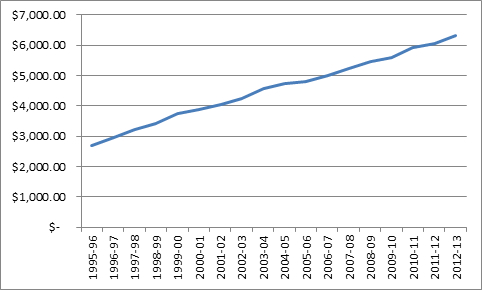
Figure 1 – Average Tuition, Canada, Nominal Dollars
Figure 1 is the graph that the zero-tuition crowd love to show: steady 5.1% annual tuition increases from 1995 to the present. That’s actually a trick of scale – in fact, during the era of maximum government skintness (the 90s) tuition was going up about 9% per year to make up for cuts in government grants. After 1999, the economy improved, public finances improved, and the rate of fee increase fell to just about 4%.
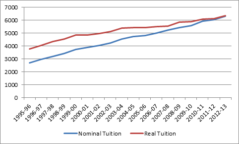
There is, however, a little thing called inflation. It’s kind of important if you want to understand real prices over time. Here’s what the tuition graph looks like if you take inflation into account.
Figure 2 – Average Nominal and Real ($2103) Tuition, Canada
This changes things a bit. Those annual increases since 1999-2000? Just two percent, after inflation.
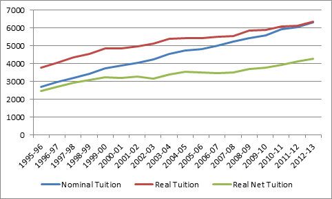
But, as apparently nobody in the press or politics seems to understand, those increases in fees have been accompanied by increases in subsidies, too. The most important of these are the increases of various forms of tax credits. Say what you want about them – they reduce the actual cost of education by about a third. Their value is eroding slightly at the moment due to inflation, but they are still worth $2,220 to the average Canadian student.
Figure 3 – Average Nominal and Real ($2013) Tuition plus Net Real Tuition Canada
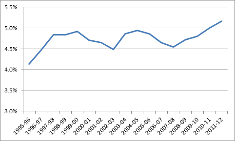
Finally, if we’re looking at affordability, we also need to take into consideration a measure of ability-to-pay, because cost on its own is meaningless. Televisions cost more than they did, say, 40 years ago, but no one thinks they’re “less affordable”, because incomes have risen even more quickly. So to compare affordability across time, what we need to do is look at cost over time with respect to a measure of purchasing power, such as average family after-tax income. Which I do, below.
Figure 4 – Real Net Tuition as a Percentage of Average After-Tax Family Income
So, is tuition less affordable than it was? Well, a bit, yes. Fifteen years ago, it took up 4.8% of average, after-tax income; now, it takes up 5.2%. But calling it a crisis, the way the usual suspects routinely do, is a bit of a stretch.
And we haven’t even taken into account need-based student aid yet. We’ll do that tomorrow.


6 Responses
Interesting to look back to 1966… tuition / ancillary fees at one university (Dalhousie) – tuition $600 ancillary fees $45. Using 5% annual increase, you end up with about $6400 – somewhat lower than their current fees, although that probably reflects the reduced percentage of subsidies in the Maritimes today. Do you have access to data that reflects the national average over 40 or 50 years to extend your graph?
Hi Ed. Thanks for writing.
None of the statscan inomce data goes back before ’76. The main statscan tuition series goes back to 72 (I think), but I only have up to 1980 on my computer. But even without that, I can tell you the graph you’re thinking of would be U-shaped, with the base around 1986 or so.
Is after tax family income really the best measure of ability to pay? I covered my own costs without financial support from family, as did many of my friends at school. Families of means may be in a better position to further subsidize education for their offspring, but that’s often not the experience of students from families of moderate or modest means.
I’m always glad to see you take those who pick and choose their data strategically to task. This is another good example. Thank you.
But I wonder: instead of considering affordability as a result of average family after tax income, let’s recognize that many (most? some?) students are paying for their educations themselves. Their families are not, and in those cases, the purchasing power of their families (or the average family) is not relevant.
I wonder what the data would look like if affordability was calculated based on the average post graduation salary and factor in the changing interest rates on student loans. Sure, this can get rather messy considering some students have saved some for schooling, supplement with student employment and top up with loans. But you do messy well. I’d like to see a graph of affordability based on how long it would take a graduate to pay back a student loan which represented the total tuition and fees of their program based on the interest rates at the time of graduation. I suggest that is a little more meaningful.
Hi Carrie. It’s a fair point. My guess would be that the % would be higher but the pattern wouldn’t be very different. Let me see what I can whip up for you on this. The changing rates on student loans stuff you can see here: https://higheredstrategy.com/a-closer-look-at-student-debt-part-1/
While it’s useful to see the real cost of tuition in terms of after-tax family income, I can’t square it with my experience talking with students. My data’s anecdotal and so could be skewed. But the majority of my students now find summer jobs paying around $11-$12/hour. When I worked over the summer in the early 90s, most jobs paid $9-$10/hour (in 90s dollars). While real family income may have kept pace with increased tuition, I’m not convinced that student income has.