


Picking up on yesterday’s blog, let’s look more closely at the data on university gender and pay. In particular, we need to look at the underlying factors that cause pay disparities.
Years of service is the most obvious single factor affecting average pay. Figure 1 shows the women’s share of the professoriate, by age. Overall, 41% of the professoriate are women, but it skews much higher among younger (less well-paid) professors and much lower among older (more highly-paid) ones.
Figure 1: Women’s Share of the Professoriate, by Age
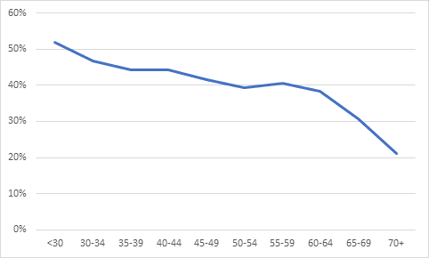
Intuitively, Figure 1 might cause us to say “that must explain a good chunk of the overall gender pay gap across universities” and conclude on that basis that it’s not “policy” driving the gender gap, but the consequences of historic hiring practices. If that were true, we wouldn’t have to fool around looking at differences across and within fields of study.
Unfortunately, we can’t tell how much of the pay gap can be accounted for by historic hiring practices because there just isn’t enough data out there to tell. Statistics Canada’s “Data” page publishes the number of men and women along with their average and median salaries, by institution. That’s it. They don’t publish national averages (yesterday’s data involved me aggregating institutional data). You can order data from them, but it costs hundreds or possibly thousands of dollars. The only group who does that regularly is the Canadian Association of University Teachers (CAUT), which, bless them, publishes a not wholly-consistent set of data on faculty (click here to see the whole set) which marginally improves the whole situation.
Beyond the figure above and yesterday’s blog, here’s what the CAUT data adds to our knowledge base:
- The proportion of women faculty members by broad field of study, which can roughly be converted into Major Fields of Study. This helps us examine inequality by hiring patterns.
- Average salary by sex, rank, and “university subject taught”, which is a fairly idiosyncratic list of fields that don’t line up especially well with the Major Fields of Study. This helps us understand inequality both within each field and across fields.
Because different charts use different definitions of “field of study,” there are limits on how one can put this data together. Here’s what I was able to compare:
- Average salary across all ranks. In the following three tables, I group all “subjects taught” into three groups: those where average salaries are over $139,000 (above average), those where the average is between $133-139,000 (at or near average) and those where it is below $133,000 (below average). Over half of the subjects taught are below average, but remember that many of these groups are quite small in terms of the numbers of individuals employed.
- % of female staff. This is the trickiest one because there is no published data on this (as far as I can see) with respect to “subject taught”. The best we can do is try to line up the subjects with the major fields (Note: There will be errors resulting from this). Above average means over 50% of full-time professors are female, at or near the average means between 39 and 50%, and below-average means under 39%.
- Total Salary Gap. The average by gap by subject is $11,300 in favour of men. This could be a function of differences in average ages within the discipline (see above), but it could also be about “market factors” (which obviously have a gendered component, though not necessarily one stemming from university policy) and other factors. Here, above-average means a gap of over $13,300, a below-average gap means less than $9,300 and “at or near” means anything in between.
- New Hire Salary Gap. If there weren’t systemic sexist factors at work, there shouldn’t be a salary gap for new hires (that is, the gap among assistant professors). But there is a gap. It’s possible that this could be explained by where individuals are hired (big universities pay more than small ones), but it’s hard to see why this would end up having such huge differences by field (+$10,800 towards men in Business, +$4,500 towards women in Natural Resources). Since initial placement on the salary scale is hard to overcome in the long-run, close attention is needed here. Across all fields, the gap was $831 favouring men, and so the boundaries for “at or near” were set $500 on either side of that. Above average implies a gap of $1,331 or more, while below-average means $331 or less (including all values where women earn more than men).
By lining all these variables up together, we see the impact of different factors which create the large salary gaps. Table 1 shows fields with above-average levels of compensation. Women are not over-represented in any of these groups, and that’s a big contributing factor to the overall pay gap. But under-representation does not mean there are extraordinary gaps within these fields. In fact, in agriculture and computer science, we see the opposite – even though there are not many women employed in these fields, the salary gaps overall and for new hires are below-average. Conversely, in business, a field in which the number of women comes close to the national average, there are extremely large gender gaps in pay within the field.
Table 1: Gender Gaps in Hiring and Pay, High-Pay Disciplines, 2017-18
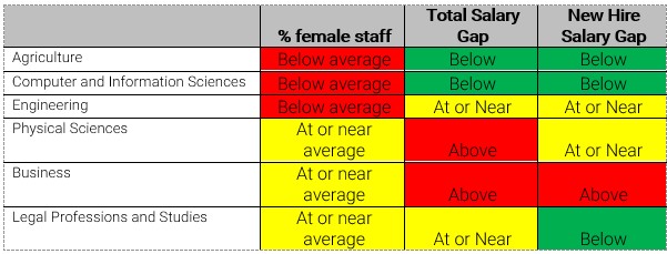
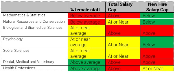
Table 2 shows a similar story in the health professions. (If you’re wondering why health professions aren’t in the top pay group, it’s because this only measures pay from institutions and many have outside sources of income). These fields have above-average percentages of female staff, but among the highest rates of pay differential within their fields. Meanwhile, Math & Stats – one of the worst fields when it comes to gender equity in staff numbers – actually does very well in terms of pay differentials among new staff.
Table 2: Gender Gaps in Hiring and Pay, Average-Pay Disciplines, 2017-18
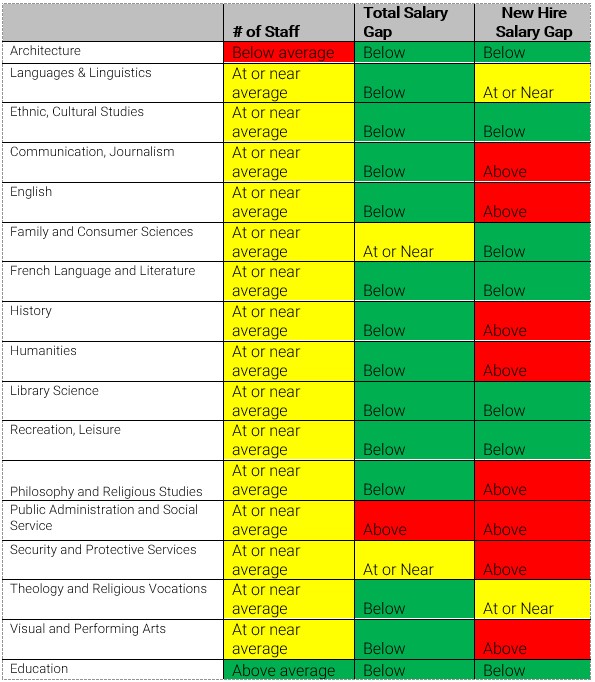
Among the low-pay disciplines, there are a few which are exemplars in terms of within-field pay equity (e.g. French Language & Literature, Library Science), but also one – Public Administration & Social Services, which I believe covers Social Work – which has above-average within-field pay gaps. Only Education is a true paragon with both high proportions of female staff and below-average levels of within-field disparity.
Table 3: Gender Gaps in Hiring and Pay, Low-Pay Disciplines, 2017-18
As you can see, this starts to get pretty complicated: there are many sources of overall pay gaps and they intersect in different ways. Finding the right way to rectify these things is tricky: sometimes universities will throw up their hands and just give one-off raises to all female faculty (e.g. Waterloo), in other cases, institutions go on elaborate quests to eliminate within-field differences (e.g. McMaster), but still basically throw up their hands at cross-field differences on the grounds (I think) that the university is just reflecting differences in pay in the overall economy. There’s something to that, but it probably falls to the university to be a lot more pro-active in hiring and retaining women faculty in fields like Engineering and Computer Science, where the male-female staff balance is, amazingly, largely unchanged from 30 years ago.
Still a way to go on this file, unfortunately.