


Today, I want to talk about a massive shift in the higher education cost base that has gone largely unremarked but had huge implications for institutions across the country.
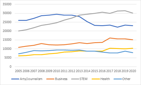
Let’s start by looking at Ontario undergraduate application statistics for 2020, the preliminary version of which came out a couple of weeks ago. Figure 1 shows very little change from last year in terms of the big four application areas. STEM is down a tad, but nothing to write home about (yet). I think if you look at Figure 1 carefully, it shows the system has stabilized for the last 4-5 years, and that the era of big shifts (the long run-up in STEM enrolments from 2005-2015, the crash in humanities and social science enrolments, particularly between 2012-2015) may be over and what we are looking at is the new normal: Business, Health and STEM all up 15-25% over where they were a decade ago, and Arts – meaning Humanities and Social Sciences combined – and “other” are down about 20% (most of the fall in the “other” category is due to declines in visual arts and music).
Figure 1: Applications by Field of Study, Ontario, 2005 to 2020
So, there has been a change in demand: but did universities accommodate this shift, by changing patterns of admission and enrolment? Well, it’s difficult to tell from Statscan data, for two reasons. First, Statscan does not break down enrolment data by year of study. This isn’t surprising because year of study is a surprisingly tricky concept to work out in practice (is a first-year law student in a second-entry program a first-year student? Is a student just starting an Engineering program but who previously spent two years in Arts a first-year student?). So, you can only look at the student body as a whole, which creates a comparability problem because the undergraduate student body of 2020 is a mix of the incoming classes of 2016 to 2020. It takes a while for change to cycle through.
Now, because we’ve been at a new equilibrium for a few years, this complication in counting entering students would not really matter, if we lived in a country produced educational statistics in a timely way. Canada, however, is not such a country. At the moment, the most recent national data we have is from 2016-17, which puts us in last place among industrialized countries in terms of timeliness of enrolment data (we don’t look great compared to a lot of non-industrialized countries, either – Nigeria’s 2018 data is here, for instance). We won’t get into why: there are several reasons, all of which add up to “nobody in Canada actually cares enough about education to produce data”.
Anyways, the point is the last data we have for enrolments in Ontario is from 2016, which is essentially a compilation of the 2011-2016 application processes. This data lags application data by anywhere from five to nine years. But as Figure 2 shows, the story it seems to tell is that in the first half of the decade, institutions did indeed accommodate the demand shift.
Figure 2: Undergraduate Enrolments by Field, Ontario, 2005-06 to 2016-17
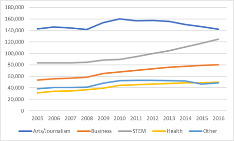
This has major cost implications. Humanities and social sciences subjects – any classroom subjects really – are cheap to teach. STEM subjects, being laboratory based and/or requiring large amounts of technical infrastructure, are much more expensive. We can argue a bit about how much more; it will vary a bit from place to place. But in most weighted-enrolment systems, STEM programs tend to get funded at between 50-100% more than arts or business. But clearly, accommodating this shift means extra costs for institutions – costs which most certainly have not been met by the provincial government, which has kept funding essentially frozen in real terms for the past decade.
How big a shift? Well, assume that institutions continued to allocate seats to accommodate demand, that STEM and Health fields cost twice as much per student as Arts and Business fields, and “other” is about halfway in between (Visual Arts and Music are expensive but Education is not, and given those make up most of the “other” category it makes sense to split the difference), as I do in Figure 3, below. Then what the changing student base has done is – on its own, without any other inflation effects costed in – raise per-student costs by 7%.
Figure 3: Change in Average Per-Student Cost based on Changing Student Mix
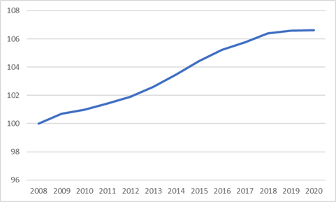
Seven percent might not sound like a lot, but remember: operating budgets at Ontario universities are about $10 billion, so 7% comes out to something like $700 million. Now, ask yourself how the heck institutions funded that when the provincial government left its funding frozen?
The answer, of course, is student fees. Costs were partially met by enrolling more international students and using some of the surplus to expand capacity in these areas. But also, institutions simply charged students more in high demand fields: in Ontario, average tuition in Engineering is now about 85% higher than it is in humanities, and business is about 50% more (on average – in some cases it is more than this). Had fees been frozen as well in this period, I think it’s a pretty safe bet that institutions would have been much less responsive to demand.
It’s an interesting example of how incentives matter to institutions – for inputs as well as outputs.


One Response
Thanx for this interesting post. I wonder how many other jurisdictions have had a big switch between arts and sciences. It may be based on the strength of Ontario’s schools, which apparently prepare pupils equally well in the arts and sciences.
Would this data difficulty be solved by following a number of other countries in reporting enrolments commencing each field of study each year?