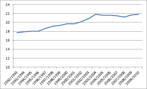
Here’s an intriguing question: what do student/faculty ratios look like across the academy? No one ever publishes this number. What you tend to get out of the Statscan data (with a little help from the excellent folks who put out the CAUT Almanac) is a graph of overall student/faculty ratios, such as the one below in Figure 1, which shows that across all institutions and all fields, there has been an increase of about 20% in the faculty/student ratio over the past twenty years.
Figure 1: University FTE Student/FT Faculty Ratio, Canada, 1992-3/2009-10
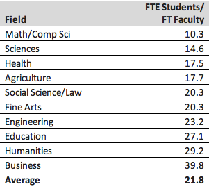
Now, everyone knows that these loads aren’t the same across the university, but data to prove this is scarce, mostly because Statscan in its wisdom divides fields of study differently when publishing data on student data, and data on profs. However, if you’re prepared to put in a little time with the Classification of Instructional Programs, it’s possible to see how student faculty ratios differ by field of study. To wit:
Table 1: FTE Students: FT Faculty, Canada, 2010
Ok, now those are some pretty stunning numbers, which at face value imply vastly different workloads across the institution. But workloads can be equalized through the use of adjuncts, temporary staff, etc. Business faculties – which have crazy-high ratios – use a lot of adjuncts, and with good reason: it’s an applied discipline, and there is a lot of value in having practitioners (i.e. non TT-faculty) teach. Conversely, there aren’t a lot of Math PhDs in the private sector available for the odd course here and there. And of course, expectations for publication can differ significantly from one field to another. So let’s not get too excited about raw differences in student/faculty ratios.
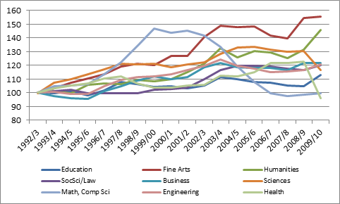
But maybe we can get excited about changes in ratios, which may indicate some kinds of changes in who gets resources in the academy. What we find, though, is the following:
Figure 3: Changes in FTE Student/FT Professor ratios, Canada, 1992 = 100
That’s a messy graph, so let’s break it down. Student-Faculty ratios in Fine Arts have gone through the roof – mostly because it’s the only field of study that has had a net loss in professors over the past twenty years. Humanities ratios are also up close to 50%, but this is due less to inadequate hiring in humanities (though that is a factor) than it is to a significant rise in enrolments.
Not all fields show falling ratios, too. Health shows a huge fall in ratios in 2009-10 for reasons that are a bit mysterious (Statscan seems to think there was a 40% jump in the number of Health faculty that year, which seems unlikely). But check out the numbers for math/computer science. In the run-up to the dot-com boom, student/faculty numbers soared; in the aftermath, they plummeted. Overall, FTE enrolments are now back to where they were in 1998 or so, but we have 700 more profs in the field than we did back then.
A cautionary tale, perhaps, for those who want universities to slavishly follow the latest job market trends.


2 Responses
Alex – The data (you’ve missed) don’t support your argument, at least to the extent you suggest with your “massively different workload” argument.
Faculty classified by principal subject taught, and student programs classified by SPEMAJ (both of which you’ve converted to CIP) aren’t the correct basis for calculating S:F ratios. You’ve missed out cross-teaching which is a huge term in the equation. It is true that not a lot of students major in mathematics, for example, but the math professors teach to students in Engineering, the Natural and Life Sciences, Business and almost every other program. In some departments, this service- or cross-teaching constitutes up to 80% of the total instructional load.
Sure there are some pedagogical issues that drive some differences in “true” S:F ratio but budget pressures are keeping these at a minimum. When adjusted for cross-teaching loads, the numbers at my university differ not by 300% as you’ve suggested but by maybe 25%.
You’ve stretched the argument much further than the rather limited data warrant.
Chris
Simon Fraser University does publish data about student and faculty numbers, and this can be broken down by department and faculty. Check out the data at http://www.sfu.ca/irp/departments.html
Data can be accessed by academic department or by faculty or institution-wide
If you scroll down towards the end of the tables you will find student:faculty ratios and student:full time teaching equivalent ratios.
These data are used for planning purposes.