Did this make it through your spam filters? Here’s hoping.
Ok, so everyone knows from even a casual glance at student satisfaction data that there’s a correlation between institutional size and satisfaction. Students, on average, prefer small schools to big schools. Makes them feel more at home. Less of a leap from high school. The accompanying small class sizes don’t hurt either (the relationship between size and satisfaction is of course one reason why the Globe and Mail’s Canadian University Report takes care to separate institutions by size before comparing them).
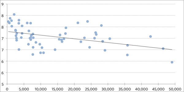
As the graph below shows, on a nine-point scale, a university tends to lose about a tenth of a point for every extra 6,000 students they enrol. That sounds small, but when you consider that all but two institutions in Canada receive a score of between six and eight, even small differences can have a big effect on where schools place relative to one another.
Relationship between School Satisfaction and Institutional Enrolment

So, what would happen if you normalized satisfaction scores for size? That is to say, what if, instead of measuring an absolute value of satisfaction, we measured the distance from that nice little diagonal trend line?
The answer is that not much would change for some institutions – especially those that already have enrolments in the 10-15,000 range – but there would be some very big adjustments for some institutions at the top and the bottom.
At one end of the scale, there are a number of institutions whose poor performance in satisfaction rankings can be ascribed mainly (but not entirely) to the size of the institution – they actually do as well as (or maybe even better than) expected, given their size. With size-normalized scores, the University of Toronto would jump 23 places in the table out of 62 institutions. UBC would rise 19 places, the University of Alberta 17, McGill 16, Concordia 15 and Ryerson 11.
On the other end of the scale it’s a different story: there are a number of institutions whose position at or near the top of the table are due to a large degree to their size and their size alone. Normalized for enrolments, UPEI would drop 14 places, Cape Breton, Brandon and UNBC would drop 11 places, while Thompson Rivers and Nipissing would drop 10 places each.
You can make an argument either way for whether normalizing for size is the right way to display the data. Clearly, students like smallness and that needs to be reflected somehow. But then again, you also want to be able to display data in a way that rates institutions base on what they do, not on their size. I’d be interested to hear from anyone with ideas on how to do both in the next CUR.


2 Responses
How about basing it on a model on how the top cities are rated? There was an interesting article in ‘Money Sense’ magazine that shows how they arrived at their ‘top cities’ list rankings, go to: http://bit.ly/GCpfjW . They basically used a point system weighted with categories that are most important to people living in a city. This same idea would be replaced by categories that matter most to students, not just based on size alone.
Students like large institutions with all the action and services, but still want a small-town feel. Big cities do that by creating friendly, small neighbourhoods within it. If they don’t, then a big city is just a lonely place, just like a big higher ed institution without a ‘community feel’ is a lonely place for students. Colleges can take a marketing lesson from this.
And yes, I’m surprised the email heading wasn’t treated as spam. LOL
Alex, I think you finally cracked the nut!
I am not sure what indeed would be the best way to show the results in the next CUR but maybe we do it not necessarily in charts but as an editorial piece.
It is worthwhile explaining to students (and probably parents alike) how well managed some of our large universities are even though one might feel overwhelmed by the big city (Toronto, Montreal). So I tend to agree with Mr. Jones that the city might have to be added as a filter.
In any case, it is worthwhile explaining the ranking from a different viewpoint!
Kudos 🙂
And, Yes for me too …. it did make it through my spam filter … just avoid starting it with “My Dear”.