


Morning all. Last week, the Government of Ontario published all the new Strategic Mandate Agreements (SMAs) that it signed with the province’s 40-odd universities and colleges. Included in each of these documents were key information around the “Revolutionary” Performance-Based Funding system announced in April 2019. This was important first because it confirmed the indicators in use (in the entire 20 months since the PBF was announced, the government never publicly stated what the indicators would be: appallingly, everything we have known about this system has come from leaks.). Further, they published the institutional targets for each indicator, and this – along with a copy of the Technical Manual for the program (which the government did not publish because this is Ontario and the dominant attitude to policy transparency can be exquisitely summarized by the word vaffanculo, but the University of Windsor kindly released them – see here) – allows us to actually work out what the financial consequences of the system will be when it is fully phased in.
And folks, the answer is absolutely hilarious. Allow me to give you a guided tour of how this is going to work.
Recall from previous blogs that the Ontario system is built around a set of ten indicators. Institutions are going to be given a target to meet on each of the ten indicators. The talking point about this system is that institutions are going to be “competing against themselves and not each other”, so the targets (technically, “allowable performance targets”) are the average of an institution’s historical performance over the past three years, minus a fudge factor for annual variation – essentially, if your score bounces around a lot from one year to the next, there is more tolerance for being below the average. And if they fail to meet the target, they may lose money.
How much exactly will vary: the overall amount of the performance-based funding envelope is set to rise to 60% of each institution’s potential allocation by 2024-25 (so, for instance, at U of T this works out to about $400 million, Carleton about $100 million, Lakehead $30 million, etc). And within that envelop each institution gets to attach a weight to each indicator of between 5 and 25%. So if you have $100 million in the envelope and you underperform on an indicator worth 5 percent , you are at risk of losing some percentage of $5 million. Underperform on an indicator worth 25% and you will lose some portion of the $25 million.
But how much you underperform matters, too. Miss your allowable performance target by 1% and you only lose 1% of the money at risk in that indicator. Miss it by 10%, and you lose ten percent, etc. And this matters because most indicators in this data set do not move around a whole lot. On most of the indicators, in fact, it is basically impossible to undershoot your target by more than a few percentage points. So although everyone has been talking for months about performance funding being an eye-catching 60 percent (cue Conservatives congratulating themselves on making the system pay money for results, and anti-Conservatives claiming that institutional finances will be devastated), in fact institutional fluctuations won’t be anywhere near 60 percent.
We can’t calculate quite how big fluctuations will be exactly because we only have historical data for six of the ten indicators (and face it, one of the other four – measuring skills via an online examination administered by the OECD – is probably never going to happen because there is no feasible way to get students to take it seriously). But on the basis of those six, we can still get a pretty good sense of what will happen by looking at each school’s worst performance on each indicator for the last three years, and plugging it into the formula based on each of their allowable performance targets and the value they have assigned to each indicator, all of which is available in the strategic mandate agreement.
So, to be clear here: what I am trying to do here is stress-test the system. If each school got the worst results of the past three years in a single year (let’s call it the “worst-case scenario” number), what percentage of their performance-based allocation would they lose? And the answer is, on average, 1.3%. At no institution is more that 3.8% of the allocation at risk, and at many of the big ones it is well below 1%. At the University of Toronto, which accounts for about 20% of all provincial spending, it is 0.2%.
How can it possibly be so low? Again, look to the lack of variation in most of the indicators. Take graduation rates – these rarely move than a couple of percentage points in a year. So even if an institution has a “bad” year, it’s almost impossible for them to miss their target by more than a percent or so – meaning even in a bad year, a school will likely claim nearly the entire value of that indicator.
To illustrate this point, Table 1 uses the above-mentioned stress-test analysis to show two numbers for each of the six indicators where we have data. The first is what I call the “average worst year score”. That is to say, I calculate what percentage of funds each university would get under each of the indicators if their score in a given year was equal to the worst on average of the past three years. The second is what I call the “weakest worst year score”, which is the single worst result any institution could get on that indicator if their score was as bad as the worst of their past three years.
Table 1: Institutional Fund Retention by Indicator, Ontario Performance-Based Funding System
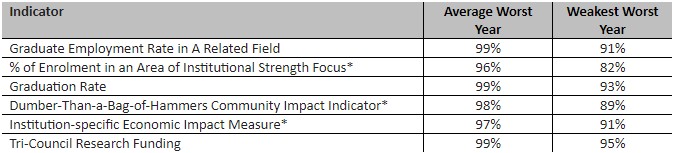
*indicates institution has discretion over definition. These will be the subject of tomorrow’s blog. For more on the Dumber-Than-a-Bag-of-Hammers indicator, please see here.
Ok, so what does this mean? Let’s start with a simple one like graduation rates. The average worst year is 99%, which means that across all 21 institutions, if they turned in their worst graduation rate performance of the last three years, they would still receive 99% of the funds available under that indicator. The weakest worst year is 93%, which means there is one institution which, if it turned in its worst performance of the last three years, would still get 93% of its available funds for that indicator (in this case, it’s Hearst, which is tiny, so its numbers bounce around a lot more than anyone else. As a result, it has more potential than any other institution to get screwed around by this system as it is the weakest of four out of the six categories shown here). The main point here is that by design there is almost no money at risk here on any of these metrics.
To try to turn these percentages into real dollars, I took each institution’s worst-case scenario number and multiplied it by the total amount of money in each institution’s performance-based funding envelope in 2024-25 (when the system is, in theory, supposed to be 60% performance-based). As I noted above, this isn’t a perfect forecast because it is missing four indicators, but I would bet strongly that these new indicators are not going to be more volatile than the ones we already have, so it’s probably pretty close. Anyways, here’s the results of that exercise:
Table 2: Calculated Dollars at Risk, by University, 2024-25
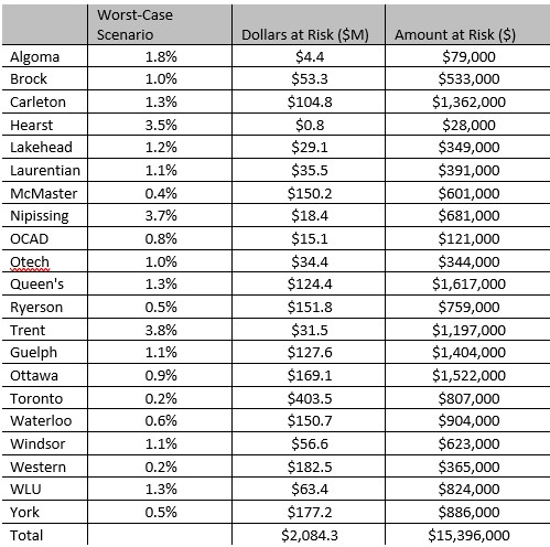
That’s right. All this for about $15.4 million. Out of a $2.1 billion performance envelope. Out of $3.7 billion in operating grants. And it’s only that big if every institution posts the worst numbers on every indicator at the same time, so in practice it’s probably a lot less than this.
I wrote awhile ago that performance-based indicator systems constructed on a “contract” basis, the way Ontario has designed it (and the way Alberta is doing so, too, come to think of it), you could either end up with a system which is painful, or one which is pointless. It is pretty clear that the Ministry has opted for the latter. Which leaves us with the worst of both worlds: a system which makes grand claims to steer performance (60% performance-based!) but which in fact is almost entirely toothless (0.4% of funds actually at-risk in the absolute worst-case scenario).
I realize that this analysis will be rejected by almost everyone in the political realm. Conservatives will hate that their let’s-get-tough-on-lazy-academics bluster will be exposed as being entirely performative, and anti-Conservatives will hate that they can’t pull out some lurid scare story about 60% of funding being controlled by evil Ford government priorities. But blowing up convenient narratives is what we independent policy types do. I’m not sure what to say other than that this program is nothing like what’s been advertised.


2 Responses
Thank you for this analysis. In the higher education sector we are being led to believe that this is armageddon. Your analysis suggests that it is really an a make work project for accountants to do more reporting.
I think that the headings of the last column of table 2 should simply be $ not $M
Agreed – truly Much Ado About Nothing. This could have been foreseen for at least four reasons.
The first is the false premise: that the provincial government is fiscally a major shareholder in the province’s universities. It isn’t. Taking all three envelopes into account, provincial funding amounts to less than half of institutional revenue, averaging around 40 per cent and in some cases leas than 30 per cent. Inter-provincially Ontario ranks lowest. And, as HESA points out, less than two-thirds of either amount will actually flow on a “performance” basis.
The second reason flows from the first. The track record of performance funding in other jurisdictions demonstrates that it succeeds when government is the majority fiscal shareholder, and supplementary government funding from other sources – what Ontario calls “special purpose grants” – is relatively very minor. Neither condition applies to the Ontario scheme.
The track record from other jurisdictions, including Ontario’s own from its first performance funding adventure, provides the third reason. Performance funding never succeeds in the absence of genuinely “new money” funding incentives. The current government inherited the performance funding model from the previous government, which had already announced that there would be no new funding. The current government, given the straitened financial circumstances caused by a pandemic, would have been wiser and more realistic to defer performance funding until there was least a prospect of real financial incentives. Instead, the PBF offers a goofy, complicated formula that depends in the first instance on performance failure to release funding for reallocation to institutions that have already “succeeded” by the same performance metrics, and for that reason have no need for an incentive.
For colleges and universities there is an economic impact metric, which, as HESA insightfully disassembles, is a dog’s breakfast of wishful thinking. The government could have known or, at least, should have tried to find out from Statistics Canada whether or not economic impact and job growth “multipliers” were at all elastic from institution to institution or even region to region. The answer is either none or not enough to make a difference, as has been the case for more than a decade. Given a static economic multiplier (to which HESA elsewhere shed a useful light), all that a college or university can do to increase its economic metric impact is increase enrolment, expand its wage bill, or spend more on operations. None is practicable in current fiscal circumstances. Even less ado.
Finally, but not foreseen, is the omission of a research metric for colleges. One consequence of the new charter for colleges was the inclusion, in response to their own lobbying, of applied research in their mandate. College faculty are eligible to apply for grants from all Federal granting councils. The province has already established, in a different ministry and apart from the OPF, the Colleges Applied Research Development Fund, standing currently at $20M annually. CARDF proposals are supposed to address economic impact. It seems that what is an inventive in one government program is becoming a dis-incentive in another.