


I haven’t written about graduate labour market outcomes recently, and the good folks at the Council of Ontario Universities just published some new data on the class of 2018, so today seems like the day to come back to this topic.
The main reason to use Ontario data to do this is because a) it’s available, b) it provides a useful amount of breakdown by discipline and c) it has a nice long time series. The Statistics Canada Education and Labour Market Longitudinal Platform (ELMLP) is getting better, but because it is still kind of new it still lacks long historical trends. Quebec and BC also publish university graduate employment/income numbers, but disaggregate field of study data in a way that makes it difficult to compare with Ontario. Alberta, maddeningly, also publish graduate outcomes data by field of study but doesn’t distinguish between college and university graduates when doing so. So, Ontario it is. Which is fine, because Ontario is 40% of the country and therefore any pan-Canadian trend is unlikely to be too different.
The way the Ontario survey works is by surveying people who graduated in a particular year (e.g. 2018) and interviewing them over November to March two years later (i.e. class of 2018 was interviewed from November 2020 to March 2021). They are then asked what their employment status was “six months after graduation” (which might be different dates for each person, given different graduation times) and what their status was in October 2020, which is abbreviated in this data as “two years after graduation” even though it could be anywhere from 22 to 34 months. This methodology has been consistent for about 20 years.
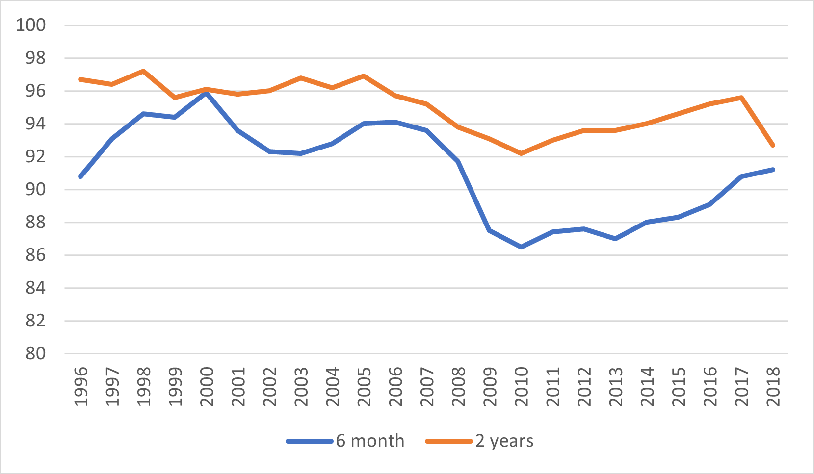
Anyways, on to the data. The first thing everyone wants to know about is the employment rate at 6 months and two years out, which is shown below in Figure 1. Remember, the year on the bottom is the graduating class, not the year of the employment data, so that large – roughly three percentage point fall in employment in “2018” is not something that happened in 2018, it’s something that happened in 2020, i.e. during COVID. That anomaly aside, what the data show is that employment rates for recent graduates took a long time to recover from the financial crisis in 2008, but nevertheless had mostly done so by 2017 or so.
Figure 1: Percent of Ontario Graduates Employed, 6 Months and 2 Years After Graduation, by Graduating Class, 1996-2018
The second thing everyone wants to know about is about graduate salaries. For a very long time, these were heading downwards in real dollars. This probably was not just a hangover from the financial crisis; in all probability it was also the labour market adjusting to the massive increase in the number of graduates due to the expansion of university enrolments following the double cohort of 2002-3. The good news here is that real graduate incomes have been rising for every class since 2014, and indeed for the class of 2018 their income at two years is as high as it has been for any class since 2005 (i.e. the last one to be interviewed before the Great Financial Crisis hit.)
Figure 2: Average Annual Salaries of Ontario Graduates, 6 Months and 2 Years After Graduation in constant $2020, by Graduating Class, 2001-2018
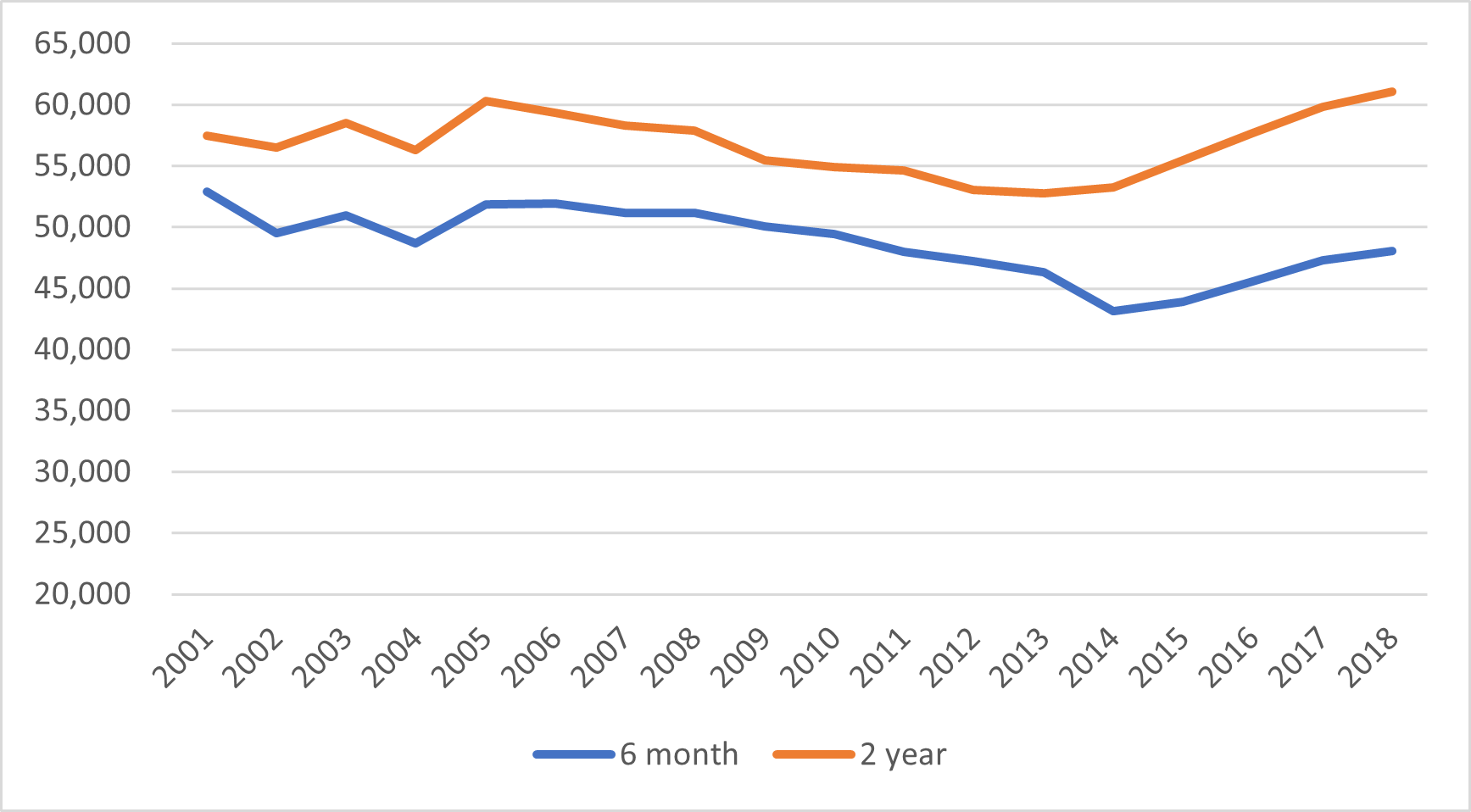
But perhaps the more interesting and significant news is what has happened to the gap between graduate incomes at six months and two years. At the turn of the century, the gap between salaries was just 9%. That widened a bit over the next decade or so, during which time the gap stayed in the 11-15% range. Then, for the class of 2014, something changed – the gap shot up to 24% and is now 27%. That is to say: graduates still have starting salaries lower than 15 years ago, but their subsequent salary progression is faster. This is, I think, consistent with a narrative in which employers are increasingly paying for experience rather than a degree.
Finally, people usually want to know about how these numbers break down by broad field of study. The data is a little messy, mainly because the story for employment rates is very different than it is for salaries. For instance, supposedly “hot” fields like math, engineering and physical sciences all have lower employment rates at 6 months after graduation than do Humanities and Journalism (though this reverses itself by the two-year mark). So, let’s just focus on the salary question and look at incomes two years out by broad field of study. This is below in Figure 3.
Figure 3: Average Annual Salaries of Ontario Graduates by Field of Study, 6 Months and 2 Years After Graduation in constant $2020, by Graduating Class, 2001-2018
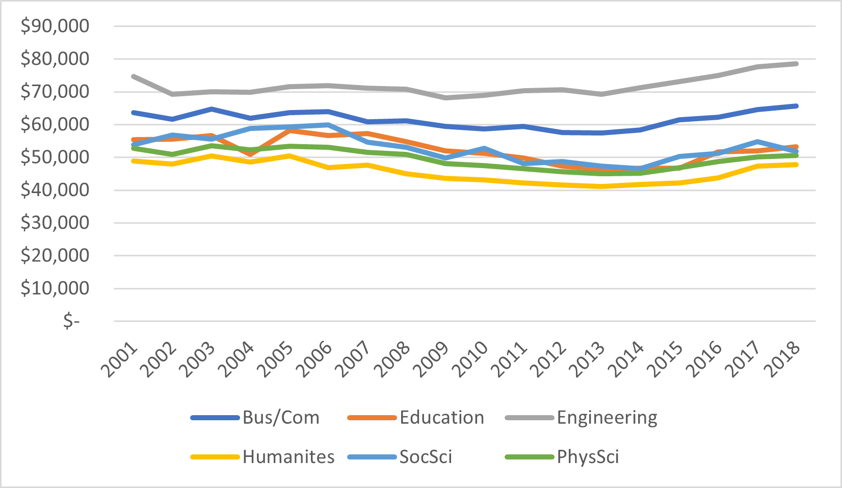
Figure 3 shows two things. First, the gains of the past few years have been pretty equally distributed: engineering salaries are up 10% in real terms, humanities up 14% and all other fields somewhere in between. Second, that the erosion of salaries after the 2008 financial crisis were very unequally distributed. Recent gains have left engineering and business/commerce salaries at an all-time high; but for other disciplines it’s a different story. Education and humanities are 9% and 5%, respectively, off their class of 2005 peaks, social sciences are 14% off their 2006 peak, and physical sciences are 6% off their 2003 peak (buttressing a point I have long made, which is that in Canada there is no “S” in STEM, at least as far as incomes and careers go).
Lots of food for thought here, but that’s enough for now. Have a good long weekend.