


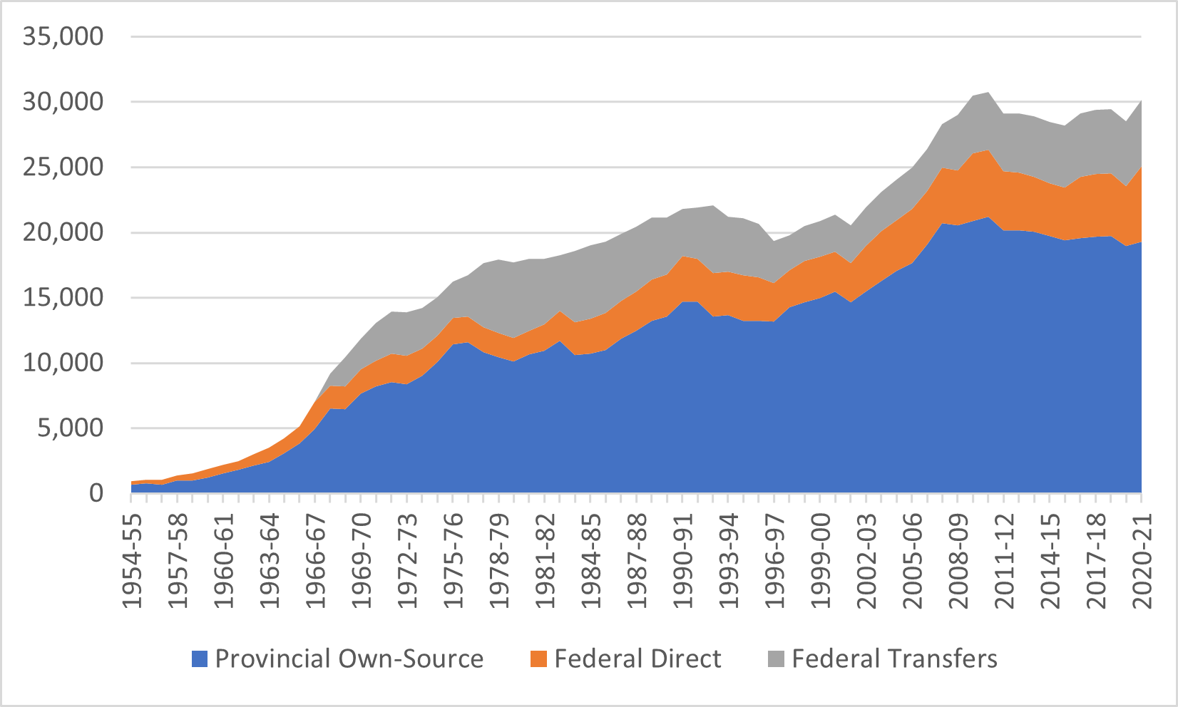
So it seems a lot of you were pretty interested in last week’s data fest and in particular this graph (of which I am inordinately proud, ‘cos damn it took some work).
Figure 1: Total Government Transfers to Institutions by Source and Type, Canada, 1955-56 to 2020-21, in millions of $2022.
But One Thought readers are curious types, and many of you wanted some expansions, explanations, and variations! So, today I am going to respond to some reader requests and produce some new variants. Here we go:
Q. Can you add other sources of income to that graph to show total income?
A. You bet! See figure 2, below. The growth here in “other” income post-2000 is a little bit exaggerated because there seems to be some discrepancies between the way the pre- and post-2000 surveys picked up this type of income. So, it’s a series break rather than a wholesale change in the way universities were financed: the pre-2000 numbers should probably be somewhat higher.
Figure 2: Total Institutional Income by Source, Canadian Colleges and Universities, 1955-56 to 2020-21 in Millions of $2022
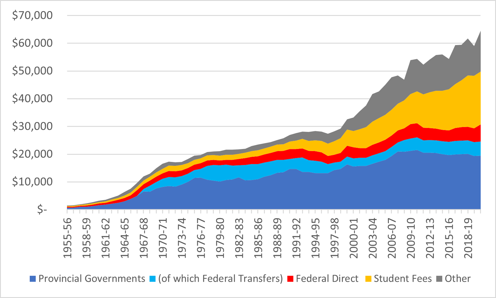
The big story here is that institutional income in post-secondary education has grown much faster from 1999 onwards than it did at any time in the preceding 30 years. So much for “austerity”.
Q. Can you split that up into university and college separately?
A. Sort of. The thing is that transfers aren’t earmarked specifically for either universities or colleges, so any estimate here must make some assumptions about how those monies get divided. Just to keep things simple, in the following graphs I assume that provinces divvy up fiscal transfers in the same way they divide their own expenditures (that is, if a little over 30% of provincial transfers go to colleges, as they have done for the last decade or so, then I assume a little over 30% of all federal transfers get spent that way, too). Figures 3 and 4 show how this plays out.
Figure 3: Total Institutional Income by Source, Canadian Colleges, 1955-56 to 2020-21, in constant $2022
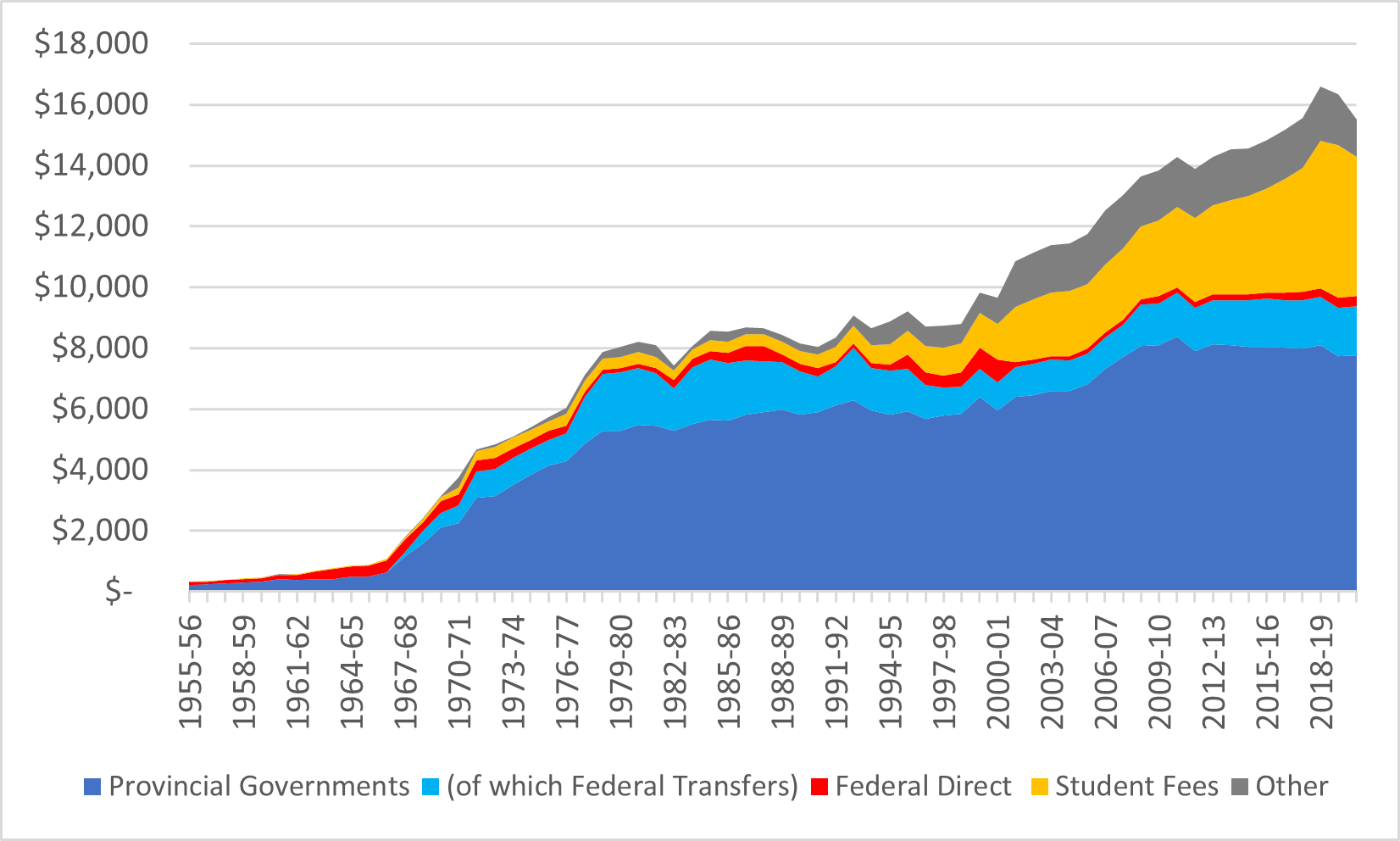
Figure 4: Total Institutional Income by Source, Canadian Universities, 1955-56 to 2020-21, in constant $2022
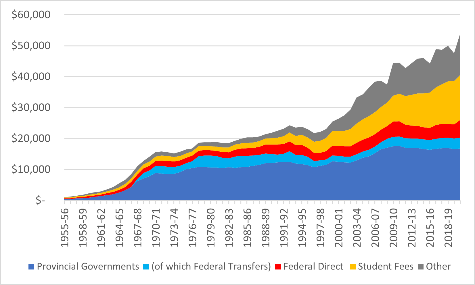
Main takeaways here are: the financial expansion of colleges happened somewhat later than it did in universities, and the run-up in institutional income over the past 20 years has been sharper in universities than it has in colleges.
Q. Can you normalize that graph for full-time equivalent student numbers?
A. Urgh. The problem here is that to calculate FTE, you need both the number of full-time and part-time students. For universities, part-time numbers are available from 1962-1975 and from 1980s onwards (no, I don’t know why). For colleges, data on full-time student numbers seems to go back to 1976, but I cannot find any data on part-time student numbers prior to 1988-89. So, in the following graphs, what I have done for universities is interpolate the part-time data for the late 1970s data and show everything per FTE back to 1962 and for colleges I have expressed the data as a function of dollars per full-time student as far as I can go. The two graphs are therefore both internally consistent but not consistent with each other (so don’t go comparing the two!)
Figure 5: Total Institutional Income per FTE Student by Source, Canadian Universities, 1962-63 to 2020-21, in constant $2022
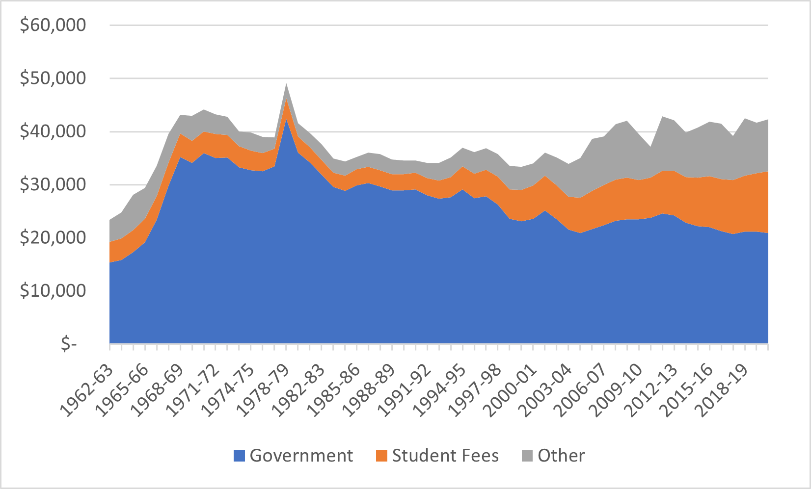
Figure 6: Total Institutional Income per Full-Time Student by Source, Canadian Colleges, 1976-77 to 2020-21, in constant $2022
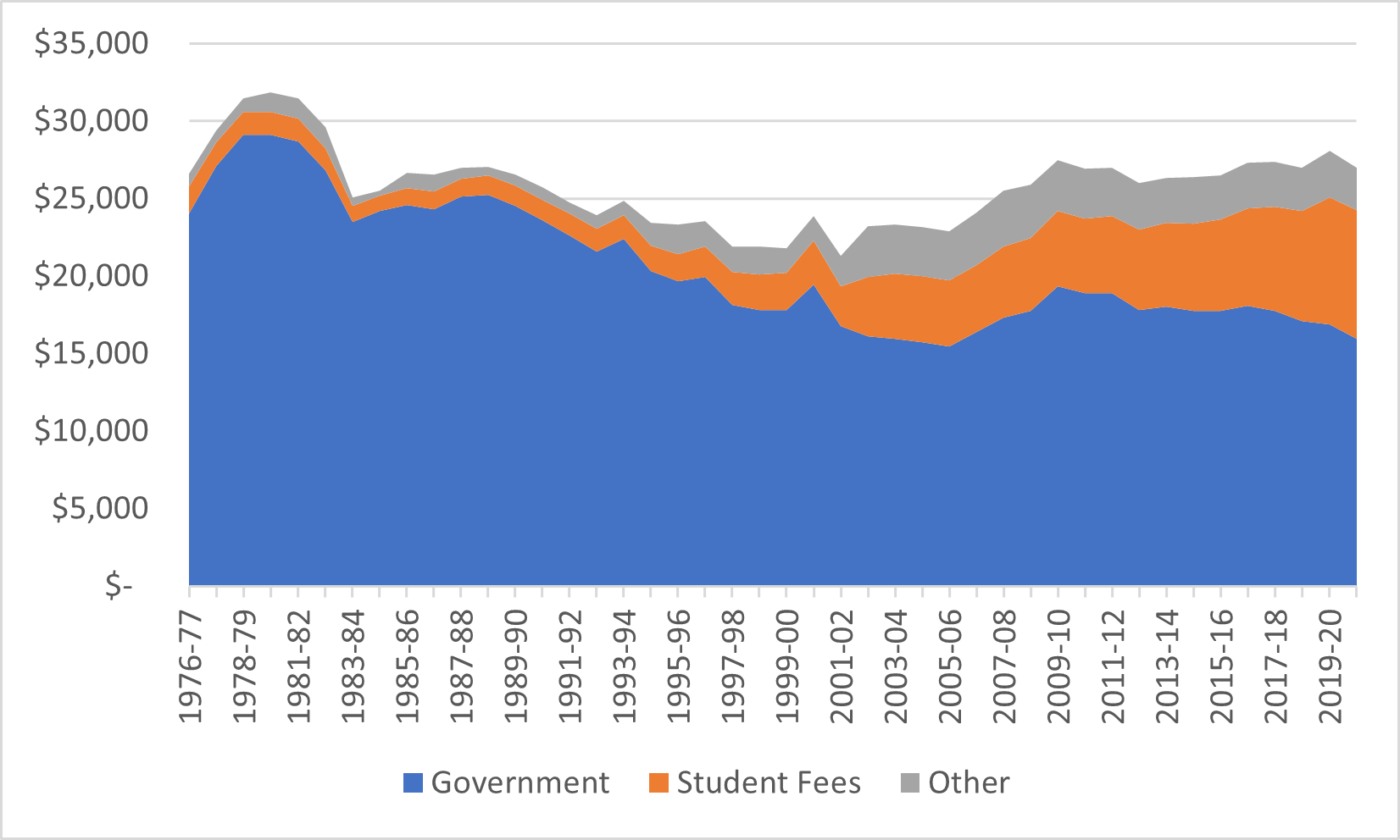
At a high-level, the picture shown in figures 5 and 6 are the same: there was a spike in per-student income in the late 1970s, followed by a more or less consistent slow fall in income from governments, followed by a recovery in total income from about 2000 onwards.
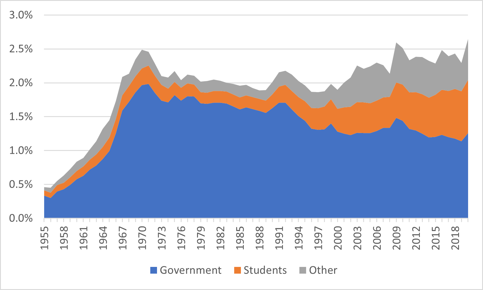
Q. Can you show all that as a percentage of Gross Domestic Product?
A. Yep! See figure 7, below. The story here is pretty like the story in figures 5 and 6 (long decline in funding from government offset by significant rises in non-government income after about 2000), only the peak was in the late 1960s rather than the 1970s. But, technically, total institutional income as a percentage of GDP has never been as high as it was in 2020-21.
Figure 7: Total Institutional Income as a Percentage of GDP, by Source, Canadian Universities, 1955-56 to 2020-21, in constant $2022
Thank you to all my readers for being such data nerds. Doing these is fun!


One Response
Thank you. This is extremely interesting.
Two comments:
1. The decrease in government spending per FTE student or in terms of GDP percentage in Figs. 5-7 certainly contributed to the impression that we are operating with austerity budgets.
2. More important, and even more to the point of austerity:
There is an important and worrisome story hidden in these figures that maybe cannot be resolved in the data. This concerns tendencies in some provinces to reduce basic operating budgets while at the same time use the “savings” for targeted funding towards programs that provincial governments favour, because there are particular actual needs, or maybe only perceived needs, or particular political preferences.
A worrisome consequence of this is a limitation of academic perspectives and a de facto reduction of academic freedom, because universities are redesigned as clinics for particular societal desires or needs. It is OK to target funds towards actual societal needs where universities can help. However, this should be done in a true dialog between provincial governments and university leadership, as opposed to a top-down approach where the dialog reduces to “take it or leave it – we need you to do this and we don’t care much about the other things you’re doing”.