


I found some great data yesterday!
It turns out that when Statscan murders a data series, it sometimes leaves traces of the old corpse on its website. Not anywhere you can find it through normal keyword searches or anything, but if you can find yourself an old CANSIM table number (ask your stat nerd grandparents, kids) you might just be able to dig up some truly interesting data. Yesterday I managed to find so much historical data on Canadian higher education finances that I can’t process it all at once, so you’ll be getting in drips and drabs for a week or two (lucky, lucky you). Boy is it interesting. Buckle up!
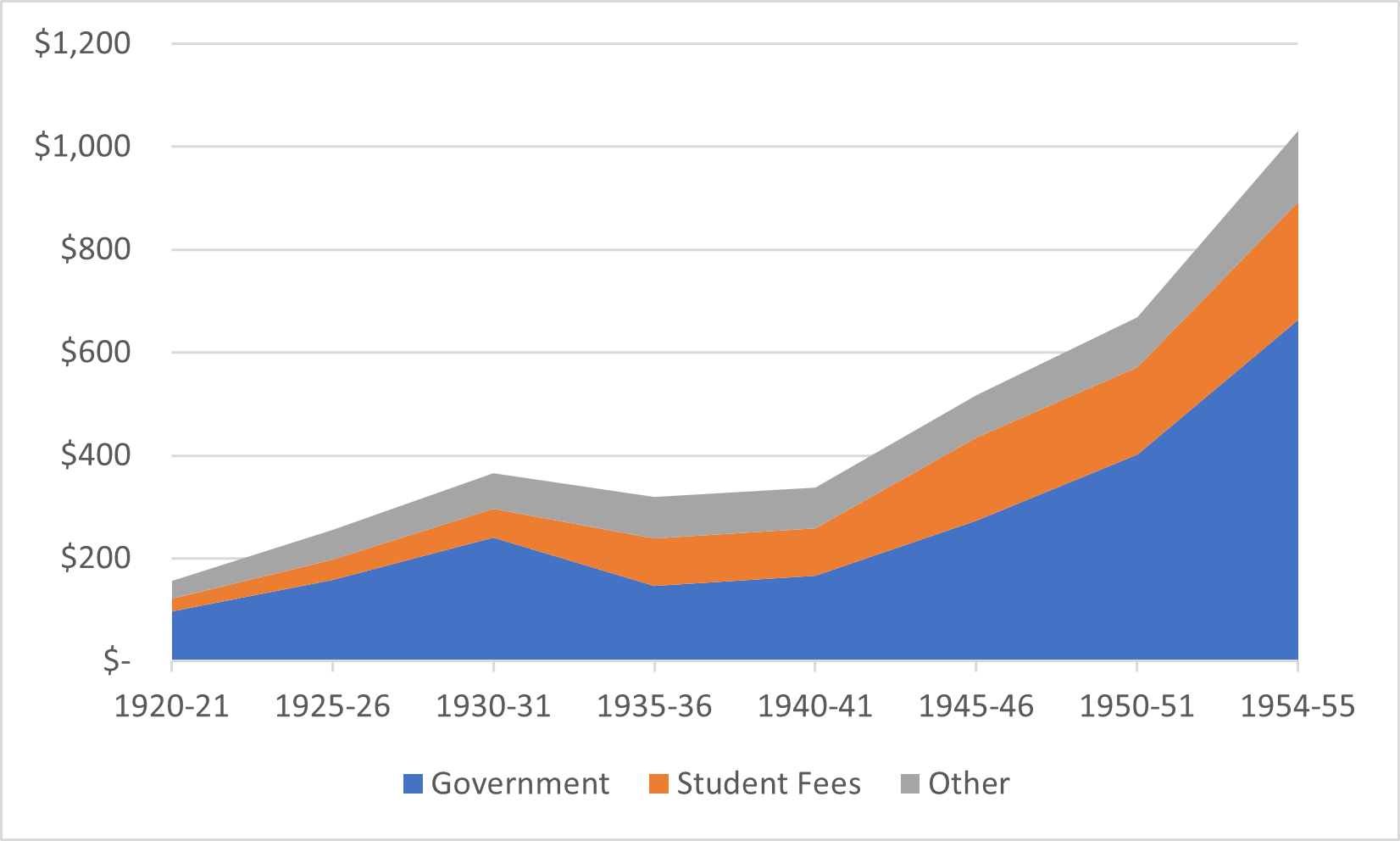
Let’s start with some real pre-history: data on higher education financing from (roughly) the end of World War I to Sputnik. In 1920-21, the budget of all Canadian universities was roughly equivalent, in constant 2022 dollars, to one year of today’s expenditures at Laurentian University. Or, to put it another way, university budgets in Canada have risen about 250-fold in the last century. During the 1920’s, higher education expenditures increased somewhat, but then fell somewhat when government expenditures dropped sharply during the depression; intriguingly, the late 1930s were the only period in Canadian period prior to 2018 when government provided less than half the overall funding for universities. However, after the war, things moved quite quickly: by 1954-55, driven by a revived economy and higher enrolments, total revenues had tripled from their 1940 levels.
Figure 1: Canadian Universities Income by Source 1920-21 to 1954-55, in millions of $2022
But that was only the beginning. Total institutional income tripled again between 1955-56 and 1962-63, and then quadrupled in the eight years to 1970-71 (again, this is all inflation-adjusted). To put it another way, that’s equivalent roughly to an 18% year-on-year increase every year for 15 years, which to put it in a more modern context is roughly equivalent to the scale of higher education investment made China over the period 1998-2013.
Figure 2: Canadian Universities Income by Source 1955-56 to 1999-00, in millions of $2022
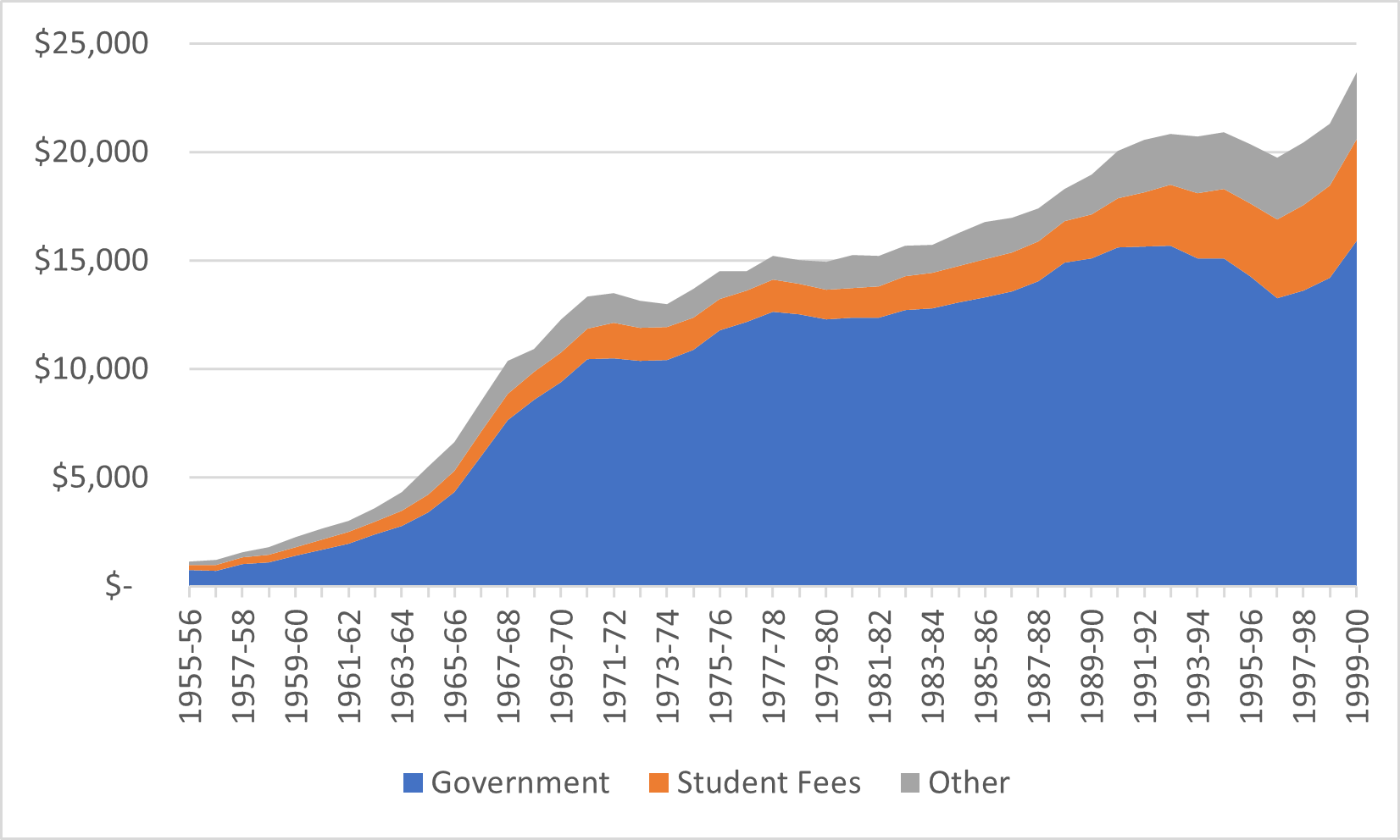
But then growth just kind of stopped. Well, at least slowed to a more sensible kind of level (kind of like present-day China, FWIW). Over the next 20 years or so, up to 1990, annual growth averaged inflation plus two percent, which is roughly what it has been for the last 20 years (we could call that the “Canadian rate of Higher Education growth”). The difference is that the majority of growth in the 1970s and 1980s came from increases in government spending, while in the 2010s it has come almost exclusively from international student fees.
Speaking of fees, all this new data allows me to construct a 100-year time series of student contributions as a percentage of total income (this is very exciting for me even if it isn’t for regular people). Have a look at Figure 3.
Figure 3: Student Fees as a Percentage of Total Institutional Income, Canada, 1920 to 2020
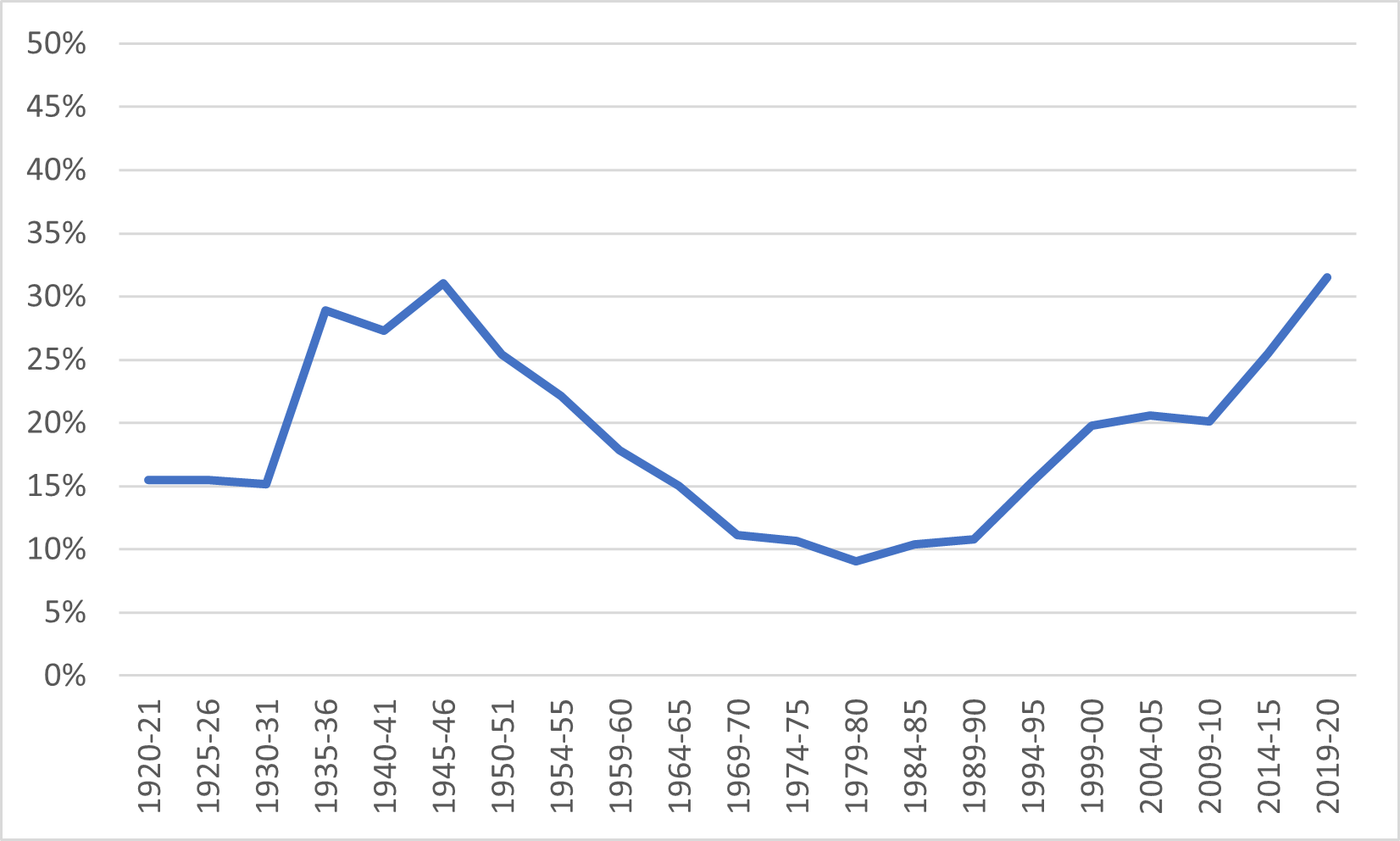
Student fees as a percentage of income rose steeply in the depression and did not start coming down until the 1950s. After that, there was a roughly 30 year period where institutional revenues from government rose much faster than revenue from students (apart from a tiny blip in 1972, year-on-year income from student sources never decline in nominal terms, though there was a period in the late 1970s where income growth was outpaced by inflation). Not much changed during the 1980s, but the 1990s saw fees rise from 10% to 20% of total income. The 2000s were another decade where not much happened, but the 2010s saw fees rise again in importance as a source of income, from 20% to 30%, though a substantial portion of this rise came from international student fees, not domestic ones.
Fun, huh?
More tomorrow.


2 Responses
Will you tell us your newfound source? 🙂
Fascinating numbers alright. One would expect downward pressure on fees when domestic demand drops, but how creative we are.