Everyone seems to be enjoying data on graduate outcomes, so I thought I’d keep the party going by looking at similar data from Ontario colleges. But first, some of you have written to me suggesting I should throw some caveats on what’s been covered so far. So let me get a few things out of the way.
First, I goofed when saying that there was no data on response rates from these surveys. Apparently there is and I just missed it. The rate this year was 40.1%, a figure which will make all the economists roll their eyes and start muttering about response bias, but which anyone with field experience in surveys will tell you is a pretty good response for a mail survey these days (and since the NGS response rate is now down around the 50% mark, it’s not that far off the national “gold standard”).
Second: all this data on incomes I’ve been giving you is a little less precise than it sounds. Technically, the Ontario surveys do not ask income, they ask income ranges (e.g. $0-20K, $20-40K, etc). When data is published either by universities or the colleges, this is turned into more precise-looking figures by assigning the mid-point value of each and then averaging those points. Yes, yes, kinda dreadful. Why can’t we just link this stuff to tax data like EPRI does? Anyways, that means you should probably take the point values with a pinch of salt: but the trend lines are likely still meaningful.
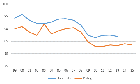
Ok, with all that out of the way, let’ turn to the issue of colleges. Unfortunately, Ontario does not collect or display data on college graduates’ outcomes the way they do for universities. There is no data around income, for instance. And no data on employment 2 years after graduation, either. The only real point of comparison is employment 6 months after graduation, and even this is kind of painful: for universities the data is available only by field of study; for colleges, it is only available by institution. (I know, right?) And even then it is not even calculated on quite the same basis: universities include graduates with job offers while the college one does not. So you can’t even quite do an apples-to-apples comparison, even at the level of the sector as a whole. But if you ignore that last small difference in calculation and focus not on the point-estimates but on the trends, you can still see something interesting. Here we go:
Figure 1: Employment Rates 6 months after Graduation, Ontario Universities vs. Ontario Colleges, by Graduating Cohort, 1999-2015
So, like I said, ignore the actual values in Figure 1 because they’re calculated in two slightly different ways; instead, focus on the trends. And if you do that, what you see is (a blip in 2015 apart), the relationship between employment rates in the college and university sector looks pretty much the same throughout the period. Both had a wobble in the early 2000s, and then both took a big hit in the 2008 recession. Indeed, on the basis of this data, it’s hard to make a case that one sector has done better than another through the latest recession: both got creamed, neither has yet to recover.
(side point: why does the university line stop at 2013 while the college one goes out to 2015? Because Ontario doesn’t interview university grads until 2 years after grad and then asks them retroactively what they were doing 18 months earlier. So the 2014 cohort was just interviewed last fall and it’ll be a few months until their data is released. College grads *only* get interviewed at 6 months, so data is out much more quickly)
What this actually goes is put a big dent in the argument that the problem for youth employment is out-of-touch educators, changing skill profiles, sociologists v. welders and all that other tosh people were talking a few years ago. We’re just having more trouble than we used to integrating graduates into the labour market. And I’ll be taking a broader look at that using Labour Force Survey data tomorrow.


 Tweet this post
