


It’s that day of the year, when OECD releases its annual report on education across the world’s richest countries, known as Education at a Glance. I have written about these releases many times before, and in truth a lot of the data tells the same story, year after year: Canada has very high attainment rates, mainly due to the way we choose to present our data on college students. We also spend more than most countries on post-secondary education if you count both public and private sources. None of this is new. Instead, what I want to focus on is a couple of interesting new points of comparison, and one interesting piece of long-term analysis.
The most interesting piece in here is on completion rates. Now, how to calculate this has long been a controversy at the OECD. Fifteen years ago, OECD – following general European practice – use to talk about “completion rates” when what they actually meant was “attainment rates”. This would drive that small segment of American policy wonks who paid attention to this stuff quite squirrelly: in their minds, attainment rates represented the fraction of population in a certain age range with a degree, while completion rates referred to the proportion of people who began a degree who went on to finish it (Canadian policy wonks were indifferent because StatsCan could never figure out how to calculate completion rates anyway).
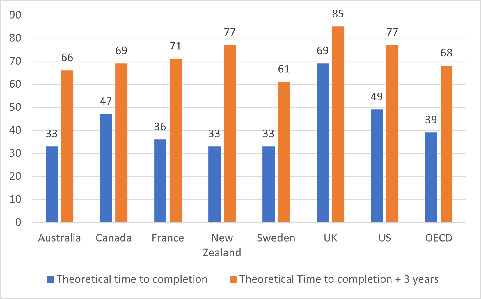
But now, however, OECD appears to have comparable data on the American definition of completion and – this is the real miracle – StatsCan appears to have finally worked out how to use the Post-Secondary Student Information System to generate actual completion rates. Frabjous day! So, what did the OECD find? Well, look at Figure 1. The blue bars represent completion rates at the theoretical time to completion (usually four years in North America and three elsewhere), and the orange bars represent completion rates at theoretical time to completion plus three years. The main surprise is the US numbers, which look suspiciously good in comparison to others (try lining any of the numbers up to data from the National Student Clearinghouse Research Centre – I certainly can’t make it work, even if we are restricting the numbers to students who start in 4-year colleges). Canada looks ok in this comparison. Not brilliant, but not terrible. The interesting ones for me in here are the UK and Sweden: anyone who thinks tuition fees have a significant impact on completion will have a bit of a job to do explaining those results.
Figure 1: Completion Rates at Theoretical Time to Completion and Theoretical Time Plus Three Years, Selected OECD Countries, 2019
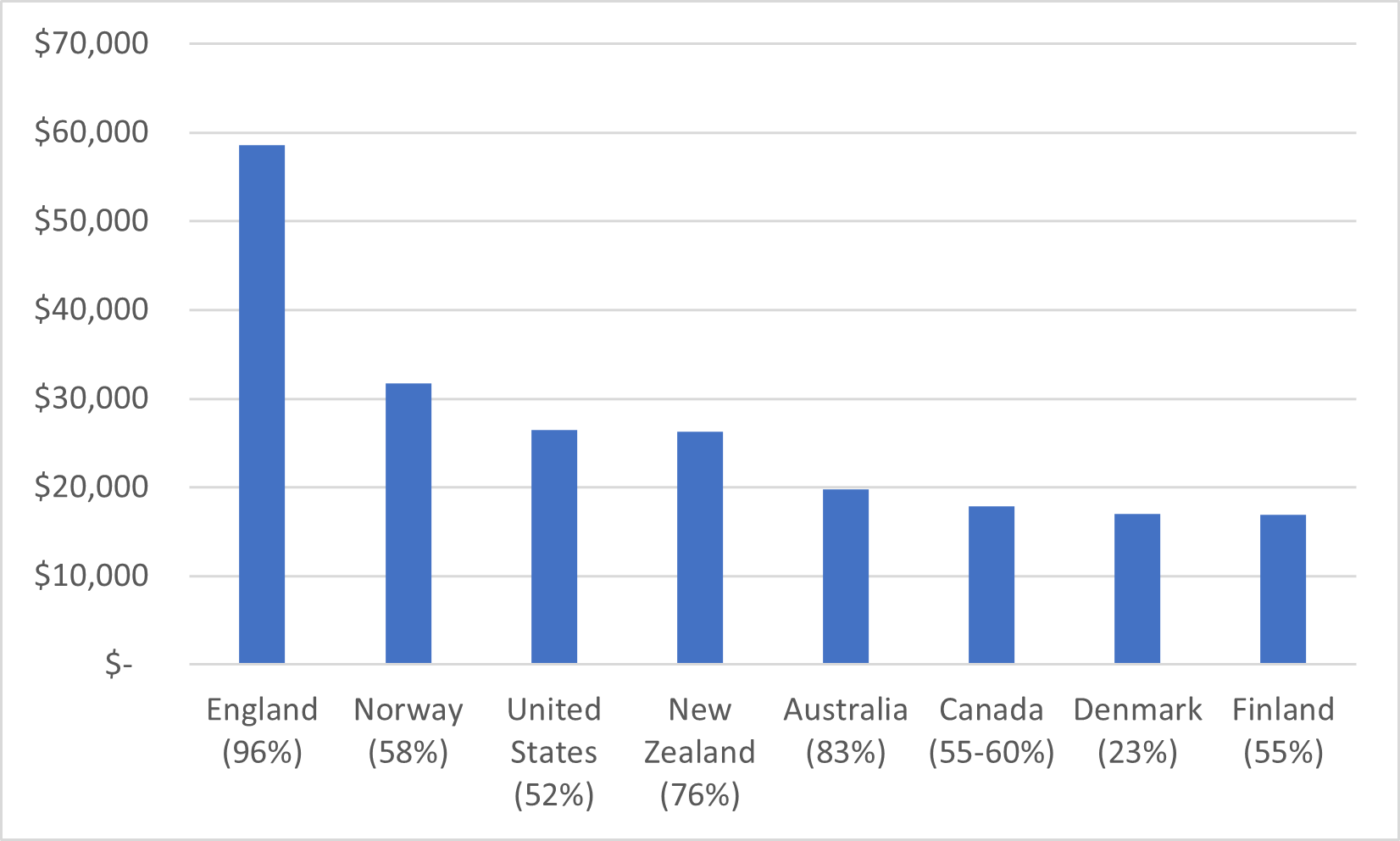
Next on the list of pleasant surprises here are the comparisons of student loan debt. I have always had some difficulty with the way OECD treats the details of student aid programs: for instance, Canada is not described as having an income-contingent student loan system, even though that’s precisely what income-based repayment is. Also, StatsCan for years didn’t report any details of provincial student aid, which meant the Canada data was nonsensical. But this year, there is some interesting data on student loan debt – not for all countries with loan programs but many of them – and the Canadian data looks more or less correct. So, below, a comparison of student loan debt levels at graduation, in which Canada looks pretty good (for that matter, the United States doesn’t look that bad either).
Figure 2: Student Loan Debt Levels at Graduation, in USD at PPP, Selected OECD Countries, 2019 (percentage of graduates with debt in brackets)
For the last two graphs, I want to show OECD statistics on total expenditures on tertiary education institutions. Figure 3 shows that when it comes to public expenditure on higher education, Canada has been top of the pack for the better part of two decades (at least among major economies – we trail a couple of the Scandinavian countries by a bit), while figure 4 shows that when all forms of revenue are included, we trail the United States somewhat but still lead the rest of the major OECD countries.
Figure 3: Public Expenditures on Tertiary Education Institutions, as a Percentage of GDP, Selected OECD Countries, 2005-2019
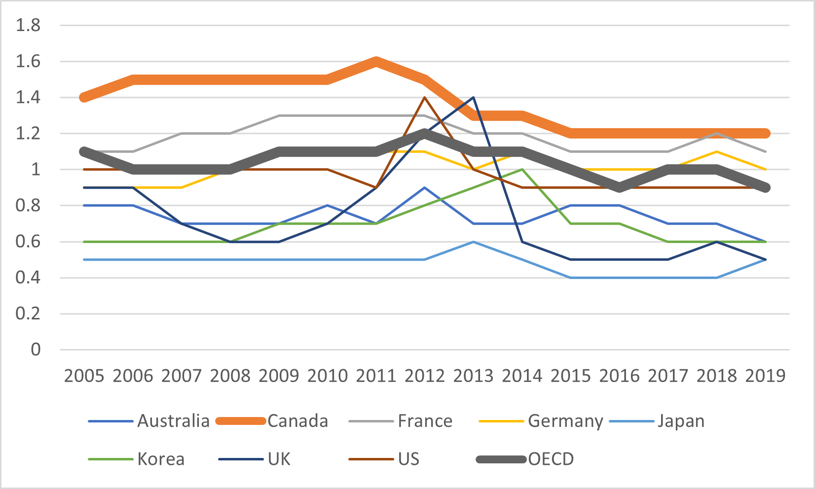
Figure 4: Total Expenditures on Tertiary Education Institutions, as a Percentage of GDP, Selected OECD Countries, 2005-2019
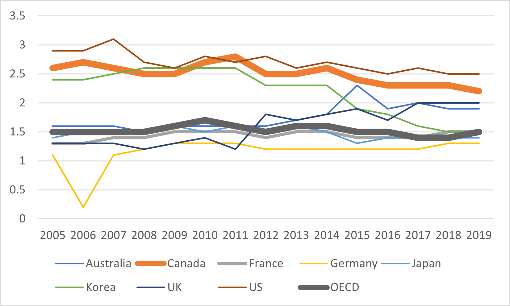
Across the OECD, both public and private expenditures are pretty consistent over the past fifteen years, but some of the group’s biggest spenders – Canada, the US and especially South Korea – are falling back towards the median. And it’s not entirely because of a drop in public spending either – in both Korea and America it’s in large part due to falls in student numbers and hence aggregate tuition revenue.
But whatever the reason: while Canada still has an advantage in higher education over the rest of the OECD, that lead is not as big as it used to be. And that’s probably cause for concern.