


Time for a quick economics lesson.
Every class in a post-secondary institution has a cost curve. It looks something like this:

Once an instructor is assigned to a class, that class has a set cost to the university regardless of how many students enroll, shown above as the Cost Curve (CC). It’s mainly a function of the instructor’s salary and materials costs, which are very low in lecture courses, higher in laboratory courses, and highest in clinical courses. That CC will therefore be higher in dentistry than in engineering, which in turn will be higher than in business. Class size isn’t completely irrelevant; usually if the number of students rises above a certain number, then the costs of a TA or two gets added to the base cost of meeting the professor’s salary – hence the step-function you see in Figure 1 – but most of the costs are fixed.
Every class has an income curve, too. It looks like this:
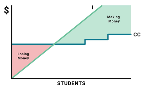
For every student enrolled in a class, the institution receives money. Sometimes that money comes from tuition, sometimes it comes from enrolment-related government grants. And assuming you’re only getting domestic students, the amount of income per student enrolled is pretty constant, so that’s a nice smooth upwardly-sloping curve which in the graph above is labelled I for Income. If the government is using some kind of formula which weights students by field of study based on some kind of notional cost bands, then the slope will be steeper in some fields than in others.
Anyways, if income per student is X and class enrolment is Y, then your income (I) for the class is going to be $XY. If I > CC, the course is making money. If I < CC, the course is losing money. Simple, right?
Now, what happens if a government cuts the real grant per student and/or lowers tuition, as the Government of Ontario has been doing with abandon for the past few years? Simple: the slope of the cost curve flattens out. For I to remain above CC, holding teaching costs constant, the class needs to take on more students.
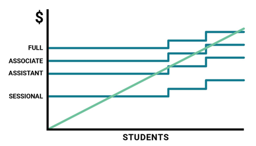
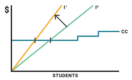
Of course, teaching costs constant don’t have to be held constant. The other thing you can do is reduce instruction costs by hiring a cheaper teacher for the class. The CC for an associate professor is lower than for a full professor, and an assistant professor is cheaper still. The ultimate cost saver is going for a sessional replacement.
There are other ways to reduce costs. In extremis, one can turn a lab course into a lecture course, or one can change the step-function by adding fewer TAs. And to the extent that you’re factoring overhead into the calculation of CC – something I’ll get back to – you can also push the CC downwards that way.
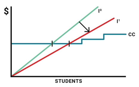
Now, for a whole bunch of reasons, universities find it difficult to push CC down. What they would much prefer to do instead is to find ways to prop up I, to make that slope as steep as possible. This is why they lobby for more government funding and higher tuition fees. It’s also why they let in more students from abroad. International student fees raise the average income per student and therefore change the intercept between I and CC. As you can see below, the break-even point for a class is completely different with 0% international students (I0) than it is for one with 100% international students (I1), assuming that international student tuition is more than per-student domestic tuition and domestic subsidies combined (which is nearly always the case).
The peculiar thing about universities (and possibly where they differ most from colleges) is that they make almost no attempt to ensure that I > CC happens in any given class. In fact, the whole thing is set up in such a way as to require massive cross-subsidies from one class to another. What one tends to observe is that the most senior (read: “expensive”) members of staff tend to teach the upper division classes with small student numbers, while more junior ones teach the larger introductory classes. This results in huge surpluses in the latter and huge losses in the former. In theory, this all works itself out at the institutional level, but only in a state of total opacity and rarely if ever at the level of a department or faculty.
Thus far, I’ve made two simplifying assumptions, one big and one small. The small one has to do with costs. I’ve basically ignored the issue of overhead, mainly because I don’t think it matters that much. I described CC simply as a function of direct costs (salary and materials), but those two things only account for about half of all university costs. Throw in costs of IT, Libraries, Physical Plant, Student Services, etc., and the number goes up considerably. These costs are probably not borne equally across all fields of study: some fields use these services more intensively than others, so it’s probably not a matter of simply applying a simple multiplier to the CC across all fields. There’s also the vexed question of how to count research dollars, which strictly speaking are a drain on institutional resources because of the way they don’t take care of their own overhead. But as British statistician George Box once said: all models are wrong, some models are useful. So, yes, this is an oversimplification and there are a variety of ways one could theoretically incorporate these elements into this model. But it doesn’t change the underlying reality.
The bigger issue has to do with income. The description I have used above makes perfect sense if you can in fact attribute income to enrolment. But this presupposes some kind of relationship between enrolment and income. Obviously, it is easy enough to attribute tuition to enrolment. And in places like Ontario and Quebec, where most government expenditures ae based on a weighted enrolment-based formula, the bulk of government income can be attributed this way as well. But in some places: specifically, Newfoundland, Prince Edward Island, Manitoba, Alberta and British Columbia, students in particular courses have no intrinsic value because transfers to institutions are determined without reference to enrolment. It’s not “you have 1000 FTE students and each FTE is worth $10,000 so you get $10 million dollars” and it’s definitely not “you have 1500 “weighted” FTE student units at $10K/FTE and so you get $15 million dollars”. It’s just “here’s $10 million, work it out however you want”.
And so, what this means is that in those five provinces, the per-student value of the ‘I’ curve is determined partly by tuition rates, but also partly by political considerations within the university itself. It’s not even really a matter of different part of the university “making a case” for differential levels of per-student subsidy. Instead, effective per-student subsidies are an emergent property of several decades of ad hoc decision-making made in the absence of any kind of genuine examination of costs and revenues.
In short: getting costs and revenues aligned is important. It is much easier to accomplish where governments are setting prices on student enrolments (which is what weighted student enrolment systems actually do) than where they are not. Alberta, BC, and Manitoba would be doing their universities and colleges a favour by introducing such systems.


2 Responses
I wonder what those curves will look like at Concordia and McGill next fall….Or will they just flatline?
“What one tends to observe is that the most senior (read: “expensive”) members of staff tend to teach the upper division classes with small student numbers, while more junior ones teach the larger introductory classes. This results in huge surpluses in the latter and huge losses in the former.”
It also results in serious inequities of workload.