

Last week, I went through some of the data from the new National Graduates Survey (NGS) on student debt. Today, I’d like to go through the new data from this survey on graduate salaries. It’s…not great.
The first way it is not great, of course, is that truly comparable data only goes back ten years. This is because although the NGS goes back to the graduating class in 1982 (with an antecedent in 1976), Statistics Canada decided in 2010 to just switch from collecting data three years after graduation instead of two (initially, this was partially due to some Harper Government inanity, but significantly StatsCan decided to stick with the new system simply out of sadism). For data on debt this did not matter because the questions ask about debt at graduation, but for data on income…well, it’s a pretty serious problem.
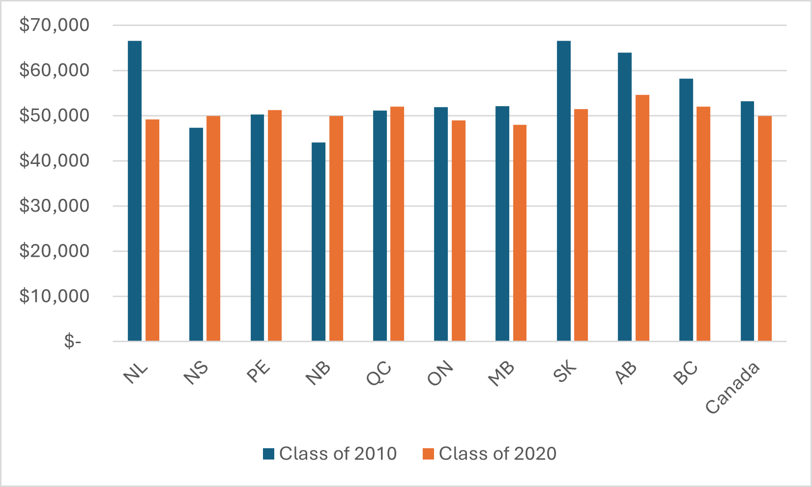
But the second way it’s not great is simply: the data does not paint a very good picture of graduate outcomes. Let’s start with the issue of graduate salaries by province of study (we could also use province of residence, but the difference isn’t very big). Figures 1 and 2 show median—not average—salaries three years after graduation, in constant $2023, for bachelor’s graduates and college graduates, respectively. Note first the gap in salaries between university and college graduates; about $13,000 per year for the class of 2020. But what I think is interesting is the change in the pattern of earnings between 2010 and 2020. The pattern for both sectors is pretty similar: most provinces other than Quebec are showing a decline in graduates’ real incomes, but the biggest proportionate drops by far happen in the hydrocarbon provinces: Alberta, Saskatchewan, and Newfoundland.
Figure 1: Median Salaries Three Years After Graduation, by Province of Study, Bachelor’s Graduates, Classes of 2010 and 2020, in real $2023
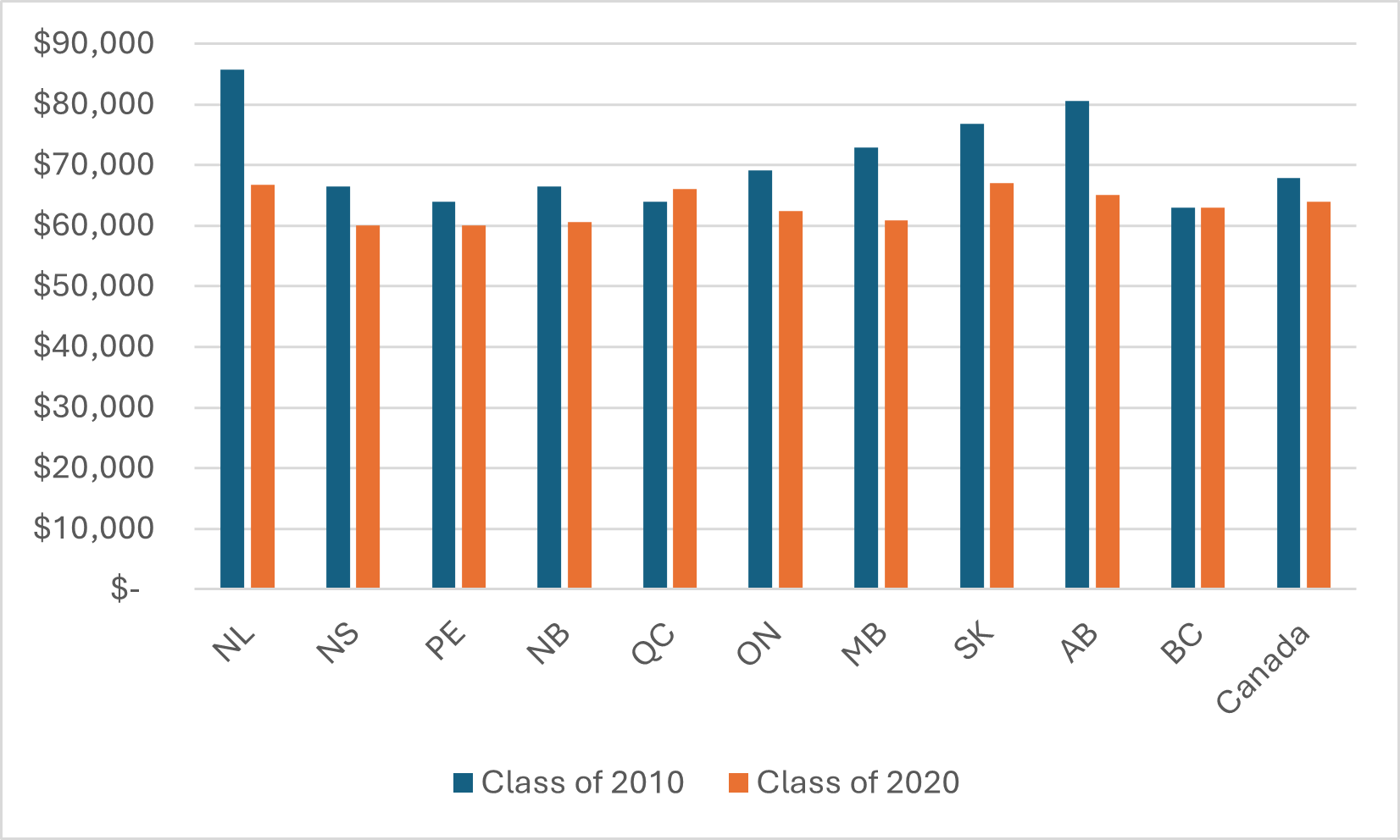
Figure 2: Median Salaries Three Years After Graduation, by Province of Study, College Graduates, Classes of 2010 and 2020, in real $2023
Now, you may ask yourself: why is this? Are graduates in those provinces disproportionately employed in gas/petroleum industries? Yes, a bit, but that’s not really what’s going on. The point is that when the economy is firing on all cylinders in a province, everyone’s wages rise due to a scarcity of labour. Arts graduates see their wages get bid up, too. Maybe not quite to the extent of Engineering graduates, but enough to make a noticeable difference. And the end of the commodity super-cycle around 2013-14 really hit those provinces hard.
Figure 3 requires some explaining, because it is kind of ugly and confusing (sorry). I wanted to look at whether geographic disparities in graduate incomes were rising or falling over a longer than just between 2010 and 2020. I couldn’t look at absolute income differences, because (as noted above) the 2000 and 2005 data was from two years after graduation, while in 2010-20 it was collected every three years. But it is still possible to look at disparity in provincial medians as a function of relative difference from the national median, which is what I do here for Bachelor’s graduates (the picture is almost identical for college grads, so no need to post two graphs). And the results are kind of interesting.
Figure 3: Difference Between Provincial and National Median Salaries Three Years After Graduation, Bachelor’s Graduates, by Province, 2000-2020
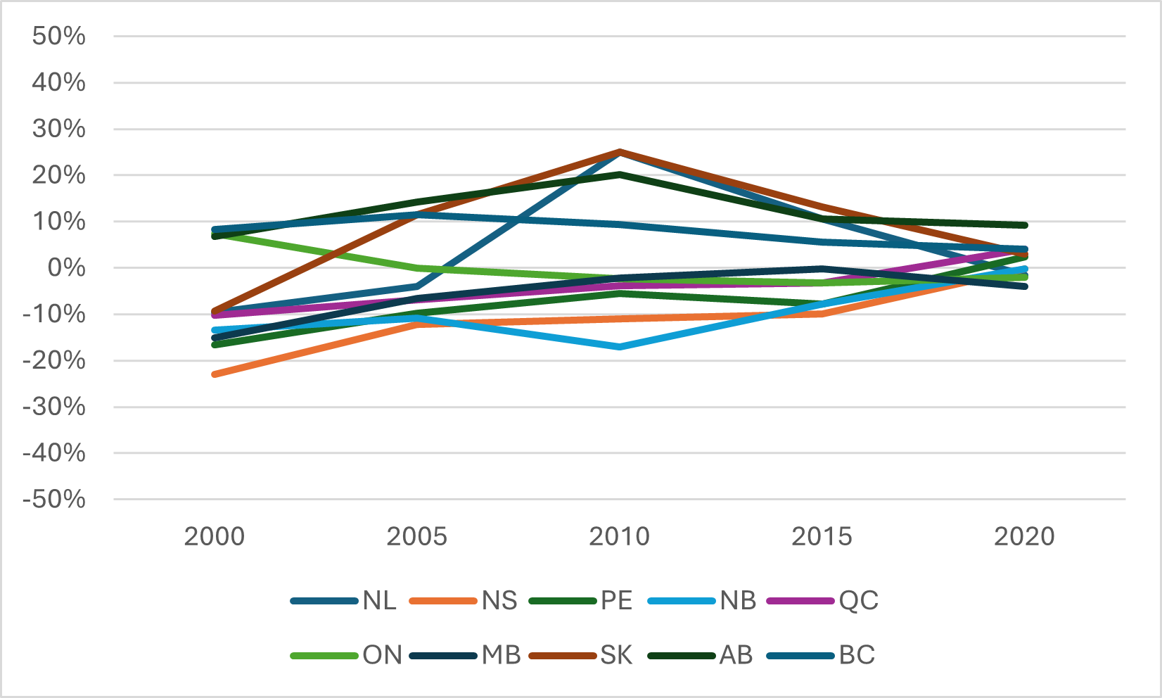
Obviously, the dispersion around the mean is much greater for the class of 2010 than it is for 2000. Now, you might answer: “so what, Usher? Didn’t you just tell us there was a series break in 2010?” Yes I did, but if it were the series break causing the greater dispersion, you would expect that dispersion to last for the classes of 2015 and 2020, which it quite clearly doesn’t. In fact, what we see in 2020 is less dispersion of salaries by province not just than in 2010, but in 2000 as well (which I for one would never have guessed). I think what that tells us is that commodity booms like the one we had just over a decade ago tend to increase geographic graduate salary inequality.
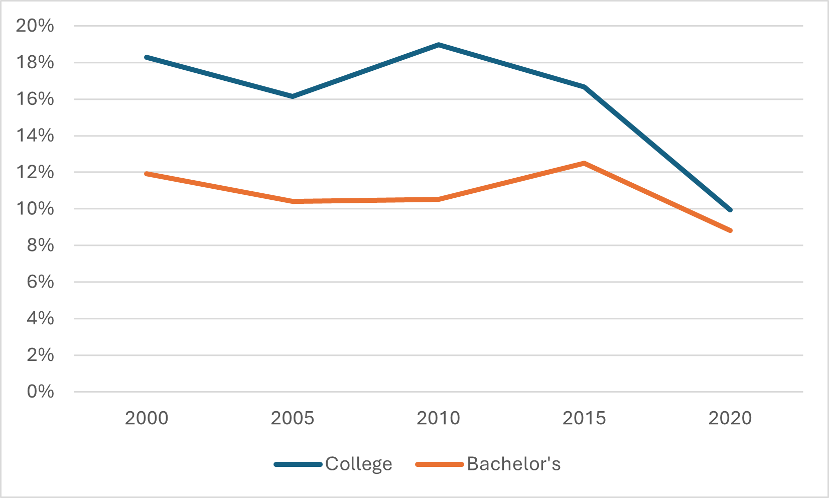
Figure 4 looks at gender disparity in median graduate incomes over time and uses a similar technique to Figure 3. Here I take the relative unadjusted difference between Men’s and Women’s median incomes in each of the last five survey periods, for both college and university graduates. In 2000, the median salary for male college graduates was 18% higher than it was for female graduates while on the university side the gap was 12%. There are two main reasons why median incomes by sex might differ when you look across all graduates. Garden-variety sexism is one; differing patterns of enrolment by field of study is another. Interestingly, the gap seems to be tumbling much faster in the college sector than for bachelor’s degrees, albeit from a much higher base.
Figure 4: Difference Between Male and Female Median Salaries Three Years After Graduation, by sector, 2000-2020
And that brings us to maybe the most interesting graphs today: namely, median income by field of study for the Class of 2020, which I show below in Figure 5. It’s mostly what you’d think, except…check out Humanities vs. Physical & Life Sciences.
Figure 5: Median Graduate Income by Field of Study, Three Years After Graduation, Bachelor’s Graduates, Class of 2020
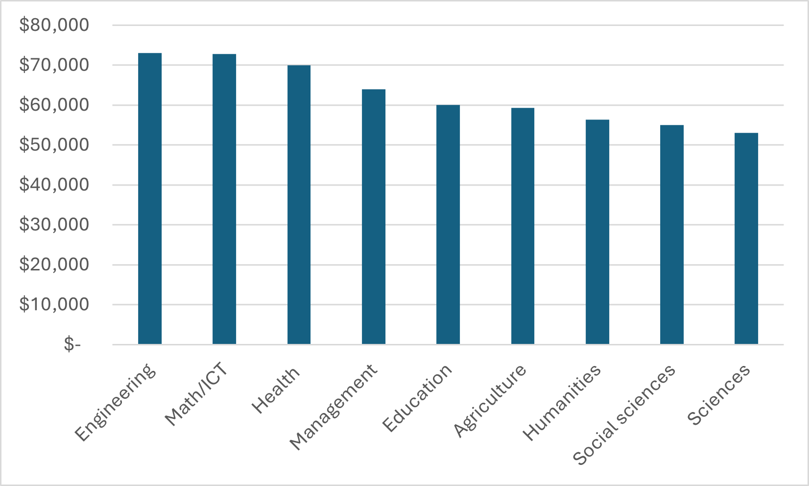
This shouldn’t be a huge surprise. In fact, one of my very first blogs (from 2011!) noted that in Canada, “STEM” was a weird concept because graduates in the sciences had labour market outcomes that were very different from those in Engineering and Mathematics. But for some people it is.
Time to revise some narratives, maybe.
 Tweet this post

Thank you for a very interesting analysis. In terms of percentage, the salaries of the Bachelor’s Graduates appear to have decreased a little more than the College Graduates. I wonder whether this could be explained by the very low graduate student stipends, which have not increased in as many years? If graduate students are included with the Bachelor’s Graduates salaries, removing them from the statistics could paint a different picture.
Just a thought: had you kept the same scale for bachelor’s and college graduates, above, we could have more easily seen how much the university premium still holds.