Today, I am going to try to pull all this data together to see to what extent federal and provincial shares of expenditure in PSE have changed over time.
As far as institutional expenditures go, the presence of federal indirect transfers complicates a good historical look at the question. Up until 1976, it’s possible to look directly at cash and tax transfers specifically designated for PSE, and it is possible again after 2007-08 when the Harper Government carved out a “dedicated” portion of the CST for post-secondary education. In between, when the funds were sent to provinces in a bundle with transfers for other services, it’s not really possible because there was simply no way to define the PSE-related proportion of the federal block transfer.
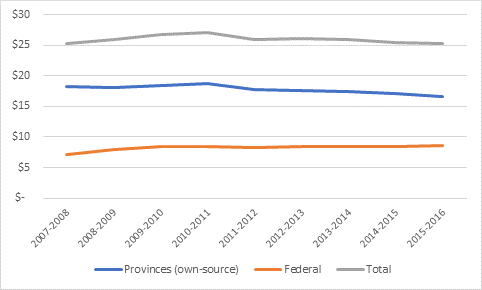
To the extent we can look at changes over time, what do we find? Figure 1 shows federal, provincial and total expenditures on post-secondary education since the Harper government began the practice of “dedicating” part of the CST to PSE. The federal figure includes both direct expenditures (e.g. research councils, infrastructure spending, etc) and cash transfers through the CST; the provincial figure represents own-source income on PSE – that is, provincial expenditures minus the dedicated CST transfer (yes, I know that’s not quite own-source because of equalization but I’m trying to keep things simple so shtum). What we see is that over the past decade or so, the federal proportion of total expenditures is creeping up slightly, from just under 25% in the year before the Harper government gave its major bump to PSE transfers, to over 30% now. Most of the increase is due to the transfer bump, but in recent years it is due to a fall in provincial expenditures combined with stable federal ones.
Figure 1: Federal and Provincial Contributions to Institutions, in billions of $2016
Now, let’s move on to something a bit harder, which is to make some comparisons to the 1960s, when you could actually calculate the federal transfer. Figures 2 and 3 have been cobbled together from a variety of sources (available on request); the former compares total transfers, both direct-to-institution and via transfers to provinces. Note that it probably undercounts the federal contribution somewhat prior to 1975 because we lack data on college finances for this period. The latter normalizes spending by dividing total expenditures by the total number of students in universities and colleges (technically, the 2014 number is FTE while the others are FT, which seemed to me the right way to compare because part-time study was quite rare until the late 70s).
Anyways, what these graphs mainly show is that federal expenditures are massively higher than they were fifty years ago, but smaller on a per-student basis than they were forty years ago.
Figure 2: Federal Transfers to PSE Institutions, 1955-2014, in billions of $2018
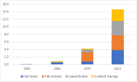
Figure 3: Per-Student Federal Transfers to PSE Institutions, 1955-2014, in $2018
So that’s the story when it comes to money for institutions. But what about student aid, where the federal contribution has been growing by leaps and bounds? As we showed yesterday, there is some pretty good data back to 1990 (though no recent data on provincial loan/grant mixes, which is irritating). Comparisons over long periods of time are possible if you’re not too fussy about loan/grant distinctions and you don’t mind some fairly back-of-the-envelope calculations of what tax expenditures looked like in the 1960s and 1970s, before anyone actually counted what they were worth.
Figure 4 takes the data from Figure 3 and then adds all the various types of student assistance: loans, grants, tax credits and education savings grants. Once you include all the new outlays on students, what we find is that the Government of Canada’s investment in PSE – now over $14.5 billion per year, though about $2.8 billion of that is in loans – is currently as high or higher than it was in the mid-1970s, even on a per-student basis.
Figure 4: Per-Student Federal Transfers to Institutions and Individuals for PSE, 1955-2014, in $2018
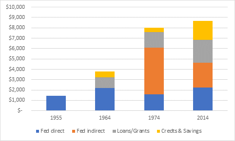
Now if you’ve been brought up since the 1990s with tales of a perfidious federal government which disinvested in education, or more specifically the left-wing mantra that Paul Martin and his budgets are the source of all ruin in Canadian higher education, this graph may surprise you. But it really shouldn’t. Taking the very long view, what has happened is that the Government of Canada has disinvested in institutions and taken that money and given it to students and parents. Back in the 1950s, the feds gave 100% of their money to institutions; now, it’s down to just 53%, with the rest going to individuals. This wasn’t a specific major policy that anyone adopted; rather, it is the accretion of a whole bunch of small decisions that governments at different points in time made for different reasons.
That brings us to the final question: how do federal expenditures compare to the provincial ones over time? We can almost do this correctly, in the sense that we have data on transfers to students and to universities but for colleges only since 2000 (or to be precise: such data may exist somewhere, but it is not available online including in Statistics Canada’s excellent compendia of historical statistics). One suspects that the provincial share would rise somewhat if this data were included. But, that said, figure 5 shows the federal share of the combined outlay to institutions and students at 39% is actually slightly higher today than it was in the storied 1970s.
Figure 5: Federal Share of Total Transfers to Institutions and Individuals for PSE, 1955-2014
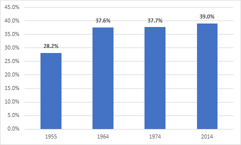
In other words: “those good old days” of federal funding? They’re happening right now.
And with that – bon weekend!
 Tweet this post