

Last week, the Council of Ontario Universities put out a media release with the headline “Ontario University Graduates are Getting Jobs”, and trumpeted the results of the annual provincial graduates survey, which showed that 93% of undergraduates had jobs two years after graduation, and their income was $49,398. Hooray!
But the problem – apart from the fact that it’s not actually 93% of all graduates with jobs, but rather 93% of all graduates who are in the labour market (i.e. excluding those still in school) – is that the COU release neither talks about what’s going on at the field of study level, nor places the data in any kind of historical context. Being a nerd, I collect these things when they come out each year and put the results in a little excel sheet. Let’s just say that when you do compare these results to earlier years, things look considerably less rosy.
Let’s start with the employment numbers, which look like this:
Figure 1: Employment Rate of Ontario Graduates 2 Years Out, Classes of 1999 to 2011
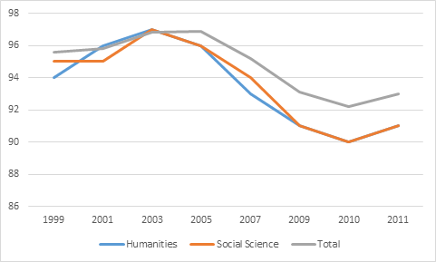
Keep your eye on the class of 2005 – this was the last group to be measured 2 years out before the recession began (i.e. in 2007). They had overall employment rates of about 97%, meaning that today’s numbers actually represent a 4-point drop from there. If you really wanted to be mean about it, you could equally say that graduate unemployment in 2013 has doubled since 2007. But look also at what’s happened to the Arts disciplines: in the first four years of the slowdown, their employment rates fell about two percentage points more than the average (though, since the class of ’09, their employment levels-out).
Still, one might think: employment rates in the 90s – not so bad, given the scale of the recession. And maybe that’s true. But take a look at the numbers on income:
Figure 2: Average Income (in $2013) 2 Years After Graduation, Ontario Graduating Classes from 2003-2011, Selected Disciplines
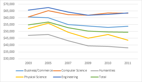
Figure 2 is unequivocally bad news. The average in every single discipline is below where it was for the class of 2005. Across all disciplines, the average is down 13%. Engineering and Computer Science are down the least, and have made some modest real gains in the last couple of years; for everyone else, the decline is in double-digits. Business: down 11%. Humanities: down 20%. Physical Sciences: down 22% (more evidence that generalizations about STEM disciplines are nonsense).
Now, at this point some of you may be saying: “hey, wait a minute – didn’t you say last year that incomes 2 years out were looking about the same as they did for the class of 2005?” Well, yes – but you may also recall that a couple of days later I called it back because Statscan did a whoopsie and said: “you know that data we said was two years after graduation? Actually it’s three years out”.
Basically, the Ontario data is telling us that 2 years out ain’t what it used to be, and the Statscan data is telling us is that three years out is the new two; simply, it now takes 36 months for graduates to reach the point they used to reach in 24. That’s not a disaster by any means, but it does show that – in Ontario at least – recent graduates are having a tougher time in the recession.
Tomorrow: more lessons in graduate employment data interpretation.
 Tweet this post

One response to “Some Scary Graduate Income Numbers”