I was playing around with CANSIM data on the weekend, when I saw something quite interesting regarding employment rates by age. Check this out:
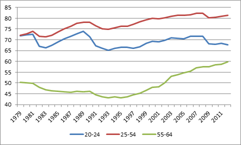
Figure 1 Employment Rates by Age Group
Although it’s common-talk to say that we’re still in hard times, in fact, employment rates among the core working-age population are near an all-time high – 81.6% is the highest rate on record, apart from 2007 and 2008; it’s a full eight percentage points ahead of where we were in the recession of the early eighties, and six percentage points ahead of where we were in the recession of the early 1990s.
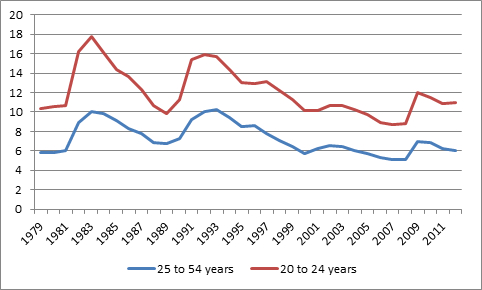
Among youth, it’s not quite the same story. Youth employment rates are a bit hard to interpret because their engagement with the labour force is attenuated by their attachment to the education system. The drop in employment rates for 20-24 year olds has a bit more to do with a drop in the student employment rate than the graduate employment rate – but regardless, news isn’t great on this front. Nothing fundamental has changed in the relationship between youth unemployment rates and core working-age unemployment rates, when compared with the recession of the 1990s (see Figure 2); however, it is taking longer for the youth labor market to rebound than it is for the rest of the labour market.
Figure 2 – Unemployment Rates by Age Group
But look at that first graph again. What’s absolutely stunning is what’s going on in the 55-64 age group. Until the mid-90s, their employment rates were falling, regardless of the economic cycle, as people took retirement earlier (I blame London Life). But since 1996, the employment rate has been rising by a percentage point per year, and this at a time when the number of people in that age group is exploding. There are currently – hold onto your hats – nearly 1.7 million more employed Canadians aged 55-64 than there were in 1996. That’s equivalent to the entire population of Nova Scotia and New Brunswick.
You don’t have to buy into the lump-of-labour fallacy, but you have to think that the change in labour market composition is having some kind of effect on the ability of young people to get a foot into the labour market. Had older workers continued retiring at the rate they were in the 1990s, workers aged 25-54 would have moved into senior jobs faster, and youth unemployment would almost certainly be lower than it currently is.
Overall, this is good news: more older workers lowers the burden of the demographic transition we are currently undergoing. But in the short term, it may be keeping young workers from sharing in the modest upswing we’re currently enjoying.


 Tweet this post

This is all very interesting but I wanted to ask a question about the dates selected. (My field is family. UK stats almost always show marriage rates graphs starting in 1971. It was an all time high but makes a nice linear graph.)
Are those participation rates for those 55-64 from 1980-1995 a historical anomaly? What happens when we compare now to that particular situation? Are we really saying that our social ideal is that 50% or less of the population aged 55 -64 should be in the workforce?
I suspect that if we took a longer historical view, we would see something rather different. I’d also be curious to see the longer view on youth employment.
My sociologist mind is thinking that there is something about how we thought post-war society and economy would be that played out for a while and then reached it’s limits. That ideology (of economic growth, prosperity, etc) also influenced actual policy. So those who started and built their careers in this hey-day of post-War Keynesianism and whatnot were in a position at age 55 (in the 80s) to take retirement. They had strong pensions. They had salary growth. Housing prices were relatively low compared to income. Education was much less expensive.
What we are seeing in that upward spike is probably the impact of the policies that started to be enacted in the 80s with the rise of a politics based on a very different economic theory.
Hi Jo. Thanks for reading.
I use ’79 as a cut-off date because it’s a nice way to show to ’82 recession (which was particularly brutal in Canada – far, far worse than what we’re undergoing now). Statscan data cuts off in 1976 because that’s when they adopted the current Labour Force Survey (and the ’76 data isn’t significantly different than the ’79 data). Some of this might be publicly available, but a quick scan hasn’t allowed me to find it.
Low housing prices wouldn’t have been a boon for the 55+ in the early 80s (older people treat housing as an asset to cash in on, not a cost), but I take your general point. But there’s another issue at work – gender. The big burst of women coming on to the labour market happened between about 1965 and 1989 (for much of that period, female LF growth was about 6% per year). Those women are just starting to end their careers now. So something like 2/3 of the growth in that older age bracket is female.
A
Interesting. I think the low housing prices earlier in their careers would have made housing a BIGGER asset for those 55+ in the 80s. I know the house my parents bought in 1972 sold for double what they bought it for in 1974 when we moved from Ontario to NS. And my cousins (who are all among the retired at 55 in the past 10 years crowd) did VERY well out of housing they bought when younger.
It seems like maybe other factors made it easier for some to weather than 1982 recession. Thanks for playing with the data.