Let’s do another blog on this topic because everyone loves talking executive compensation.
Yesterday we looked at Presidential pay in international comparison and saw that Canadian university Presidents have fairly low pay compared to equivalents in other English-speaking countries. But, one might argue, that’s the wrong metric. Maybe the real problem isn’t high pay so much as a relatively quick rise in pay over the past few years.
That’s a fair argument. But let’s see what the data says.
My data source here is the ever-handy CAUT Almanac (2005, 2010-11 and 2015-16 editions), from which we can obtain data on Presidential salaries for 2003, 2008 and 2013. There are multiple observations for 58 institutions (44 in 2003, 54 in 2008 and 56 in 2013); any institution for which I have data for only one year is eliminated. Now with numbers this small, one has to be careful about one or two outliers distorting averages either up or down. With that in mind, figure 1 shows the evolution of average compensation for university Presidents in Canada.
Figure 1: Average Pay, University Presidents, Canada 2003-2013, in real 2013 dollars
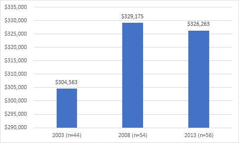
Source: CAUT Almanac
What figure 1 shows is that between 2003 and 2008 average Presidential pay rose by 8% after inflation (or, about 1.6% per year). However, between 2008 and 2013 the figure fell by a little less than 1%, meaning that for the decade as a whole the average annual increase was 0.68%.
Surprised? Skeptical? Well with datasets this small, it’s good to be careful. Not all of these are observations are comparable. In any given year, a few Presidents get hired and others leave their position. For these people, the salaries & compensation as captured by the Almanac are not particularly helpful because their salary only covers part of the year. In a couple of cases, you also get what look like one-off payments which inflate the salary.
To try and get around this problem, let’s look at the change between 2003 and 2008 for every institution for which we have data for both years:
Figure 2: Distribution of Real Presidential Salary Changes, 2003 to 2008
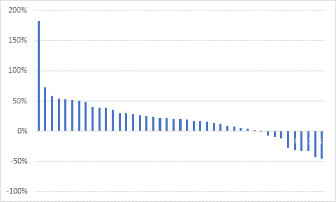
Source: CAUT Almanac
The highest value here is Acadia, and that’s clearly because the 2003 observation was for a President who was only came on board in September, thus giving her an artificially low number in the base year. Similarly, most of the negative numbers are for people who came on board mid-way through the year in 2008, such as Alan Rock (Ottawa), Roseann Runte (Carleton) and Michael Goldbloom (Bishop’s). But some of the negative numbers are also “resets” as universities bring compensation down when a new President is installed; for instance, Indira Samarasekara’s 2008 compensation was 28% lower than her predecessor’s in 2003.
Without a lot of fact-checking around appointment dates which I frankly have no interest in doing (free email guys: you get what you pay for) I can’t be sure exactly which Presidents fall into which category. But assuming that the artificially high and artificially low observations more or less cancel each other out, looking at the median observations should give us a sense of what was going on at the typical institution. As it turns out, the median here is 20%, compared to the 8% average we saw in figure 1: that’s not a “better” figure, by the way, just a different lens. For 2008 to 2013, the median is 0% (same as the average), and for 2003 to 2013 the number is again 20%.
Just for amusement, let’s compare this for a second to what’s been going on with professorial pay. Again, the data source is the CAUT Almanac for the same years. Guess what? Between 2003 and 2013, the average rise in pay – after inflation – for full professors (the nearest comparator to University Presidents) was 23%. I suspect that the rapid rise after 2008 has to do with fewer retirements and more professors staying on for more years and receiving annual pay rises.
Figure 3: Comparison of Changes in Presidential and Full Professorial Pay, 2003-2013
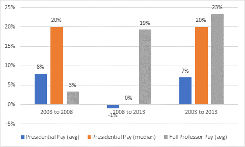
Source: CAUT Almanac
To sum up: between 2003 and 2008, presidential pay was rising by somewhere between 1.5% and 3.7% per year over inflation, depending on how you look at it. However, between 2008 and 2013 presidential pay stayed even with inflation. Meanwhile, average pay for full professors rose steeply after 2008, and over the decade to 2003 to 2013, their average pay rises were higher than those for Presidents – substantially so if we take an average-to-average comparison.
So next time anyone complains about huge pay rises to executives, just remember that professorial pay has been rising faster. Sauce for the goose, etc.
 Tweet this post