

Last week, the government of Canada announced to great fanfare (Hip Hip Hooray! Caloo Callay!) that Canada has a new international education brand. They actually meant “logo” not “brand”, but whatever – long past due because the old logo was terrible. To wit:
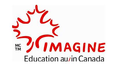
Ridiculous, right? “Education in/au Canada”? Most students who want to come study in Canada do so in order to improve their English, and Ottawa comes up with a logo that requires you to already be bilingual in order to understand it. Mercy.
Now, here’s our new logo:
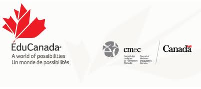
Um… OK. That’s a little bit better, I guess. But who in their right mind thinks the Canada word mark and the CMEC logo belong on this thing? Are they worried that prospective students in Izmir, Lagos, or Dnepropetrovsk would think less of us as a study destination if those logos weren’t there? That some eager would-be student from Togo would begin to get heart palpitations about the potential quality of higher education in Canada if the word mark wasn’t there? That a potential Colombian graduate student would interpret the lack of a CMEC logo as evidence of a scam?
But if you really want to shake your head in despair, take a look at the Study in Canada website, which is probably even dumber than the old logo was – note that despite the big announcement, no one seems to have found the time to actually update the logo on the website. Anyways, the website is a monstrosity. Fifty per cent of it is blank space, and its overall web sensibility would have been considered primitive even back in the MySpace era. Literally, the only thing you can say about it is that it meets official federal government web guidelines.
And this, in a very real sense, is the entire problem. The logo, the website – pretty much everything about our international education effort – is centred around what makes sense for governments and their bureaucracies. It is not centred around students. Go ahead, take a look at the Study in UK website, the Study in New Zealand website, the Study in Australia website, or even the German DAAD website. Do you see a lot of white space? In the case of DAAD – an organization partially funded by the Germans states (provinces), do you see any CMEC-equivalent logos cluttering up the visuals?
No? Me neither. Apparently, the awfulness of Canada’s efforts in this area are unique. But as all those other efforts show, it doesn’t have to be this way. We can do better. It starts simply by asking: “are we doing this because it will make sense to students? Or to governments?”
 Tweet this post

I love your logo, Alex. You have another career trajectory in branding/visual identity!
The EduCanada logo is not required and a trite tagline is most definitely not required. An 18 year-old in Mexico or in Indonesia, if they know anything about Canada, would likely recognize the Canadian flag and associate Canada with igloos, polar bears and Justin Bieber. We already have a powerful brand to leverage in international student recruitment. It’s Canada’s brand. Place a Canadian flag on your MarComm materials. Done.