


Every couple of years, I do an analysis of Candian university research ouptut data from the Leiden rankings, which always provide excellent and transparent data on publications and citations linked to each university. And, well, it’s that time again. So let’s dive in.
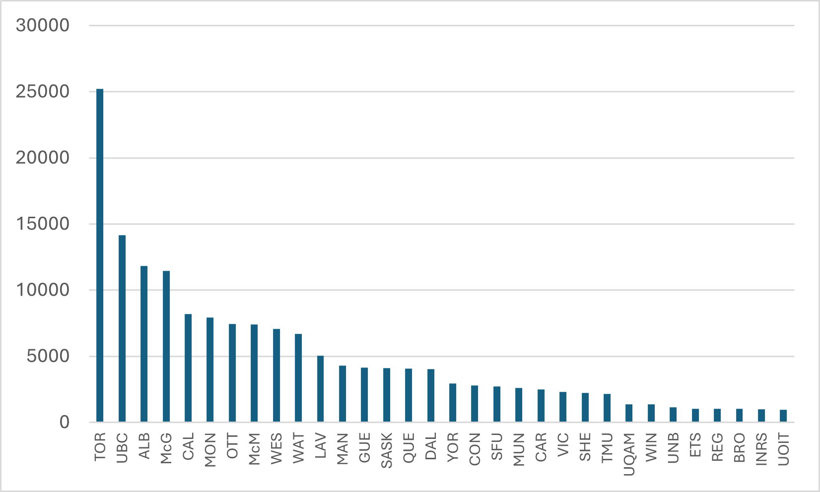
My first comparison is just about simple production: how many papers came out of each university? Figure 1 shows the data from the period 2020-2023. This graph doesn’t change much over time: Toronto is always way, way, out in front – mainly because any paper written at any hospital within about 50 miles of Queen’s Park counts as a U of T paper (affiliation rules work massively in U of T’s favour). The data included is for the 32 institutions with the largest publication counts: if you don’t see your institution, it’s because it’s not big enough to make the cut.
Figure 1: Publications by University, Canada, 2020-2023
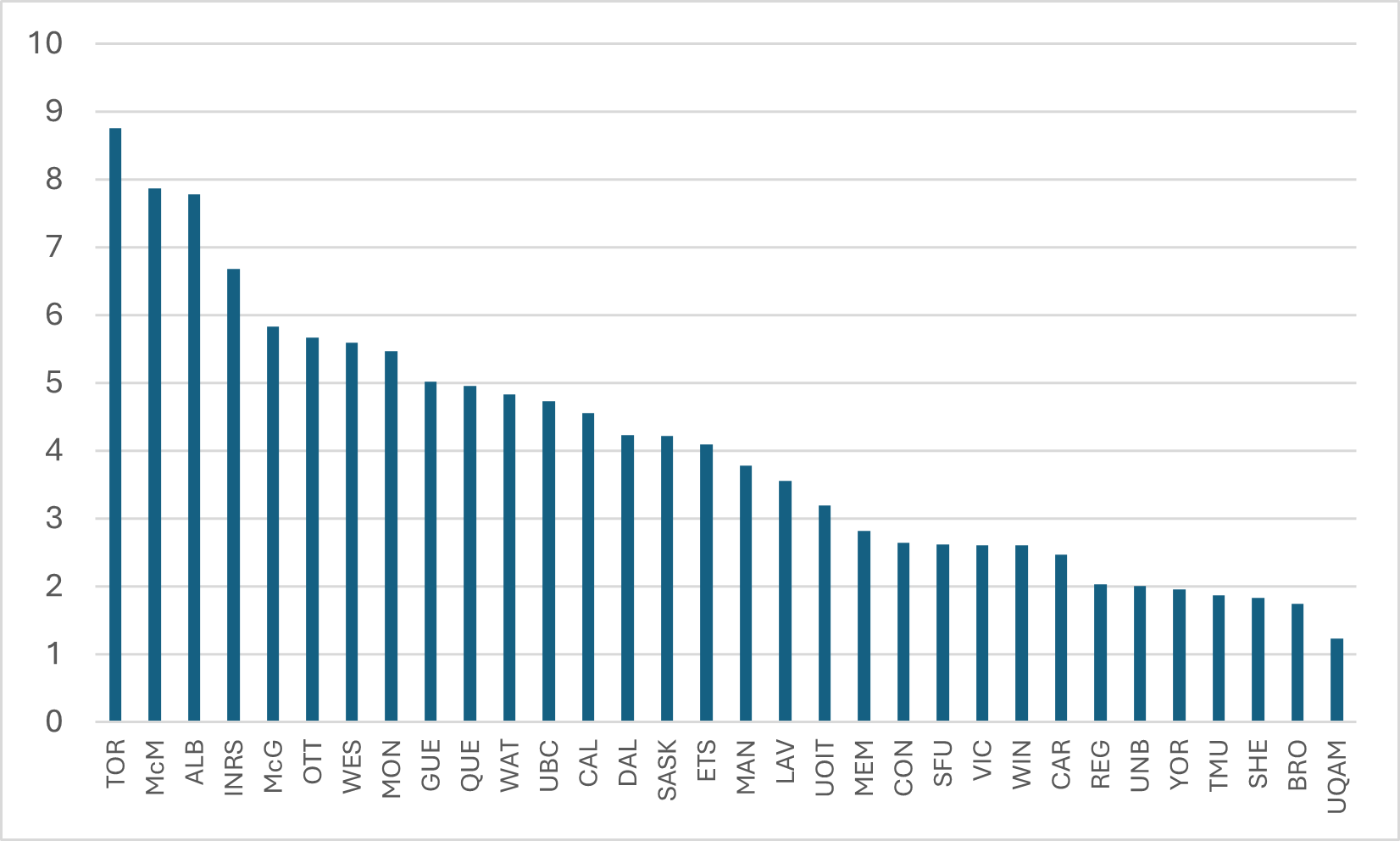
The last time I did this comparison, one faithful reader (hi Sean!) asked if I could normalize this by the size of institution, to see how much of this difference was driven by mere size. Now, there’s no simple way to normalize, but, for simplicity’s sake, I decided to use the number of ranked faculty numbers as a denominator. This isn’t a perfect solution– many articles are written by graduate students or hospital staff who are not counted among faculty – but it’s not terrible either. Using Statistics Canada’s staff numbers for 2021-22 as a denominator, Figure 2 provides a rough “total publications divided by ranked academic staff” for the period 2020-23. U of T still comes out first (though again: a lot of people writing the papers that show up in the numerator don’t show up in the denominator so it’s a skewed comparison). However, as you can see, the gaps between institutions are much smaller once normalized, though the usual suspects from the U15 (plus l’Institut national de recherche scientifique) still occupy the top spots.
Figure 2: Publications Divided by Number of Ranked Academic Staff, by Institution, Canada, 2020-23
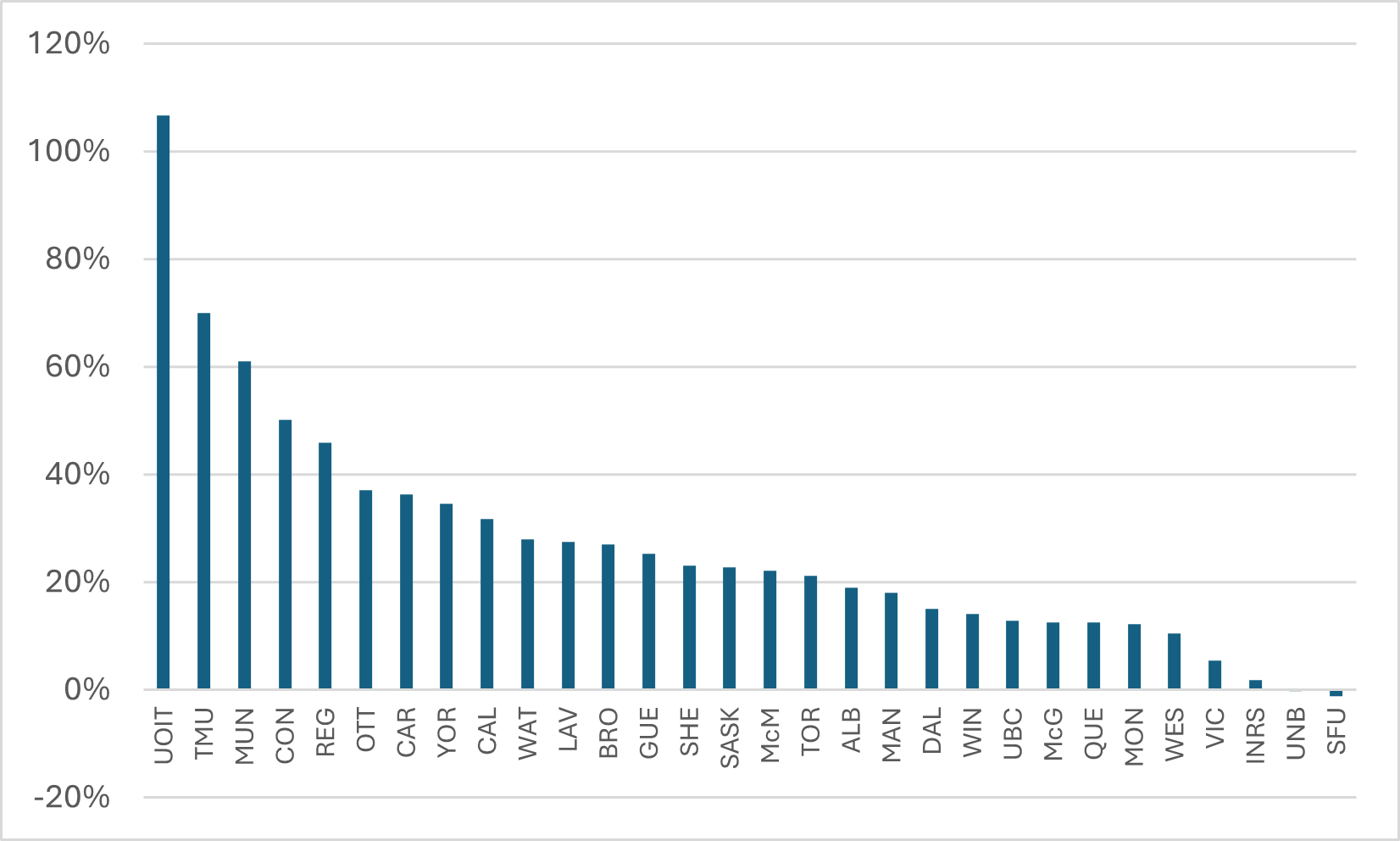
We can look at change over time, too. In Figure 3, I compare output in the period 2020-2023 with that of a decade earlier, 2010-13. This looks like an amazing result – everyone other than SFU and UNB is up, and by an average of around 25%! – but it is not an apples-to-apples comparison. Every year, the big bibliometric indexes add journals to their index, so to some extent what is being measured here is a larger “base” of journals being counted rather than a change in actual output. My guess would be that on an apples-to-apples basis, every institution from McGill down probably had output in 2020-23 that was no better than equal to what it achieved in 2010-13. The top performer here is UOIT which of course was barely in existence in 2010, so that 107% increase is partly just adding professors (but it’s still a good result!). Toronto Metropolitan, Memorial, and Concordia also seem to have made significant advances in the past few years.
Figure 3: Change in Scientific Output, 2010-13 to 2020-23
So, let me come now to the impact of Canadian research. The Leiden Rankings have a number of ways of looking at relative impact. Among them:
- Median Normalized Citation Score, which is the average number of citation scores relative to the average for the field of study in which it was published. A 1.0 score therefore means publications from that university are cited exactly as often as the world average, a 2.0 means they are cited twice as much, etc.
- The percentage of papers in the 1%, 5%, 10% and 50% of top-cited papers. So, if 1% of your papers are cited in the top 1% (again, adjusted for field of study), you are at the world average, etc.
These various measures are pretty highly correlated. There aren’t many institutions that are lousy at getting into the top 50% but great at getting them into the top 1%, etc. Where there is change over time in one indicator, you can be pretty sure there is change over time in all of them. So, for the sake of simplicity/convenience, I am going to look at a single measure, which is the percentage of papers that make it into the top 10%. The next few figures show the percentage of papers from each university that made it into the top 10% of all papers worldwide and compares this with the scores at the same institution in 2010-13. For the sake of readability and narrative, I break it into three graphs. First, the U15.
Figure 4: Percentage of All Papers in the Top 10% Most Highly-Cited Worldwide, 2010-13 vs 2020-23, U15 Universities
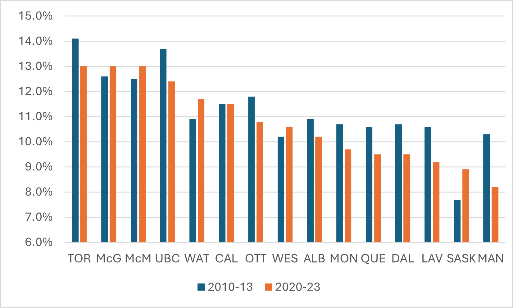
The good news in Figure 4 is that a few schools in the U15 are seeing their work have more impact: Saskatchewan, in particular, but to a lesser extent also Waterloo, Western, McGill, and McMaster. But the bigger story here is that there are a lot of places where impact is falling. Manitoba, in particular, has seen a real fall, as well as Dalhousie, Laval, Queen’s, Toronto, and UBC.
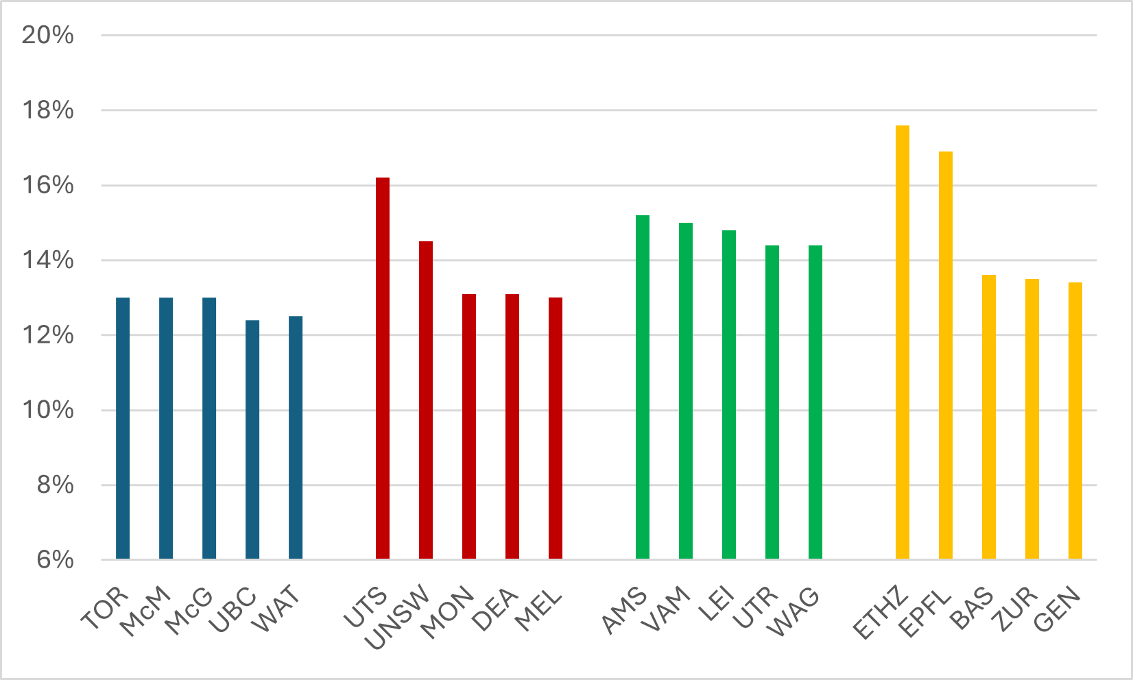
You may be wondering at this point how our top research universities compare to those in countries with which we might aspire to some scientific parity. I won’t include the US and the UK in this comparison, because all the top journals and their editors are located there and proximity matters in these things. The University of Toronto, McGill, and McMaster would be joint-40th best in the US on this measure, and joint-35th best in the UK (which is utterly ludicrous – I mean c’mon, U of T and Northumbria? Please). And I won’t include Japanese universities either because linguistic bias (among other things) means all Japanese universities have low citation numbers globally. Brock, which has the weakest numbers among ranked Canadian universities, has a better score on this measure than any Japanese university other than Todai.
But there are some countries to which we could and should compare ourselves. Say, Australia, the Netherlands, and Switzerland. In Figure 5, the top five Canadian universities are in blue, and they are shown in comparison to the top five Australian (red), Dutch (green), and Swiss (orange) universities. It’s interesting: our best don’t do as well as you might expect.
Figure 5: Percentage of All Papers in the Top 10% Most Highly-Cited Worldwide, 2010-13 vs 2020-23, Five Most Highly-Cited Universities (minimum 5000 publications) in Canada and Selected Countries
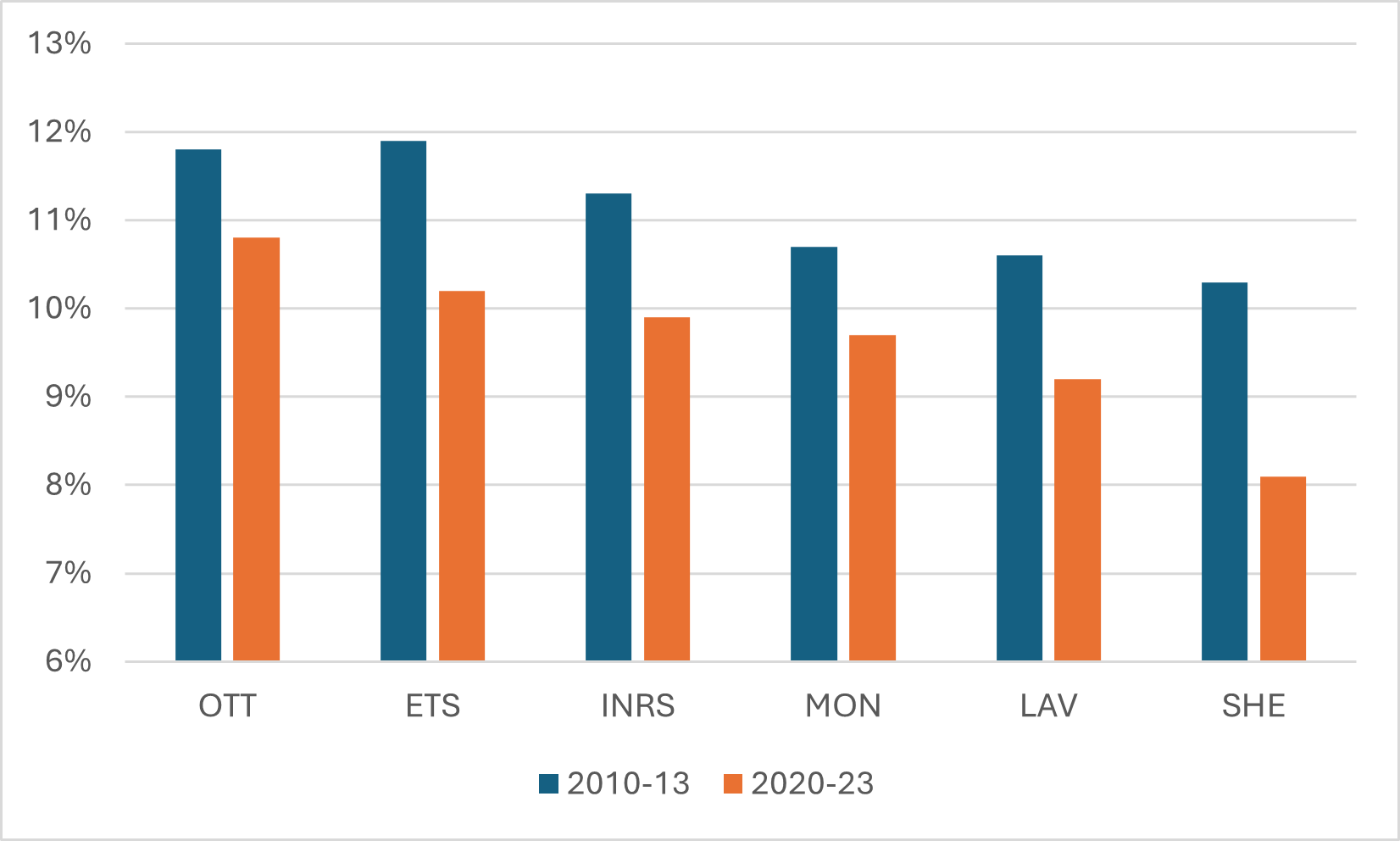
In Figure 6, I look specifically at francophone/bilingual universities. These universities have always had lower-than-expected scores than the rest of the country, and this is pretty clearly because they produce a number of articles in French (see my point about Japan, above). A gap in absolute numbers is therefore to be expected. But this doesn’t really explain why they are all seeing their impact fall at the same time. I don’t have an answer for why this might be the case, but it strikes me as something Quebec policy wonks might want to investigate.
Figure 6: Percentage of All Papers in the Top 10% Most Highly-Cited Worldwide, 2010-13 vs 2020-23, Francophone/Bilingual Universities
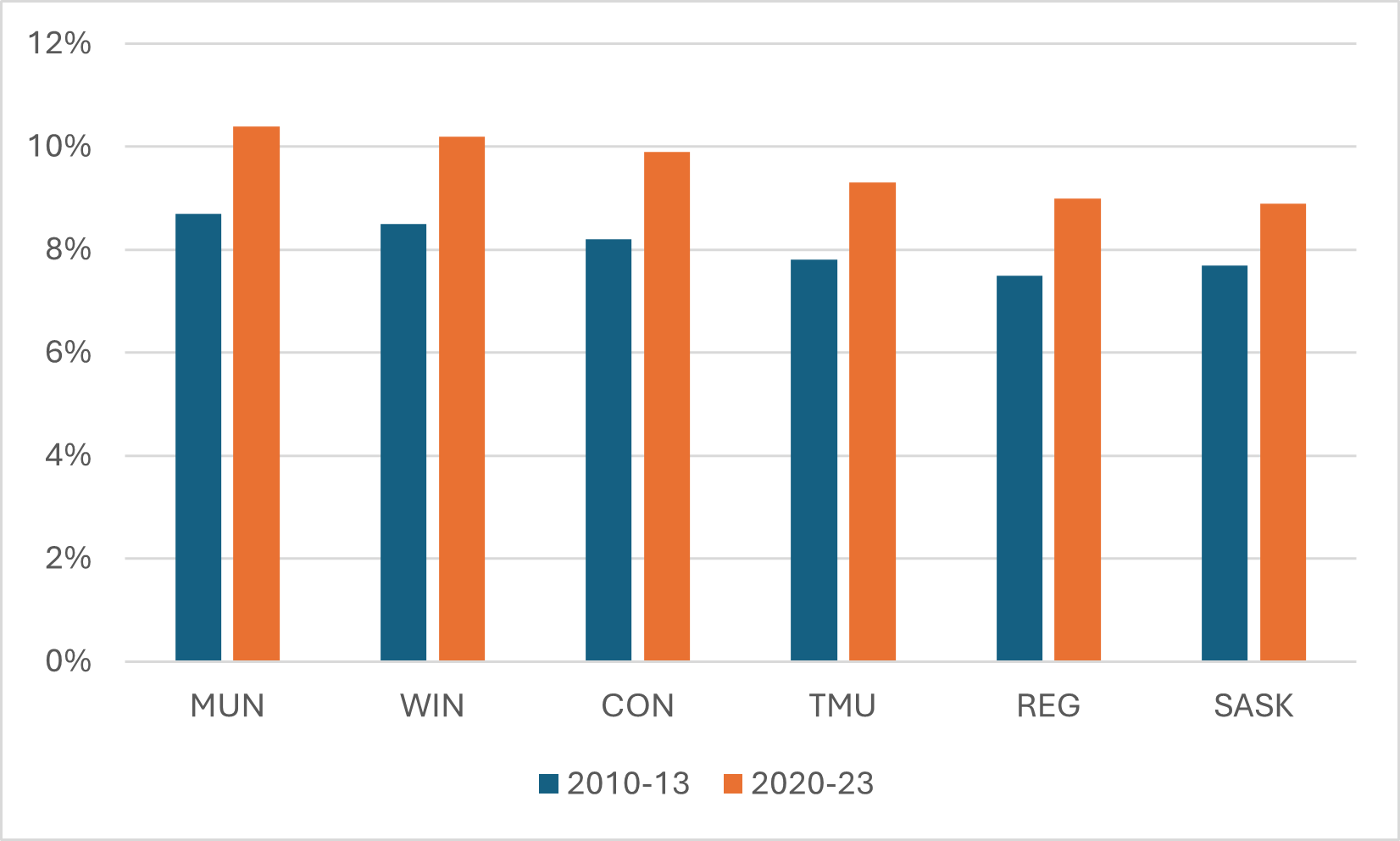
Finally, I think it’s worth pointing out where scholarly impact is clearly on the rise. There are six institutions where impact has risen substantially over the past decade, and they probably are not a top six that would have been at the top of anyone’s mind. Memorial, in particular, which has had a bit of a torrid decade or so, has nevertheless managed to see the share of its articles making the top 10% worldwide go from 8.7% to 10.4% (and into the top ten, nationally). Windsor’s share of top 10% of articles is now even with the University of Alberta, while Concordia, TMU, Regina, and Saskatchewan have all seen their shares rise by more than a full percentage point.
Figure 7: Percentage of All Papers in the Top 10% Most Highly-Cited Worldwide, 2010-13 vs 2020-23, Selected Canadian Universities
Anyways, that’s your quick tour through the Leiden data for this year. We’ll do it again sometime in 2027.


4 Responses
A useful commentary on a great source of data, as usual. But the focus on the U15 in Figure 4 is questionable when looking at normalized measures of research impact. For example, if this figure showed the top 15 universities by impact, you would see the University of Victoria coming in 4th in Canada, just after Toronto, McMaster, and McGill. Memorial, SFU, and Concordia would also make the cut. Seems a missed opportunity to mention that some of Canada’s smaller universities are actually outperforming many of the U15 when it comes to research impact.
If you forcibly dropped Humber into the Canadian university research league tables, it would sit near the bottom on sheer volume, mid-pack or better on money per active researcher, and probably somewhere around the middle–lower half on citation impact, while being near the very top nationally for industry-facing/applied work.
Does the decline of Canadian institutions in relative placement merely reflect the rise of Asian and especially Chinese institutions?
These numbers are all absolute, so no.