It’s all-Council-of-Ontario-Universities this week on the blog, but that’s because they’re the ones putting out the great data. Today, it’s the annual survey on graduate outcomes which looks at how bachelor’s degree graduates are faring in the labour market. Standard caveat: Ontario =/= Canada, but it produces nearly half the country’s bachelor degrees so it’s bound to be close to the national average and the trends you see here are unlikely to be much different that those you see anywhere else.
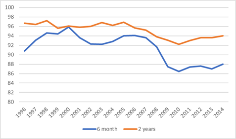
Figure 1 shows employment rates of Bachelor’s graduates, 6 months and 2 years after graduation, by graduating class (the most recent graduating class is that of 2004, interviewed in mid-2016). We’re slowly recovering from the trough year of 2010, but also still well below where we were prior to the recession. Note that in the graph the X-axis represents the year of graduation, not the year of measurement. The class of 2014’s 2-year employment rate was measured in 2016, etc.
Figure 1: Employment Rates of Bachelor’s Graduates 6 months and 2 years After Graduation, classes of 1996 to 2014
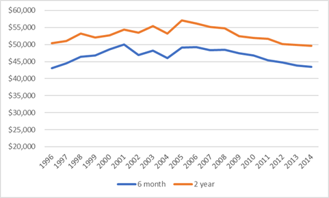
Figure 2 shows incomes at 2 years and 6 months, expressed in inflation-adjusted dollars. What the data shows is that graduate incomes are continuing to fall slightly, as they have more or less continually since the class of 2005 (which was the last one to have passed the 2 year mark before the great recession of 2008 realty started).
Figure 2: Mean Incomes of Bachelor’s Graduates 6 months and 2 years After Graduation in constant $2016, classes of 1996 to 2014
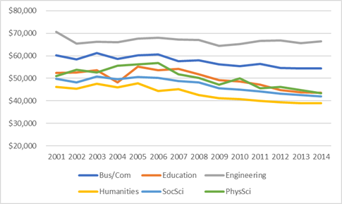
If you look at the major fields of study, in fact the patterns are remarkably similar: with the exception of Engineering where graduate income has been relatively stable over the past decade, all the major fields show significant declines over the past decade. The decline differs somewhat by field of study, but the direction is unmistakeable – down ten percent since 2005 in Business, seventeen in Social Sciences, nineteen in humanities, and twenty-one and twenty-three percent in Education and Physical Science, respectively.
Figure 3: Mean Incomes of Bachelor’s Graduates 2 Years After Graduation by Selected Major Field of Study, in constant $2016, classes of 2001 to 2014
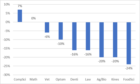
What one might easily conclude from figure 3 is that it’s the generalist degrees which are getting creamed, and more technical and professional disciplines are the way to go. But it turns out that’s not quite true. Figure 4 shows the declines in mean real income in a range of smaller fields of study: twenty-four percent for food/science and nutrition, twenty percent in kinesiology, life sciences and agriculture. Sixteen percent in law and dentistry. If incomes in dentistry and humanities are falling at more or less the same rate, it’s probably fair to conclude that whatever’s going on with graduate salaries, it’s economy-wide, not confined to some mythical group of medieval historians pouring coffee at Starbucks.
Figure 4: Change in Real $2016 Mean Incomes of Bachelor’s Graduates 2 Years After Graduation by Selected Field of Study, class of 2005 to class of 2014
One caution here is in order with respect to reading too much into this data, which I repeat from last year. There’s a problem comparing the graduating class of 2005 with that of 2014; namely, that As I have pointed out before, the size of the graduating cohort in 2015 was something like 30% larger than the one from 2005 thanks to a variety of access-enhancing measures. It’s not just competition between equally well-skilled workers which drives down wages; it’s also the fact that many of the new entrants/graduates are from lower down the ability spectrum to start with, you’d expect to see lower salaries on average even with no change in the economy. The extent to which that’s an explanatory factor is debatable, but it’s surely part of the answer.


