Yesterday, I promised to show you some of the data on our alternative measure of class size (see here for more details). Some preliminaries, though:
Our measure of “average number of classmates” may be a bit crude (it depends on student estimates of class sizes), but it is robust. Institutional averages bounce around by a few percent each year, but long-term averages – which at most institutions involve between two and four thousand observations – are pretty stable. To avoid complicating things, what I present here are six-year institutional means.
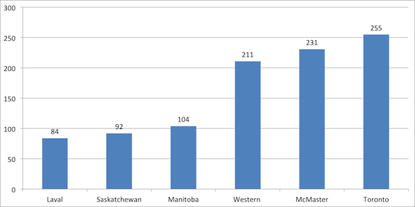
Obviously, class size is correlated with institutional size (i.e., smaller universities have smaller classes); but the data shows an enormous amount of variation around the mean. Take a look at the highest- and lowest-scoring U-15 schools: even among supposedly similar universities (research-intensive universities with medical schools), one can get vastly different average class sizes. Since they’re the same type of institution, these differences can’t be accounted for by different mixes of faculties – they must be straight-up reflections of differences in the way undergraduate education is managed.
Smallest and Largest Class Sizes Among U-15 Schools

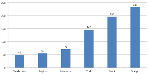
Perhaps more intriguing are the results for the next tier of institutions – comprehensive institutions with substantial student populations but without medical schools. At the lower end, these schools have substantially smaller “average numbers of classmates,” but at the top end, at universities like Brock and Guelph, the numbers are indistinguishable from those at top research universities.
Smallest and Largest Class Sizes Among Comprehensive Schools
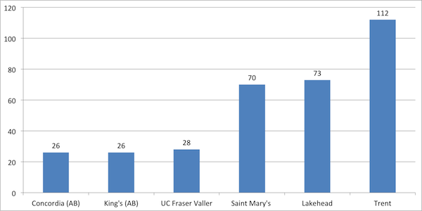
Finally, here’s smallest and largest class sizes among the smaller universities.
Smallest and Largest Class Sizes Among Small Undergraduate Schools
Notice how the institutions with the highest numbers on each of those graphs are from Ontario? That’s not a coincidence. Only three Ontario universities (Ryerson, Lakehead and Laurentian) have averages under 100; outside the province, only seven (Dalhousie, McGill, Manitoba, Calgary, Alberta, SFU and UBC) have averages over 100. Clearly, when you combine the lowest per-student funding in the country with the highest professors’ salaries in the country, something has to give somewhere: that something, apparently, is class size.
Small classes aren’t everything, of course; after all, Western manages to get stellar satisfaction ratings despite having some of the country’s largest classes. But this data does suggest that the Ontario student experience is significantly different than that in the rest of the country – and it’s not commensurate with the tuition they’re paying.
Interesting results, no? Anyone who wants to work with us on improving our methodology, let us know. We’re all ears.


 Tweet this post

One response to “Fun with Class Size Data”