Can we please just stop with the “Generation Y are screwed” meme, already? It’s utterly without foundation.
Last week, the Canadian Press ran an article about a poll, which said that, due to inflated housing prices, 72% of Canadians aged 19-33 were pessimistic about ever owning a house. This sounds terrible – until you look at the actual data.
Census data shows that, in 2006, home ownership among 20-29 year olds was, in fact, at an all-time high. True, the Teranet House Price Index does show that average house prices went up 40% since 2006, but that’s been offset by 5-year mortgage rates declining during that same period, from about 5.75% to 3%. The result: although average housing costs have risen 40%, the cost of servicing a loan for an average house has only risen 6% (or, slower than inflation as a whole) since 2006.
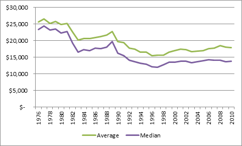
Another big piece of youth declinism came via Rob Carrick of The Globe, who began his piece, “Young Adults really do Have it Tougher”, with the sensational claim that, “people aged 20-24 are 41% worse-off financially than their counterparts were in 1976”.
Here’s what the actual data looks like, going back to 1976.
Average and Median Incomes, 20-24 year-olds, Canada, in Real 2010 Dollars
It is indeed true that today’s students have it worse than those from 1976. But since all that change effectively happened prior to 1992, it’s also true that students today are no worse off than they were 20 years ago.
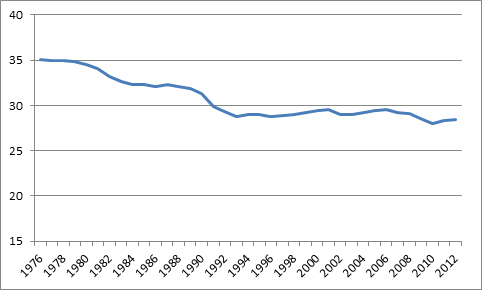
So what happened in the 80s that changed youth incomes so much? It’s not that employment rates have fallen; they’ve bounced around a fairly narrow range, in the high 60s and low 70s, for pretty much the entire past 40 years. But when we look at hours worked, the puzzle solves itself nicely.
Average Hours Worked, 15-24 Year-Olds, Canada
Average overall hours worked dropped from 35 hours-per-week, to 28 hours-per-week – or, by roughly 20%. In 1976, among 15-24 year olds (Cansim doesn’t break it down to 5-year blocks, unfortunately), over half were working 40 or more hours per week; in 2010, less than 35% were.
And why did working hours fall? The obvious answer is that PSE attendance in that age bracket nearly doubled in the period from 1976 to 1992, which left people with fewer hours available for paid work. According to The Globe, this large increase in access now has to be re-interpreted as a disaster for young people, because enrolment curtailed their income in the short-term. Yeesh.
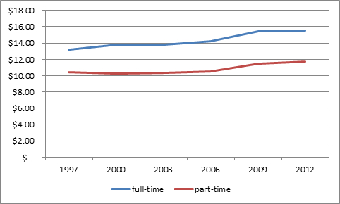
For those of you still convinced there’s a generational crisis going on, have a look at this data from the Labour Force Survey.
Average Hourly Wage Rate by Job Status, 15-24 Year-Olds, Canada, in 2012 Dollars
A prize for anyone who can turn that graph into a convincing tale of generational woe.


 Tweet this post

Good points Alex but did I miss this? A trend chart showing student debt in 2012 dollars would be helpful.
Signed, helping to pay for my kids going through PSE because they don’t have 50k handy
Thanks for reading our stuff, Tony. You may find a few previous posts on student debt handy for looking at trends: https://higheredstrategy.com/category/student-debt/
Charts 1 & 2 agree in shape but not amplitude. Income fell by 40%, hrs by only 20%. Also,. data from AUCC show univ enrollment rising steadily 1980-2009, whereas on your thesis, one would expect it to be more or less the invert of Chart 2.