

You may remember a blog I wrote last year concerning something called the Tennessee Promise. Described by some as a “free tuition” program, essentially what it did was ensure that every Tennessee student enrolled in a Tennessee community college received student aid at least equal to tuition. In the fall, the state touted that first year, direct-from high-school enrollments in Tennessee colleges had increased by fourteen percent. But now, however, some more complete data is available in the form of the State’s annual higher education factbook, which allows us to look a little bit more deeply at what happened.
What the numbers show is something a little bit weird. If we look just at direct from-public-high-school -to-community-college/college of technology, the numbers are actually much better than initially advertised. In 2014, this number was 13,527; in 2015 it was 17,550, and increase of nearly 30%. That’s quite astonishing.
However, not all of this jump in enrollment at colleges came from “new” students. To a considerable degree, the jump in the number of community-college bound students came from cannibalizing students who would otherwise have attended 4-year colleges, as shown in the figure below.
Figure 1: Public In-State Public High School Graduate Enrolment by System, Fall 2011-Fall 2015
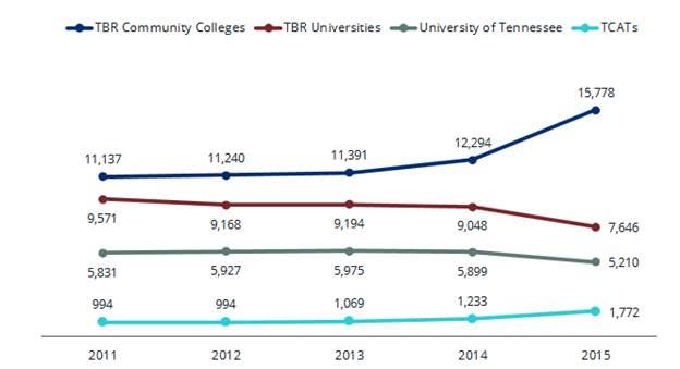
So, Community College and College of Applied Technology enrollment rose by about 4,000, but enrollments in 4-year colleges fell by 2,000, meaning effectively that half the growth came from people switching from other types of higher education. Still, net growth in enrollments at all levels was about 2,000 , or 6.8%, which is pretty impressive given that growth in the three previous years combined was only about 4%. It sure seems like there is something positive going on here. But what?
Well, free tuition promoters would have you believe that what’s happening here is a rush of previously-excluded poor students suddenly attending because education is more affordable. Unfortunately, we can’t directly check students’ socio-economic backgrounds, so we can’t know for sure who’s responding to these lower net prices. However, because the factbook shows transition rate by county, we can look at different enrollment responses by county median household income. Figure 2 plots the percentage increase in enrollments in each of Tennessee’s 95 counties against their median household incomes
Figure 2: Percentage increase in college-going rate, Tennessee 2015 over 2014 by County, vs County Median Household Income
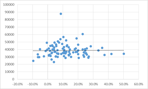
Pretty clearly, there’s no relationship here, which at face value suggests that participation rates of students from poor counties did not increase any faster than the rates of students from richer counties. But that’s not quite right. Remember we are looking at percentage increases, and poorer counties tend to have lower participation rates. Therefore, in order for the percentage increase to be the same in richer and poorer counties, the percentage point increase actually has to be larger in richer counties. (think about: a 10% rise for a county with 30% participation rates is 3 percentage point; for a county with a 60% part rate, a 10% rise requires a jump of 6 percentage points).
So, a pure, unsophisticated simple-stupid pre-post analysis of the Tennessee data, suggests that the Tennessee Promise appears to have i) caused a 30% increase in 2-year college-going rates among high school graduates, half of which was diverted from other types of higher education and ii) caused a 6.8% overall increase in transitions to all forms of college, but that this increase did not primarily take place due to increases of the college-going rate of students from poorer counties.
Make no mistake, this is still a very good outcome for a program that only costs $14 million per cohort per academic year; it works out to $7,000 per new student added to the post-secondary system, which is pretty cheap. Nevertheless, it’s worth noting that those benefits don’t seem to necessarily accrue to youth from poorer backgrounds.
 Tweet this post

Shouldn’t your graph in fig 2 have the axis reversed if the A vs B caption is correct?
I think this is a ‘Good Thing’ overall- Far too many kids go to shitty univ’s and often accrue debt they cannot pay off. Some of those kids would be better off getting a 2 year degree, imo-