

So, yesterday we looked at Ontario university graduate employment data (link to: previous). Today I want to zero in a little bit on what’s happening by field of study.
(I can hear two objections popping up already. First; “why just Ontario”? Answer: while Quebec, Alberta, British Columbia and the Maritimes – via MPHEC – all publish similar data, they all publish the data in slightly different ways, making it irritating (and in some cases impossible) to come up with a composite national figure. The National Graduate Survey (NGS) in theory does this, but only every five years but as I explained last week has made itself irrelevant by changing the survey period. So, in short, I can’t do national, and Ontario a) is nearly half the country in terms of university enrolments and b) publishes slightly more detailed data than most. Second, “why just universities”? Answer: “fair point, I’ll be publishing that data soon”.
Everyone clear? OK, let’s keep going).
Let’s look first at employment rates 6 months after graduation by field of study (I include only the six largest – Business/Commerce, Education, Engineering, Humanities, Physical Sciences and Social Sciences – because otherwise these graphs would be an utter mess), shown below in Figure 1. As was the case yesterday, the dates along the x-axis are the cohort graduation year.
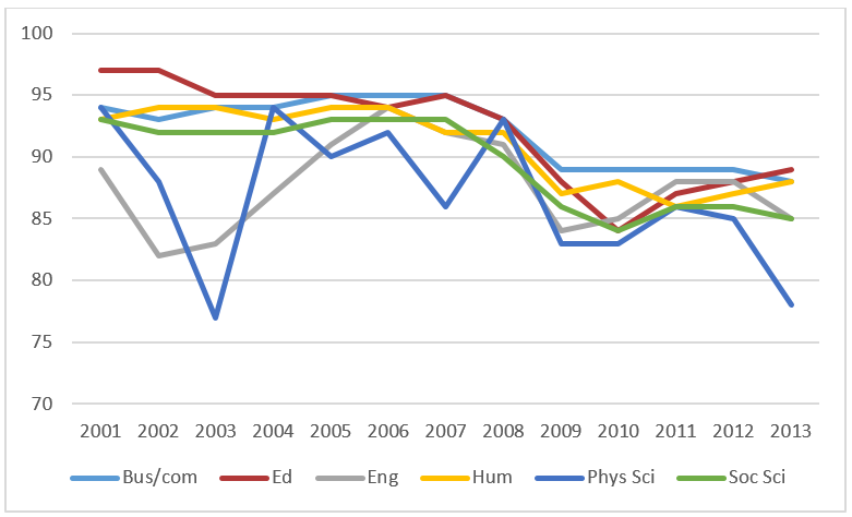
Two take-aways here, I think. The first is that the post-08 recession really affected graduates of all fields more or less equally, with employment rates falling by between 6 and 8 percentage points (the exception is humanities, where current rates are only four percentage points below where they were in 2007). The second is that pretty much since 2001, it’s graduates in the physical sciences who have had the weakest results.
OK, but as many in the academy say: 6 months isn’t enough to judge anything. What about employment rates after, say, 2 years? These are shown below in Figure 2.
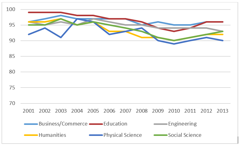
This graph is smoother than the previous one, which suggests the market for graduates with 2 years in the labour market is a lot more stable than that for graduates with just 6 months. If you compare the class of 2013 with the clss of 2005 (the last one to completely miss the 2008-9 recession), business and commerce students’ employment rates have fallen only by one percentage point while those in social sciences have dropped by six percentage points, with the others falling somewhere in between. One definite point to note for all those STEM enthusiasts out there: there’s no evidence here that students in STEM programs have fared much better than everyone else.
But employment is one thing; income is another. I’ll spare you the graph of income at six months because really, who cares? I’ll just go straight to what’s happening at two years.
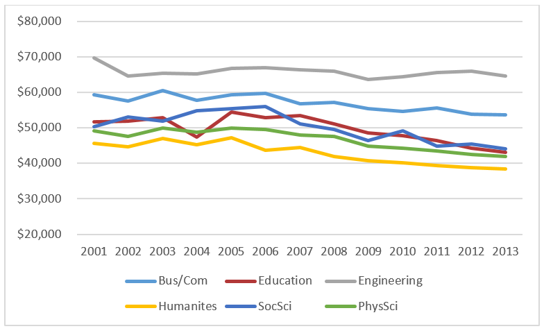
To be clear, what figure 3 shows is average graduate salaries two years after graduation in real dollars – that is, controlling for inflation. And what we see here is that in all fields of study, income bops along fairly steadily until 2007 (i.e. class of 2005) at which point things change and incomes start to decline in all six subject areas. Engineering was down, albeit only by three percent. But income for business students was down 10%, physical sciences down 16%, and humanities, social sciences and education were down 19%, 20% and 21%, respectively.
This, I shouldn’t need to emphasize, is freaking terrible. Actual employment rates (link to: previous) may not be down that much but this drop in early graduate earnings is pretty disastrous for the majority of students. Until a year or two ago I wasn’t inclined to put a lot of weight on this: average graduate earnings have always popped back after recessions. This time seems to be different.
Now as I said yesterday, we shouldn’t be too quick to blame this on a huge changes economy to which institutions are not responding; it’s likely that part of the fall in averages comes from allowing more students to access education in the first place. As university graduates take up an increasing space on the right-hand side of an imaginary bell-curve representing all youth, “average earnings” will naturally decline even if there’s no overall change in the average or distribution of earnings as a whole. And the story might not be as negative if we were to take a five- or ten-year perspective on earnings. Ross Finnie has done some excellent work showing that in the long-term nearly all university graduates make a decent return (though, equally, there is evidence that students with weak starts in the labour force have lower long-term earnings as well through a process known as “labour market scarring”).
Whatever the cause, universities (and Arts faculties in particular) have to start addressing this issue honestly. People know in their gut that university graduates’ futures in general (and Arts graduates in particular) are not as rosy as they used to be. So when the Council of Ontario puts out a media release, as it did last month, patting universities on the back for a job well-done with respect to graduate outcomes, it rings decidedly false.
Universities can acknowledge challenges in graduate without admitting that they are somehow at fault. What they cannot do is pretend there isn’t a problem, or shirk taking significant steps to improve employment outcomes.
 Tweet this post

A few comments:
1) You correctly point out that after the double cohort in Ontario, the population of university graduates may be qualitatively different, and previous years’ findings may not be generalizable. In this particular entry, I would suggest that decreasing income levels for Arts students (and others) may reflect a population shift in another way. Were income levels only reflective of those who did not attend graduate school? Perhaps (due to the recession), certain cross-sections of Arts graduates are more likely to attend graduate school (to avoid the reality of economy) and therefore the population included in this analysis has drastically changed. Keep in mind that 2006-2008 were the years the Dalton McGuinty government encouraged uptake of an extraordinary amount of Masters students in Ontario.
2) The colours on the third chart shifted for physical and social sciences, was this intention, or in need of correction?
3) A link or reference to how these Field of Study groups were composed would be useful. You are very correct in saying that there is much variance across the country. I’m scratching my head as to whether biology was included in “Physical Sciences” (as biology is a popular major in my region), if social work is included in social science, if journalism and communications is included in humanities, etc. Rather than searching myself, would appreciate the quick link.
Hi Kathleen. Good point on 1). Let me check and get back to you on 2). 3) There is no such link or reference. Biology is almost certainly in physical science, social work and journalism are separate categories which I left out of the analysis, not included in either soc sci or humanities.
Interesting data, but is there really any significant difference in employment rates between fields? For example, the two year employment rates all cluster between 90 and 96%, and given the uncertainty in the survey responses I wonder if we are splitting hairs.
I wouldn’t argue (much) with that.
The colours for SocSci and PhysSci are switched in figure 3 compared to 1 and 2. Is this correct, or are the labels incorrect?