

About a month ago, the Canadian Centre for Policy Alternatives put out a report on precarious employment in Ontario universities and colleges.
One good thing about this document at the outset: it has an imaginative research design. There is so much we do not know, and in the absence of any detailed reporting by institutions themselves cannot know about employment in post-secondary institutions. To get around this, the report’s authors, Erika Shaker and Robin Shaban, gather data from the Labour Force Survey, which – in theory at least – allows one to identify individuals in job categories within higher education. Basically, you can single out people who work in the post-secondary “industry”, and then look at their “occupation” (management, librarian, academic staff, teacher, etc), and then check out things like whether or not their jobs are full-time or part-time, whether they hold more than one job, etc. In theory, you should be able to look at wages, too, but the authors haven’t included that (though whether that’s because StatsCan suppresses data at that level or because the salary data undermines the argument here, I can’t tell). It also includes excerpts from interviews with participants concerning precarity in the sector.
There are some weaknesses in this strategy. The LFS has a reasonably big sample – over 50,000 per month – but that still only amounts to about one in every 360 Canadians eligible for the labour force. Given that there are 140,000 or so people who work in the PSE sector in Ontario, that means simply by random chance, it is quite unlikely that the LFS interviews more than 400 of them in any given month. That’s an OK sample size as long as you don’t try to subdivide it much further. However, once you get down to small groups like “librarians” – which make up 2-3% of the PSE workforce – then you’re looking at making generalizations from ten observations or so per survey, which is dubious.
To measure “precarity”, the authors focus on three factors: does the employee have more than one job? Is the job in post-secondary part-time? And is any unpaid overtime being done? At no point do the authors choose to grapple with the problems with how the data is collected and interpreted. To wit: if a lawyer or a nurse chooses to teach one course per year part-time, or if a student accepts a part-time job on campus to supplement their income while studying full-time, does it make sense to classify them as “precarious workers”? a tired professor self-reports time spent organizing a conference or acting as a reviewed as “unpaid overtime” (not an entirely indefensible classification) does that mean that someone with tenure should be considered as “precarious”? But apparently these concerns are too pedestrian for the authors.
On to the data. The most important graph in the paper is this one:
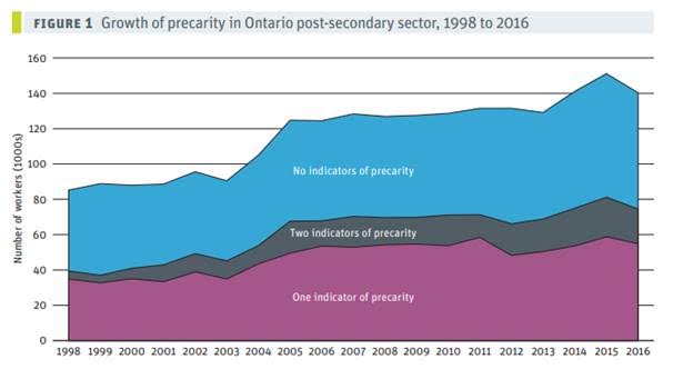
It’s hard to tell exactly what’s going on with the underlying data without seeing the exact figures (which the authors do not give us), but eyeballing the chart here’s what I see.
- In 1998, there were (roughly) 85K workers, of which (roughly) 39K were “precarious”. Precarity would therefore have equalled 46%.
- In 2005, after a big jump in employee numbers we see (roughly) 124K workers, of which maybe 67K were precarious. Precarity would therefore have equalled 54%.
- In 2016, after another big jump, we see (roughly) 140K workers, of which (roughly) 75K were precarious. Precarity = 54%.
In other words, using their own expansive definitions, there has been no increase in precarity for well over a decade. In a report about precarity, you’d think this would be a big headline finding, but no. In fact, they employ this neat visual trick to try to distract from this. Check out this graph, which measures the proportion of temporary employees in the sector:
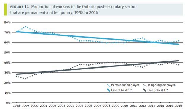
A fair reading of the information on this graph would suggest that there has been no increase whatsoever in temporary work since 2005. But add a highly questionable “line of best fit” and voila! Visually, it’s a consistent downward trend! In Figure 10, they work a downward trend out of a dataset where the value in 2016 is actually slightly higher in 2016 than it was in 1998.
Another weakness here is the authors’ decision not to look at such actual administrative data that exists, just to “reality-check check” their own unorthodox data sources. For instance, a quick look at Colleges Ontario’s (quite excellent) Environment Scan from various years suggests that over 70% of the sector’s quite substantial job growth since 2002 – that is, over more or less the same period that part-time positions overall have stayed constant – has been in part-time positions. This growth has been more or less over the same period that part-time positions reported in the CCPA’s Figure 11 have stayed constant. The proportion of part-time positions in colleges rising when the proportion of part-times in the system as a whole is staying stable implies that the proportion of part-time jobs in the university sector must be falling. This seems worth mentioning in a paper on precarious work.
Here’s the bottom line: as defined by the authors there is nothing wrong with most precarious jobs on campus. When CCPA says it wants fewer precarious jobs on campus, what does it mean, exactly? Fewer students working part-time jobs on campus? Fewer RA/TA positions? Fewer practicing professionals teaching courses in professional programs? Because to a large extent, that’s what campus part-time temporary employment consists of.
There are probably some people on Ontario campuses that deserve more hours and more pay, and it’s good that people like CCPA want to look out for them. But stridently asserting a growth in precarity where the evidence used is mixed helps no one.
 Tweet this post

I agree for the most part with Alex’s critique of the presentation of numbers in the CCPA report, but I don’t write it off as another politically charged paper. I’ll add a percentage is not always a useful statistic in viewing disparity, as anyone at the bottom of a wage grid knows percentage increases just increase the gap. In the case of larger numbers of precarious workers, they have a larger presence combined with what looks like a longer wait time to FT employment (personal observation but I’d like to see these statistics).